Grub Restaurant Brief - "X"
BRIEF:
Minor 2 asked for the branding and application of a new restaurant serving exotic food such as insects in order to encourage people to overlook its reputation.
CONCEPT:
Market research led me to conclude that consumers would be more likely to eat unusual food if the feel of its packaging was detached from visuals commonly associated with the earth and dirt, if a challenge was featured, and if there was use of minimal colours in order to appear clean and of a high quality.
My concept was derived from maths, a subject that not everybody likes yet through its challenging nature is rewarding. The idea for the brand name "X" was based on X representing the "unknown" in algebra, as I liked the connection it gave me to the food requiring discovery. I decided the brand marque itself would act as a window through which the food could be viewed - unashamedly as so to restore confidence in the consumer, while maintaining a sense of mystery in that the food is only partly visible and needs to be discovered.
SOLUTION:
I decided to create a direct mail food tester that would allow consumers to try 3 different "tiers" (maths jargon for difficulty level) of unknown food - "no calculator required", whereby they would then be invited to enter what they believed X to be online via the website or twitter in order to "graduate". This would encourage visitors to the restaurant and generate hype.

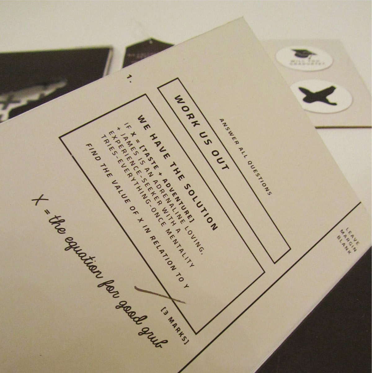
I created a booklet in the style of a school work book (complete with the relevent paper stock) to go alongside my direct mail package.
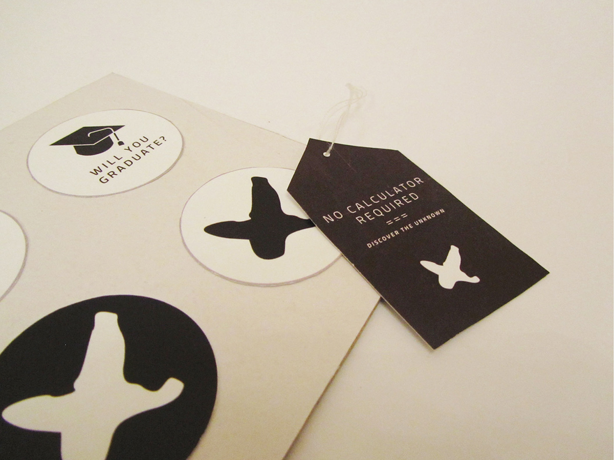
School and maths visual language is used, the X marque acting as a crest. The cover also features a line for the tester to mark their name to add a personal feel.
The book is contained within a chalkboard-esque cover slip that features the X marque as a window so that part of the booklet is visible to provoke curiosity. The flap at the back questions "will you graduate?", giving a sense of the challenge to come and building anticipation. Inside the cover slip is a pattern based on maths symbols, only visible once the booklet is removed. The slogan is inspired by an algebraic equation.
"taste + adventure"
the restaurant's focus is on the taste of the food rather than its reputation, while the challenge aspect turns eating into an exciting, adventurous experience.


The work book features patterns based on mathematical symbols and algebra, while chalkboard style pages featuring an X-shaped window reveal a teasing preview of what X might be.
Type is arranged to resemble an exam question paper as though the consumer is being tested.


The direct mail, in the form of a food-sample box, continues the visual language of an exam.
The consumer is invited to begin the "exam" within, which creates anticipation and a sense of challenge. The total calories are displayed as "total marks". The "exam" can be previewed through the X-shaped window on top of the box.
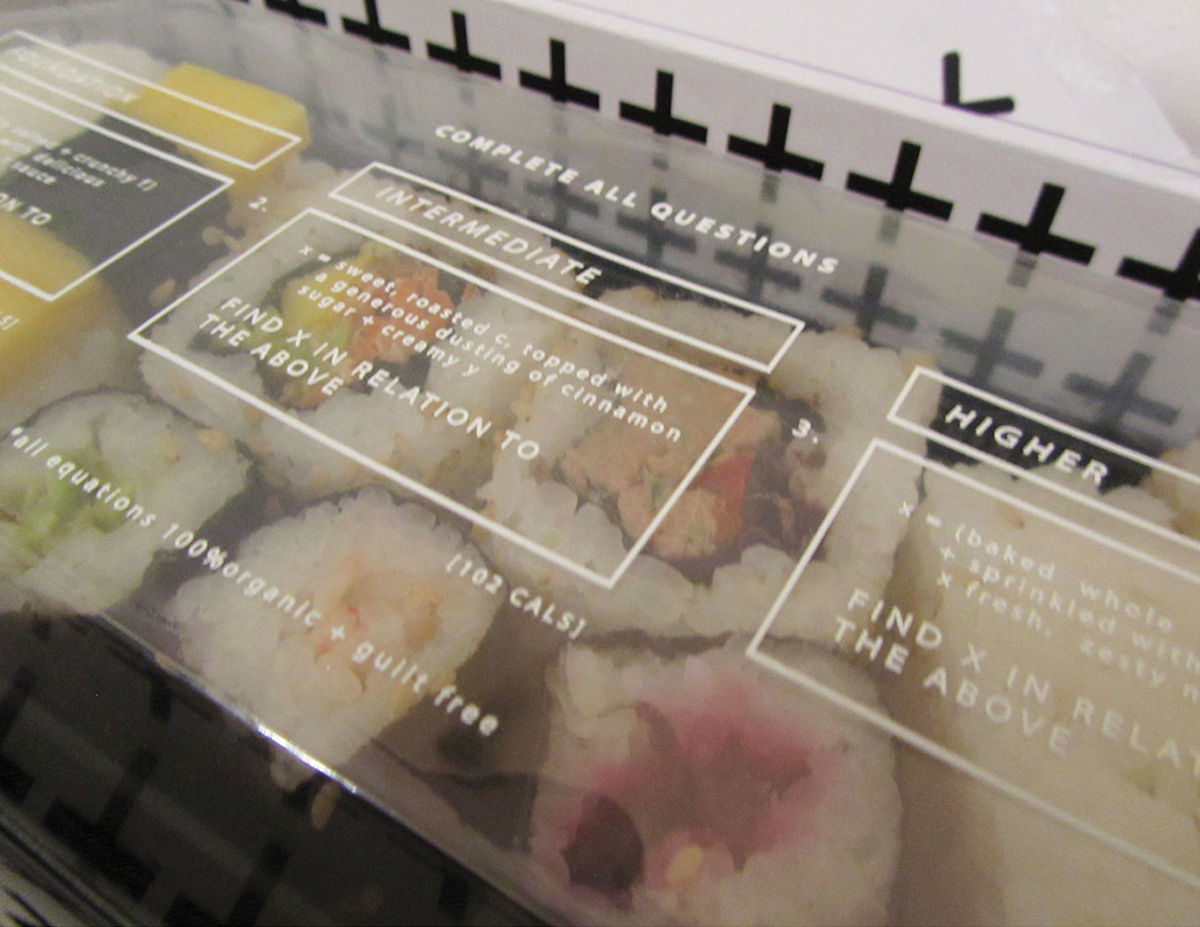
When opened, the box interior is revealed; again featuring the pattern of mathematical symbols.
When the food tray is lifted a message is revealed, intriguing the consumer.
The food tray itself has been printed onto clear acetate to allow the food beneath to enticingly show through, whilst dividing the food into tiers according to challenge level. This allows the box to be suitable for everyone and continues the exam-style format.
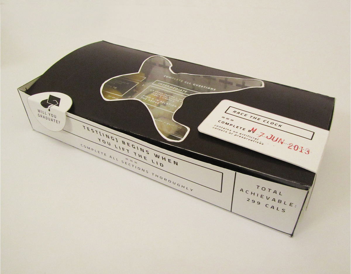


In continuation of the brand, I created stickers, tags and letterheads which feature the same visual language of mathematics and algebra.