EZDAN Real Estate
Contest Entry for Ezdan real estate.
Contest Entry for Ezdan real estate.
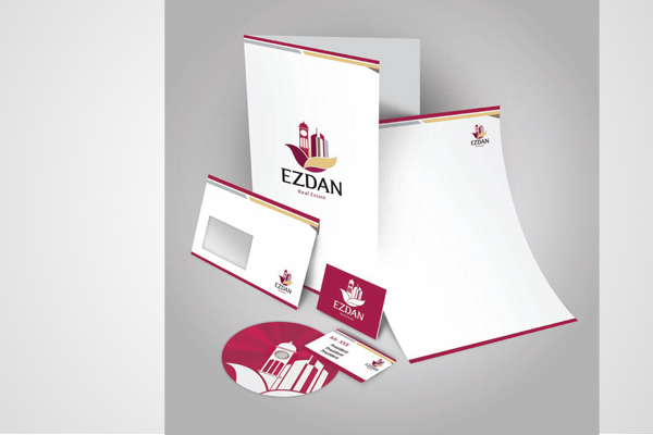
Resurrecting lives on the sands of the Gulf for forty-seven years, The Ezdan Real Estate is an indistinguishable part of Qatar’s rich culture and history now.
This logo not only signifies the time zones Ezdan has travelled in these nearly five decades from the mighty Clock Tower to the magnificent infrastructure, transforming maiden lands into emblems of strength and dignity, but also the life-long relationships Ezdan has been able to build with whoever got associated with it; be it customers or business associates. It has withstood the tests of time, reproving the mettle of its fellow countrymen who had suffered bloodshed for the sake of peace, symb olized by the historical maroon color of the logo that had evolved from the‘Qatar-red’ hue used initially.
Alongwith, is the sand-brown color that reminds us of Qatar’s heritage and is a mark that at the heart of Ezdan, it strives to fulfill its social responsibility towards the country, developing an infrastructure that could boast of its grandeur for decades to come.
The two petals, brown and Qatar-red, arising from a common stem is a promise that, the consistent endeavor and striving of Ezdan to pioneer the deliverables of commercial, residential and hospitality architectural masterpieces in the Real Estate Industry is inseparable from its commitment towards the citizens of Qatar to shelter them through all seasons alike, defying the entropy likely to be ushered in by the sands of time, hunting down all resisting forces like the swift falcon guarding the Qatarians with its razor-sharp and spotless vision.
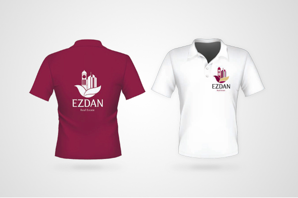