

The Brief
The employer for this work was a non-profit organisation called Kompánia Alapítvány. Our goal was to advertise the birth of a new service the organisation recently began to undertake by educating teenagers and adolescents on how to become experts at improving their own classes' coherence, acceptance, etc.
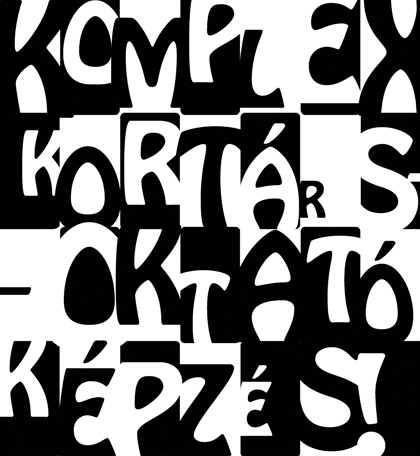
In the brief, we agreed upon only the main guidelines, including: the design must be simple and eye-catching. The text was also provided, and we agreed that the media will be A3 portrait in CMYK color.
Primary agreement on initial look. We know that this design will make the impact by
using bold/heavy type placement.
using bold/heavy type placement.
Starting point fixed, moving on...
Further adjustments, and letter-tweaking was required to reach a nice balance between legibility and wow-factor; the initial idea was to reach simplicity with usage of less text and few colors only.

After this stage, we started to move towards a more colorful approach, to convey a not-so sharp meaning. The client gave additional guidelines: it should be friendly, more feminine than masculine, reassuring, playful, and decorative but possess the quality of something changing (like the students, who go through this 'transformation' by qualificating at their trainig and become a more self- and group-aware person).
Not wanting to work with images / photos, I decided I'll create the background with vector-based illustration, and had a simple idea. To convey these meanings, but remain at really simplified shapes, i moved towards circular shapes, and the best fit between the static circle and the 'transformating' movement seemed to be the 'drop'.
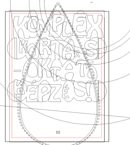
Wireframe screenshot for a general placement of the elements (the main text,
and the 'drop' including circular 'sun-like' color-modifying areas).
and the 'drop' including circular 'sun-like' color-modifying areas).
At that stage I got green-light on the finishing touches (including color variations), which lead to the final completion of the design.
The finished design


