Branding scheme and proposal for Bootle Town
Bootle is a new area of focus for regeneration within Liverpool, and plans are in place to help build a brighter future for the town.
Architecture students from the LSAD created their own regeneration schemes for the town, focusing on substainability.
Myself and Kit Ambage worked together on designing a masterplan document for one of the group’s proposals, and from there went on to create a hypothetical branding proposal for Bootle.
Together we created a new scheme to give Bootle a facelift and clear identity that could push the town forward.
This wasn’t a scheme to promote tourism like most town or city branding, this was a scheme to promote substainabilty to the locals.
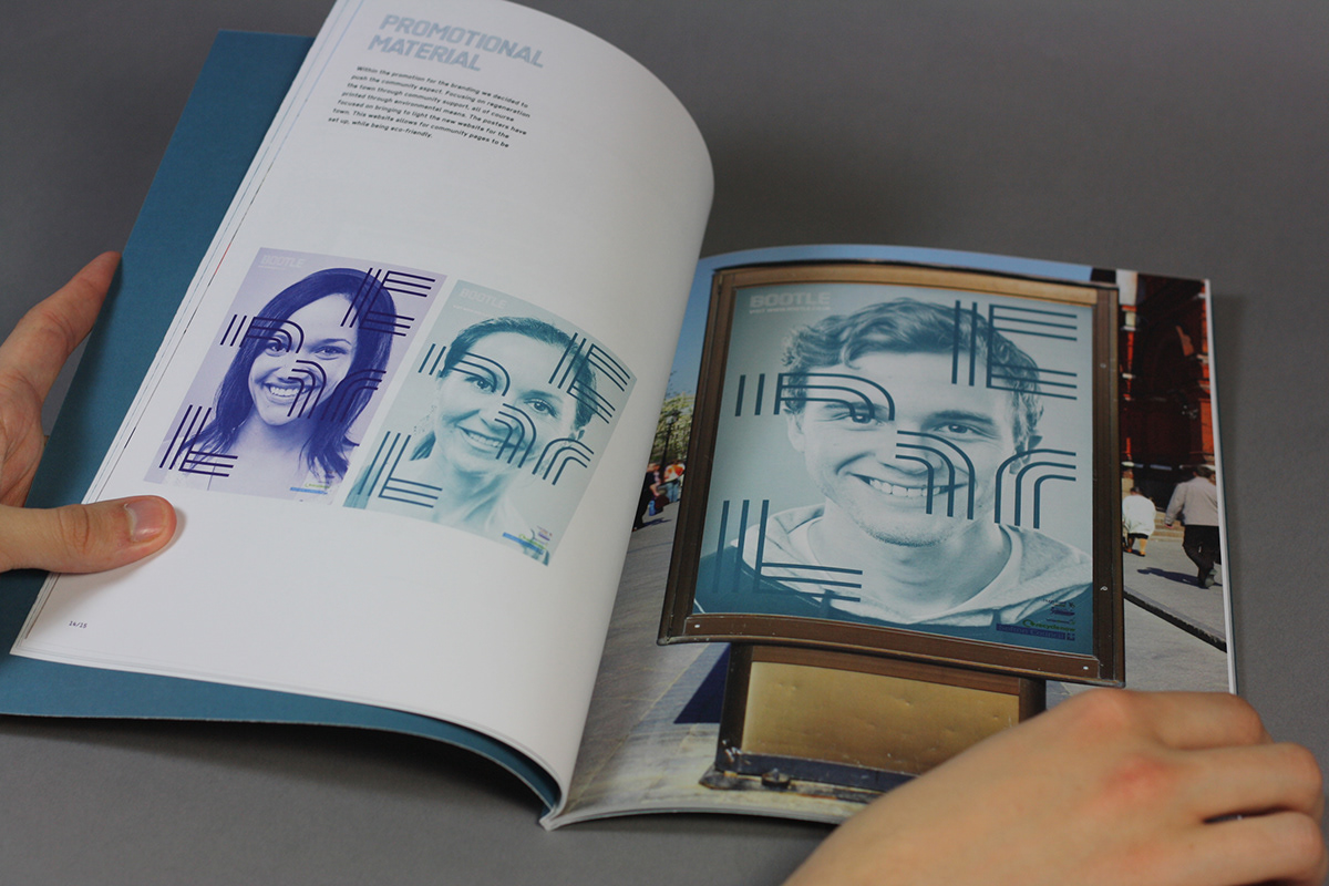
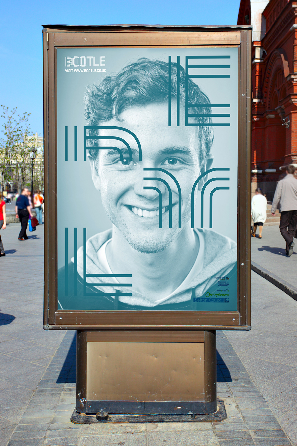
Our design elements were documented within a case study, containing details of our visual approach, which included a logo, colour scheme, banners & posters, hoardings, stationery set and most significantly, a typeface built specifically for Bootle.
The typeface, was inspired by the carvings in the wall of Bootle town hall, and the three stripes are a reference to Bootle’s long standing town motto; ‘Respice, Aspice, Prospice’ latin for past present future.


