Getting the Interview
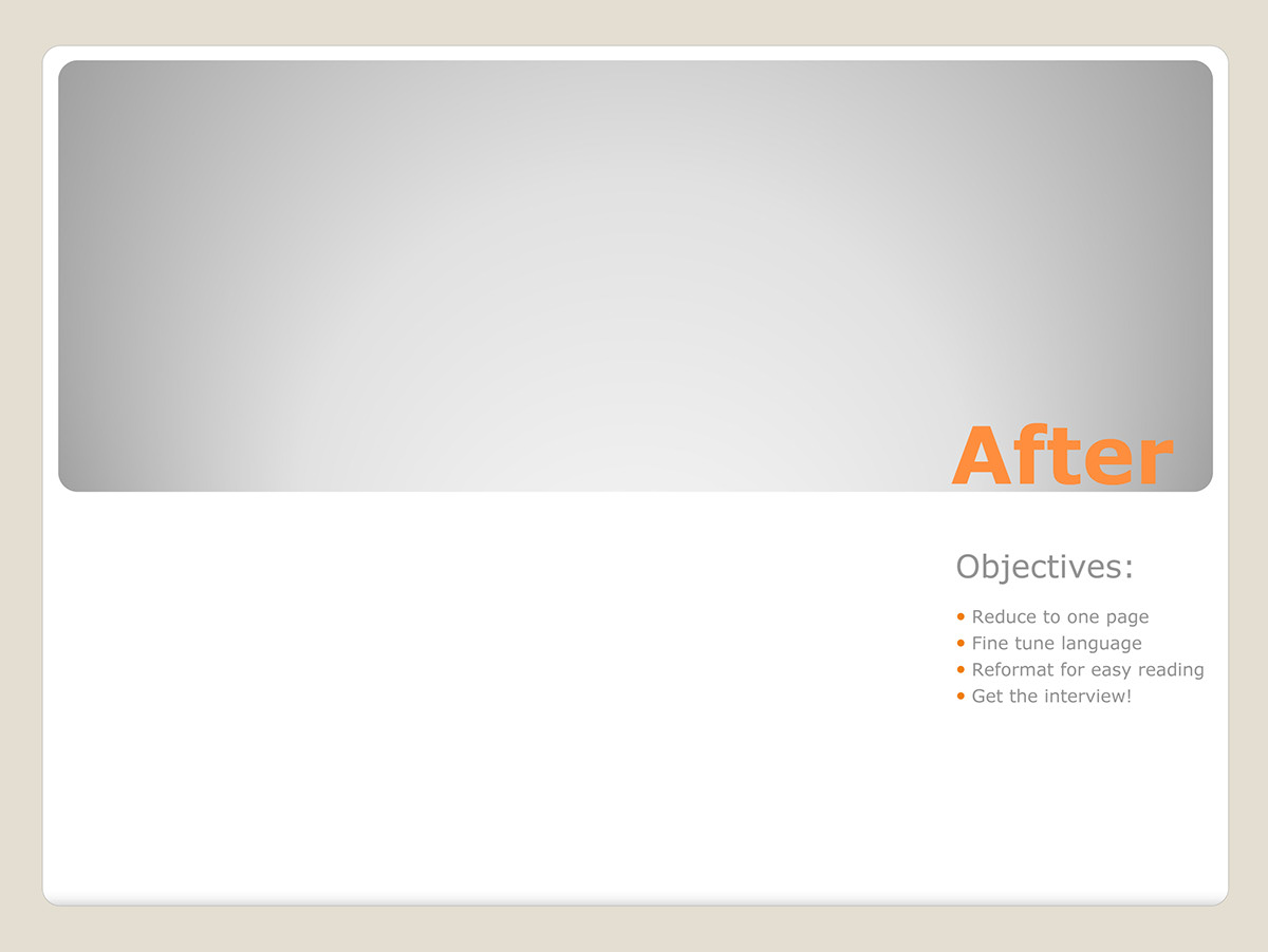
Resume Reconceptualization
Resume Reconceptualization
A resume is a first impression. As such it must truly represent you and your level of experience, as it corresponds to the position you are seeking. Selecting the right information to showcase, and then arranging it in the most effective way are what will get you noticed and invited for an interview.
I know, because I have helped others do this, and can do the same for you.
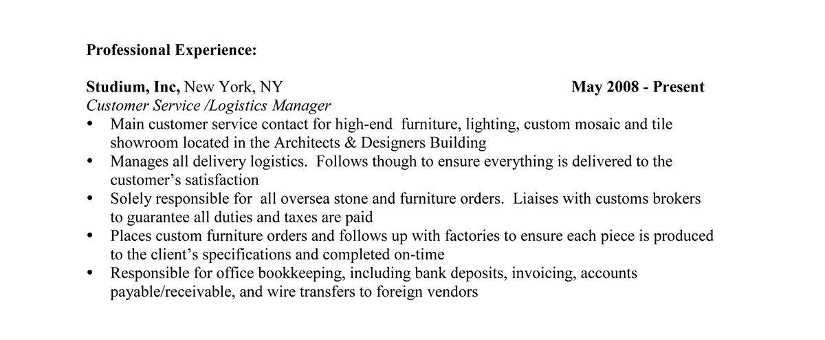
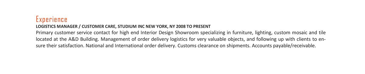
In the first example below, my client wished to obtain a managerial position within the Design Industry and yet his resume looked like that of a scattered college graduate. Too long, very messy, in Times Roman font (c'mon, with so many fonts available, why?), repetitive verbiage... it just didn't stand out and say 'I'm a winner'. He needed an upgrade, pronto!


Sample of reworked content from scattered to one with concise punch.
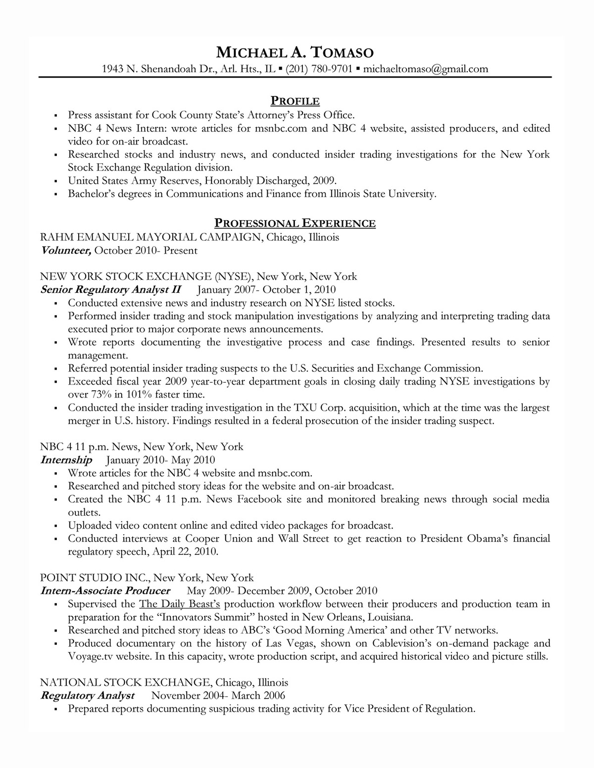
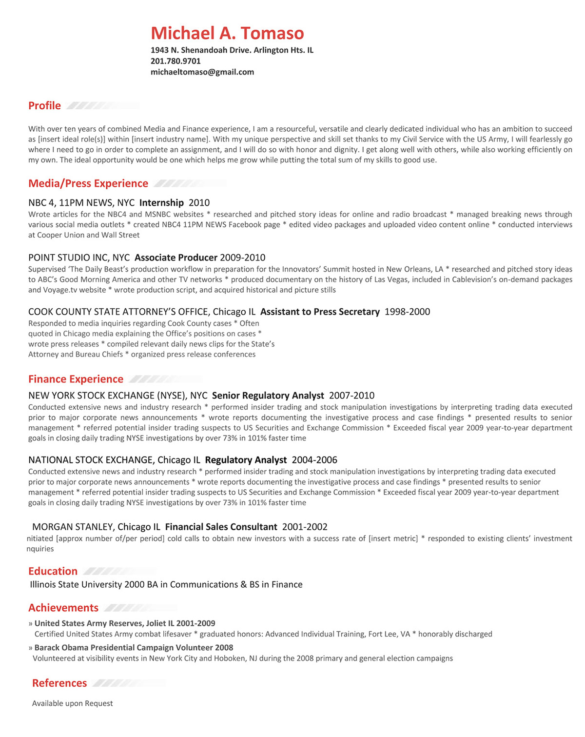
The main objective with Michael's resume below was to clearly display his dual-experience in media and finance. The original chronological layout was confusing because he seemed to go back and forth between industries and therefore the story of his employment difficult to comprehend; this was corrected by creating two separate experience categories and mentioning the duality as an advantage in the profile section. Adding bold color to his name and headers plays up his bold, fearless approach to work.


Melissa wished to translate her teaching experience into a role at a large national firm. It's a huge jump in responsibility and pay and employers need to believe Melissa has the confidence and organizational skills necessary to succeed in such a role so her resume is her chance to make that first impression. She also wants to relocate to a more cosmopolitan area and has her sights on reputable organizations such as The Smithsonian in DC, and PBS in New York City.
The mission in this case was to create a resume that effuses worthy of a in status and pay.
The unique layout of the content was based on the concept of dividing the page into professional and personal columns because in the education/anthropology/non-profit world people are evaluated on both mind and heart. So on the left you see the (heading in French suggests refinement) and on the right her and professional experience. The experience is described with the intent of stirring up curiosity to learn more about the candidate through an interview.
In terms of organizing the information it was important to separate her formal education from her certifications, and create a special skills section as she has so many to bring to the table. Small details like the words 'from the desk of' and pink headlines catch the eye and interest of the viewer.

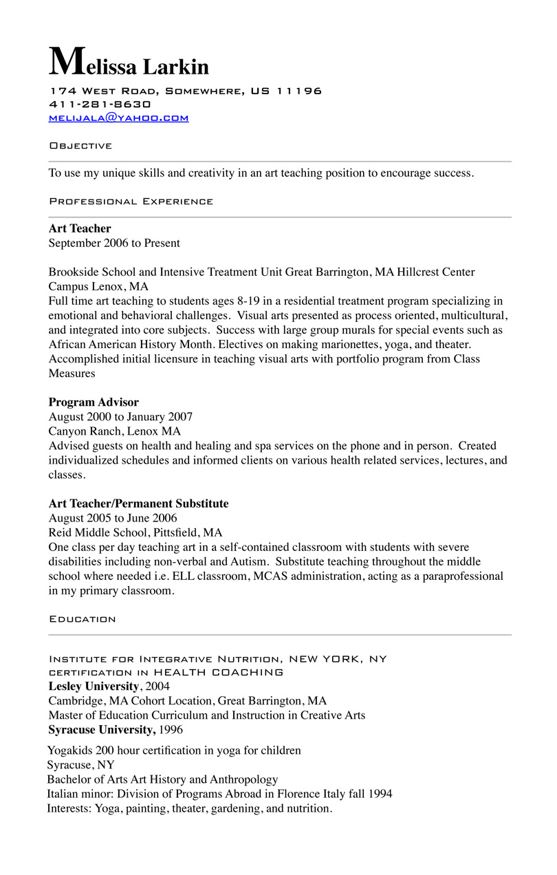


The unique layout of the content was based on the concept of dividing the page into professional and personal columns because in the education/anthropology/non-profit world people are evaluated on both mind and heart. So on the left you see the heart (heading in French suggests refinement) and on the right her mind and professional experience. The experience is described succinctly with the intent of stirring up curiosity to learn more about the candidate through an interview.
In terms of organizing the information it was important to separate her formal education from her certifications, and create a special skills section as she has so many to bring to the table. Small details like the words 'from the desk of' and pink headlines further catch the eye and interest of the viewer.
READY TO SEE RESUME'S POTENTIAL?


