This was my pre-senior project that I presented in 2012, since then it has gone through a few minor changes, this is its latest version.
The project is an identity for a division in the municipality of the capital of Lebanon, Beirut. This division, called B for Beirut, promotes tourism and enables communication about the city all over the world.
When it comes to Beirut there are a few things that set it apart from the rest. Topping the list are the people, the geography and most importantly the indescribable charm. We keep encountering foreigners that, after their first visit to Beirut, have changed their plans and moved to live here. This charm that the city has makes everyone who lives in it, to work for Beirut, to run for Beirut, to learn, to fight, to laugh, to even breathe for Beirut, to exist, to B for Beirut and this is the base of my concept and where my logo originates. The B contains 3 colors, blue and yellow signifying life and violet a royal color.


Logo
At this point I started to think about the main visual aspects of the project. When asked about Beirut, its inhabitants always tend to mention its past glory rather than the present achievements, how the city was all big and bold before it mellowed down and went to sleep. Here I realized that Beirut has a lot in common with Sleeping Beauty. Both were princesses for many years, but were cursed to fall asleep, waiting for their prince in shining armor to wake them up.
I found that there are two things that needed to be present in the posters, a woman and dynamism. I used a semi-surrealistic approach for the woman, whereas the elements used to show the movement are the basic 3 shapes; circle, square and triangle. In all 3 of the posters the basic shapes originate from the woman, as part of the woman. This is to show that even though this princess (the city) is asleep her momentum, her passion and her power has not faded.

Full poster


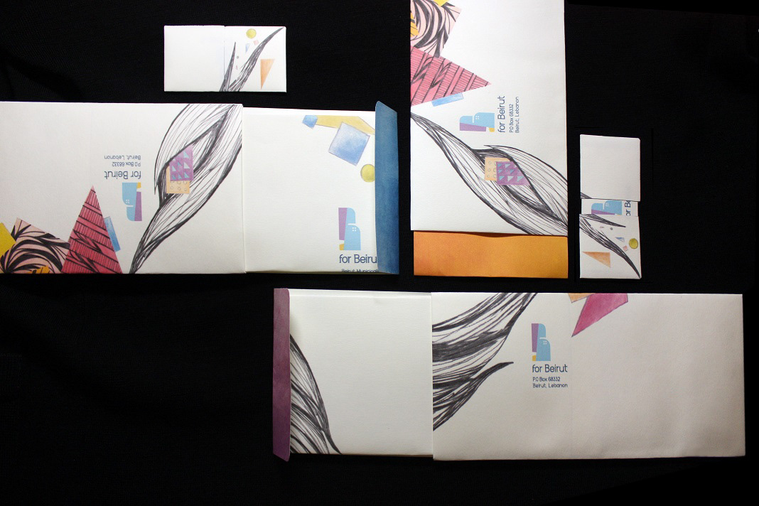
Stationary


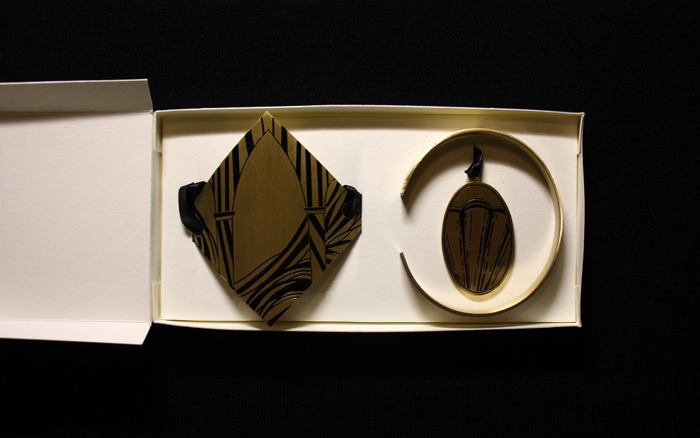
Promotional Items
For the promotional items I decided to use Brass as the main material.
The reason for this is simple, with its off-gold glow brass has a retro yet beautiful presence which suited the identity perfectly.

Hairband, Pendant & Bracelet


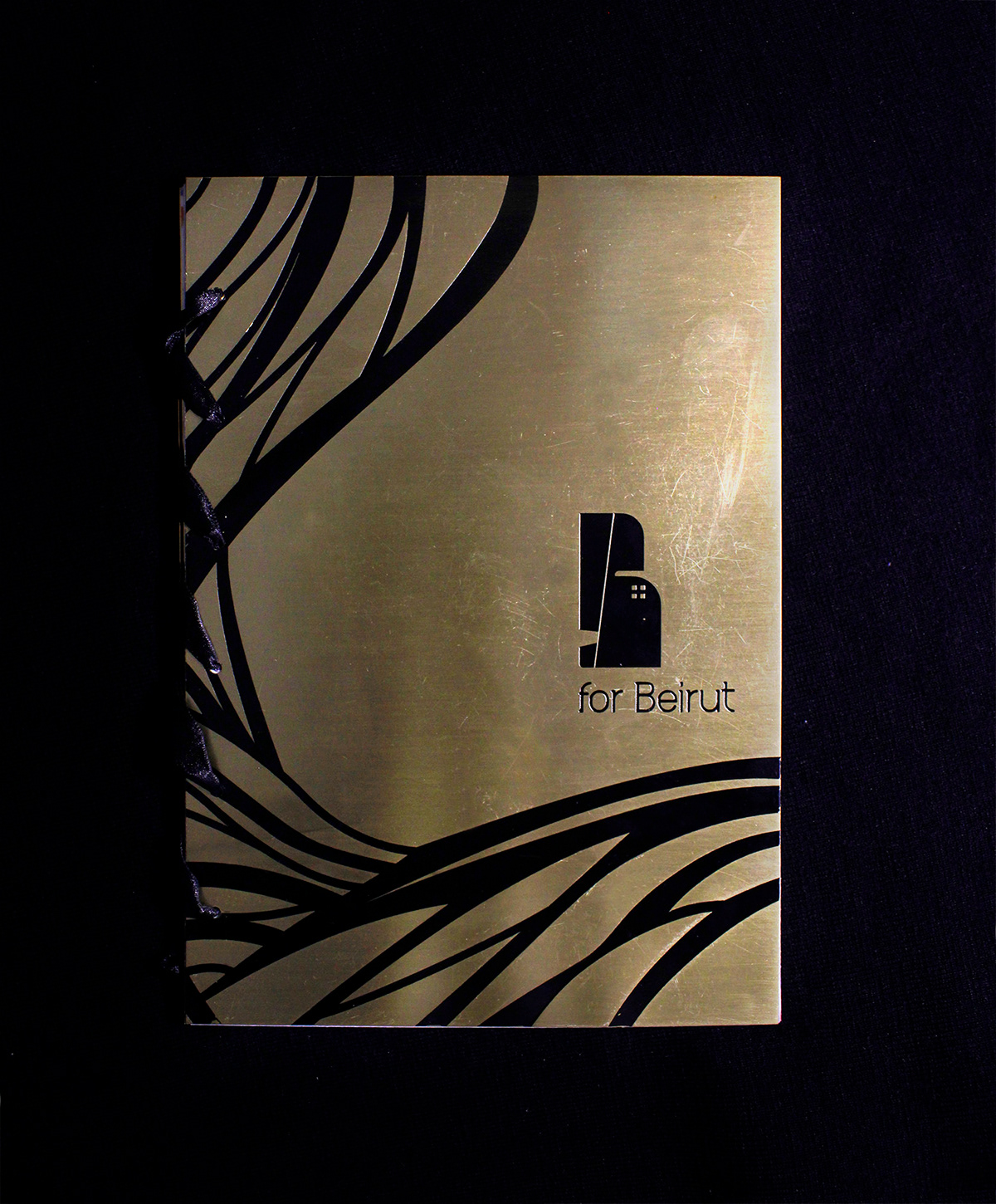
Brochure
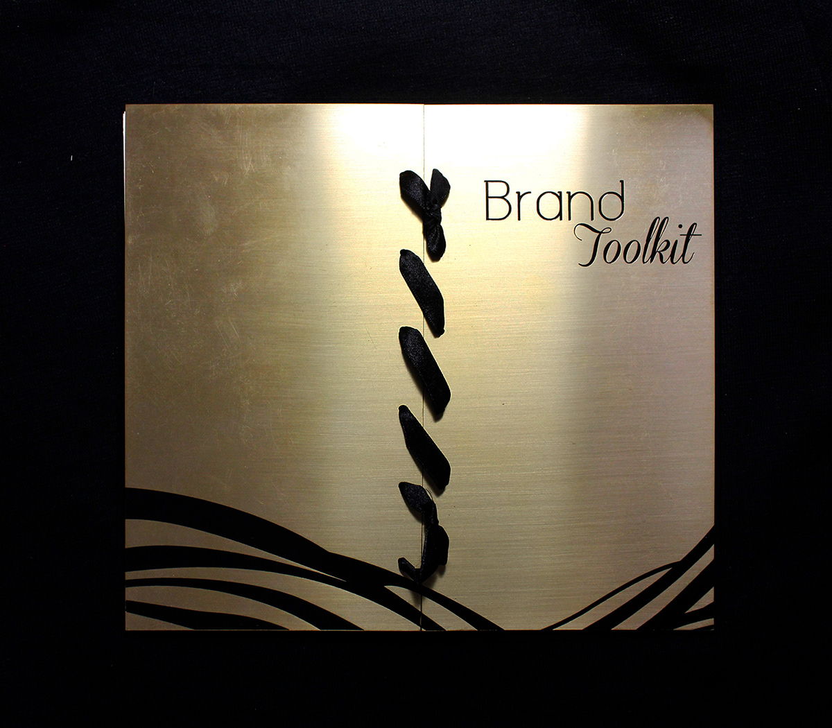
When it comes to the brochure and the brand toolkit I used two materials, brass and tracing paper.
Brass for its attractive retro look and tracing paper for its translucent properties. I wanted to show layers and the idea of revealing what is truly beneath an item. I was able to express this by overlapping and overlaying artwork in order to create a whole new visual.
Brass for its attractive retro look and tracing paper for its translucent properties. I wanted to show layers and the idea of revealing what is truly beneath an item. I was able to express this by overlapping and overlaying artwork in order to create a whole new visual.


Brand Toolkit