Jacques Henry Lartigue, A Floating World
Exhibition
Exhibition
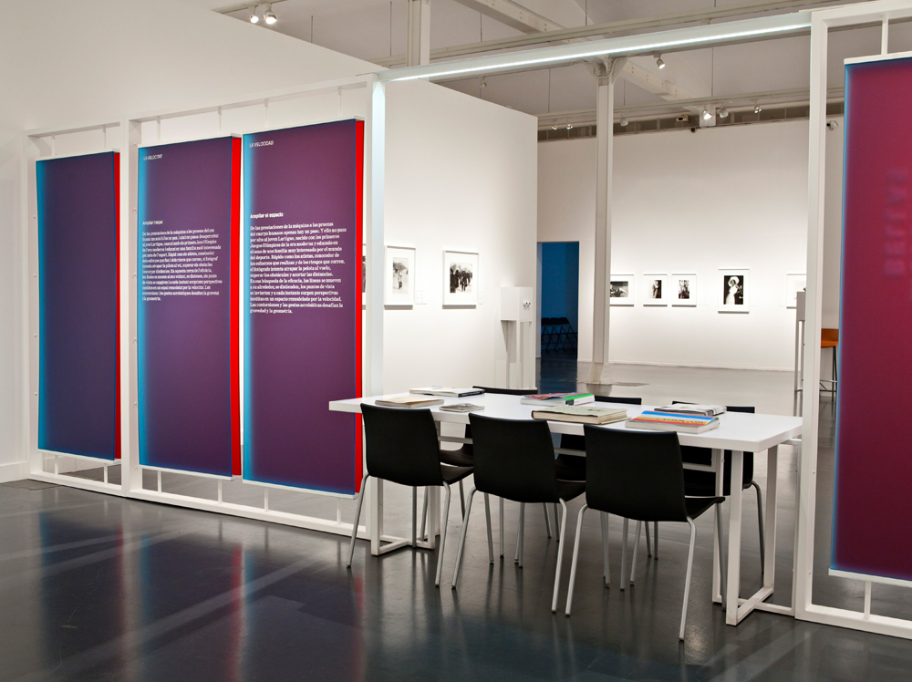
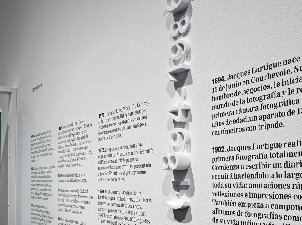
For the exhibition our goal was to be as low-profile as possible in relation to the photographs exhibited while taking a bold visual approach in relation to the space. We created points of colour to separate the sections of the exhibition and organise the information displayed. All the information presented on the same plane as the photographs was in grey text on a white background; we only used colour on the panels set perpendicular to the walls. In terms of the typography, information is presented in four formats: wall labels (A5 size), quotations (grey text on the wall surface), texts for each section of the exhibition (methacrylate panels), and volumetric typography (used to create letters that project from the wall surface to varying degrees). Overall, the aim was to heighten the whiteness and luminosity in order to create a sense of lightness, order, and respect for the work.