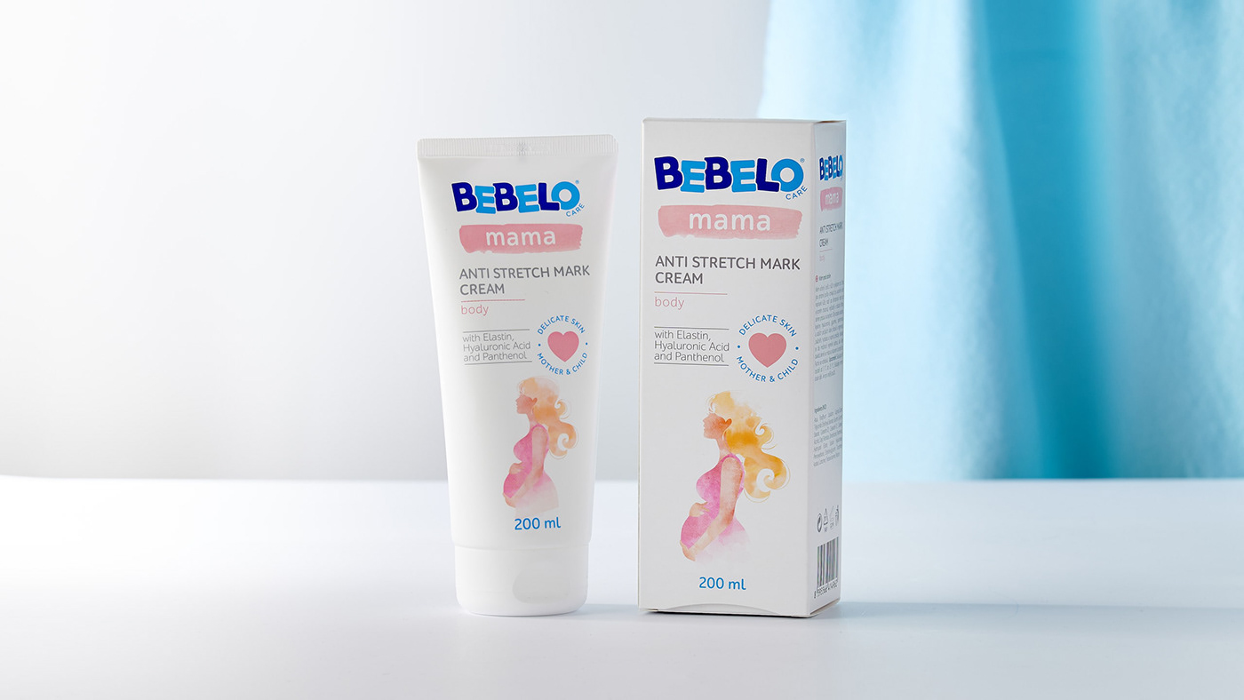
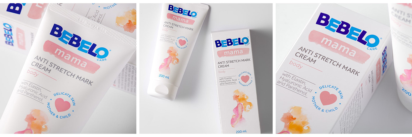
Bebelo started its journey with a range of baby cosmetics, giving mothers reassurance of high quality and tender care for good value. Cocoon's task was itself similar to bringing a baby to life. Based on the brand strategy and positioning we helped launching a completely new brand: inventing an original name, defining its visual identity and of course introducing to the world a full portfolio of packaging designs for products lovably caring for the most precious ones.

The first step was naming the product. The chosen option – Bebelo – aims to evoke warm emotions that arise when thinking of the special connection between the mother’s love and the baby. We then tried to embrace these emotions further creating the logo of the brand and adding a touch of softness, purity, and playfulness to it. Finally, we proceeded to create the packaging design for Bebelo.
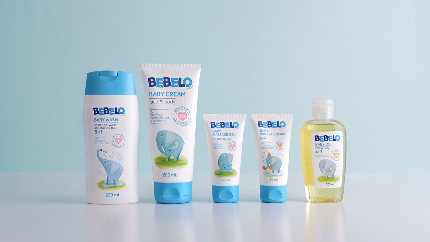
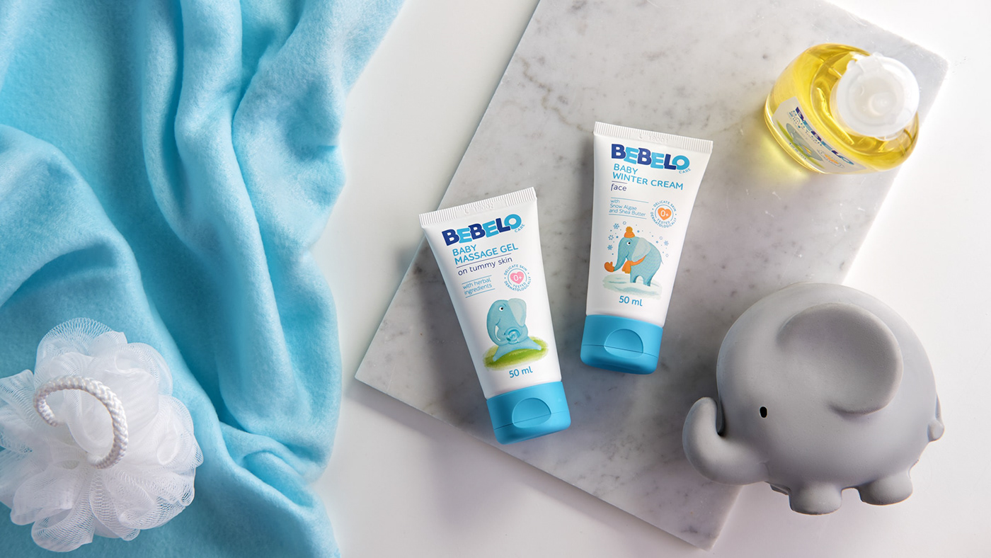
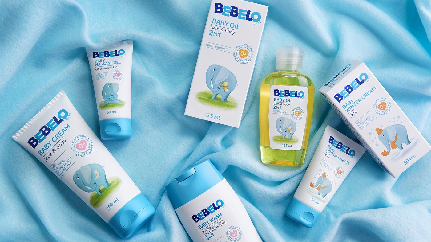
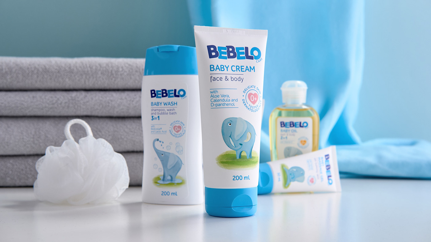
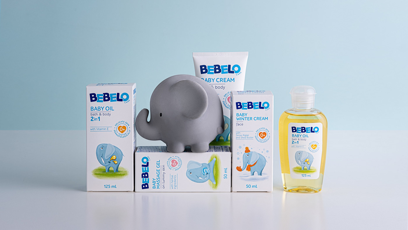
The main selected color palette included white, symbolizing cleanliness and purity, and blue tones combined with the darker blue to represent some expertise. The decision to use simple but sweet illustrations was inspired by baby books. The elephant represents the cosmetics range, while more animals are planned to stand for other product categories to come as the brand will develop. The illustration is sweet and on each of the packs the elephant has a slightly different story to tell, linked to the use of every product (baby oil, cold cream, shower cream and so on.)

Apart from the identity elements and the packaging design, we also developed the key visuals with the possibility of their further application on POS materials in the pharmaceutical environment, where this brand will be exclusively sold. We are thus proud to present Bebelo as a breath of fresh air in our portfolio, which, once more showcases that we are not only beer and alcohol brand specialists, but that we put our experienced hands and brains on categories of all kind.


Growing in 2021
Since this baby (brand) was born, exciting things happened and it grew even from a design point of view. The product portfolio expanded from cosmetics to a whole range of baby milks.
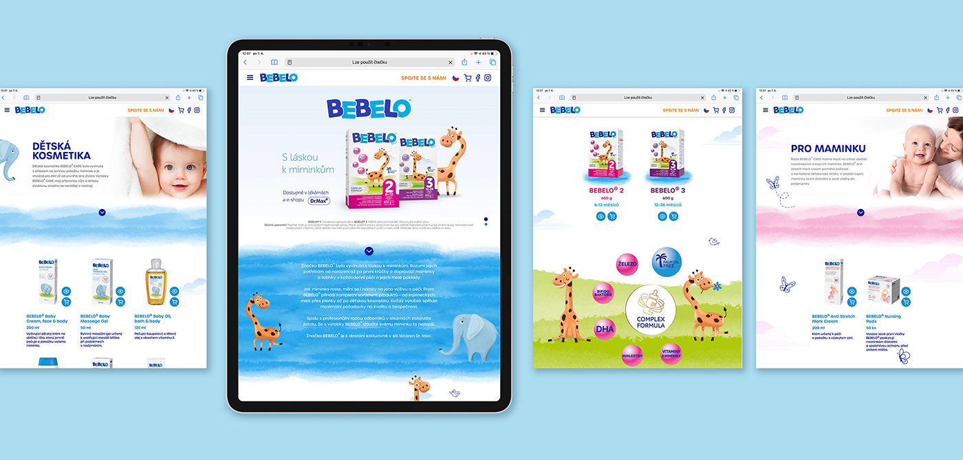
A new mascot came to life for the nutrition range, a sweet giraffe! It represents healthy growing and brings a cute, playful character to the packaging design.
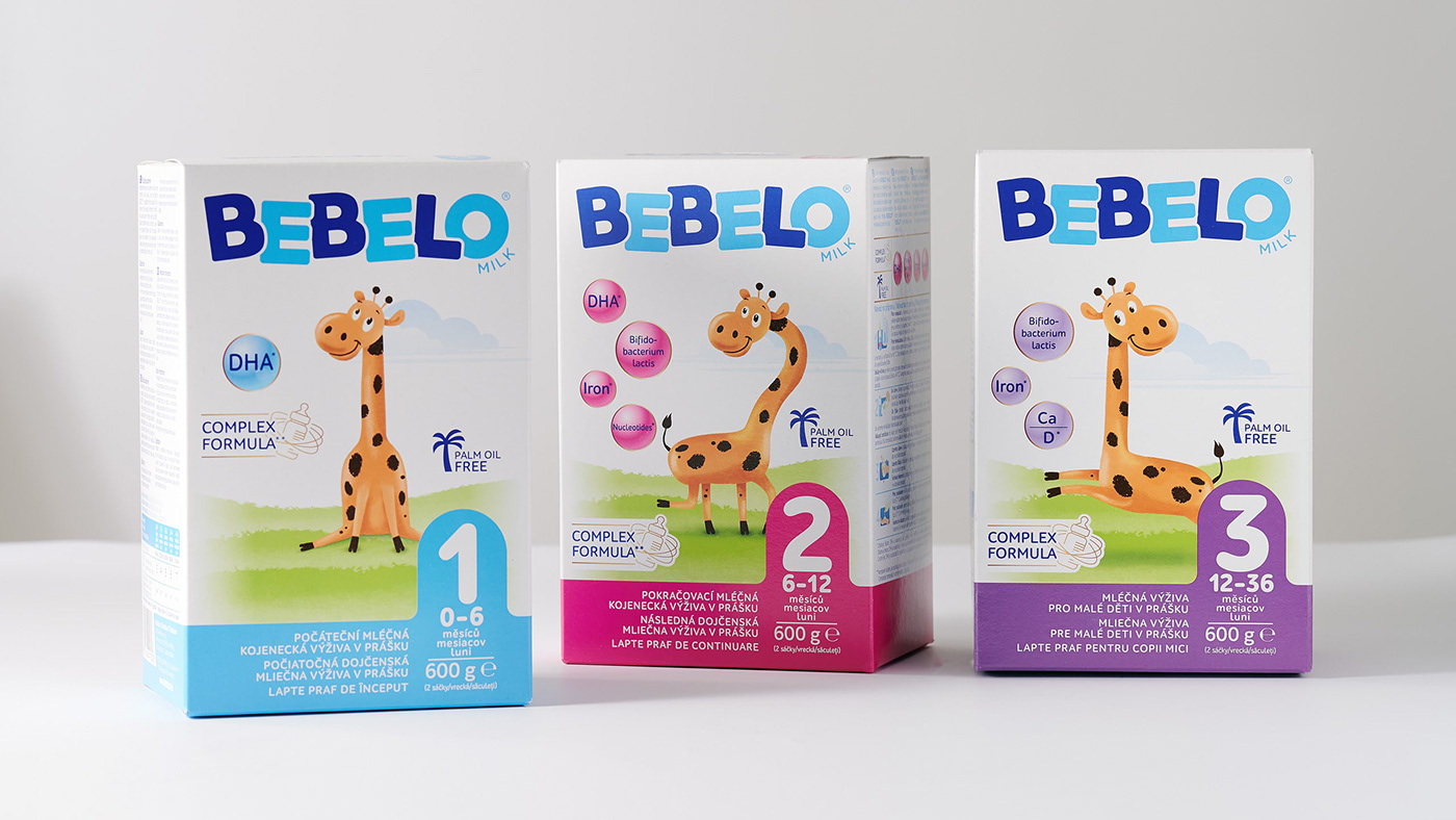
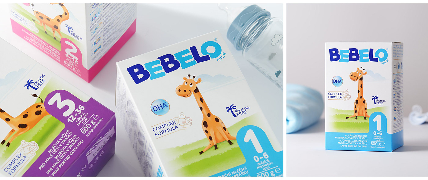
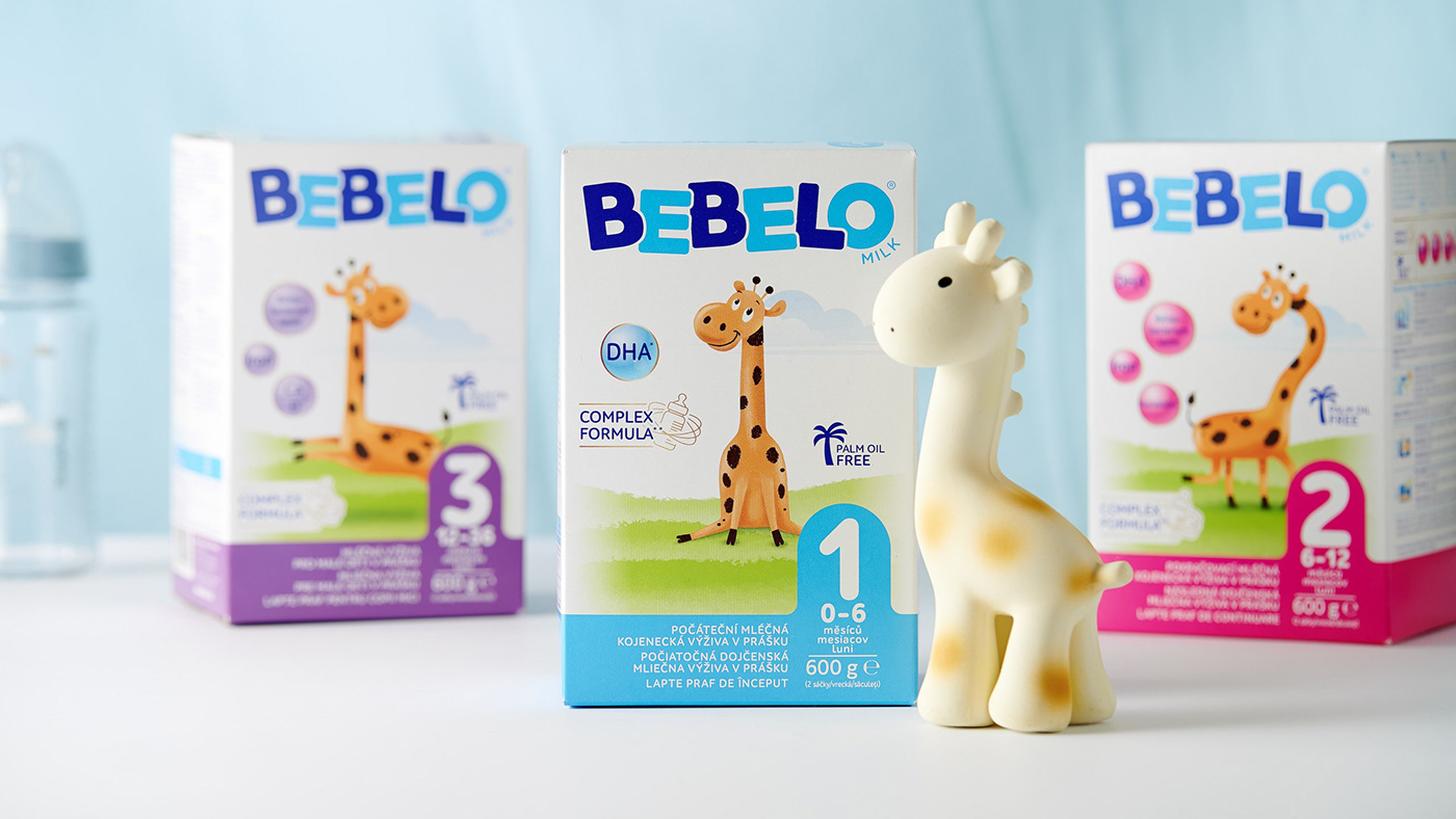
The range is sweet yet technically perfectly designed to navigate mothers to three SKUs, offering the best possible care and nutrition for different stages in a baby’s life.
The funny girrafe also came to life in a simple animated spot, created mainly for digital channels and also for the brand's website. Webdesign, full UX/UI and plenty of work has been made at Cocoon. The webpage introduces all the products and what they offer; it also gives the brand an emotional value and presentation to connect with mothers of babies.