The Twig Learning Center is for students who wish to improve their ability to learn chemistry and help students reach their highest potential. Offering a supportive learning environment where students meet in small groups with staff to work out effective strategies for mastering the chemical content.
We were asked to create a new brand, with a minimalist aesthetic, it had to project the confidence, versatility and fun nature of the subject.


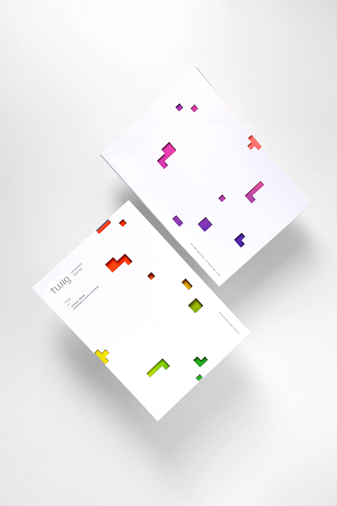
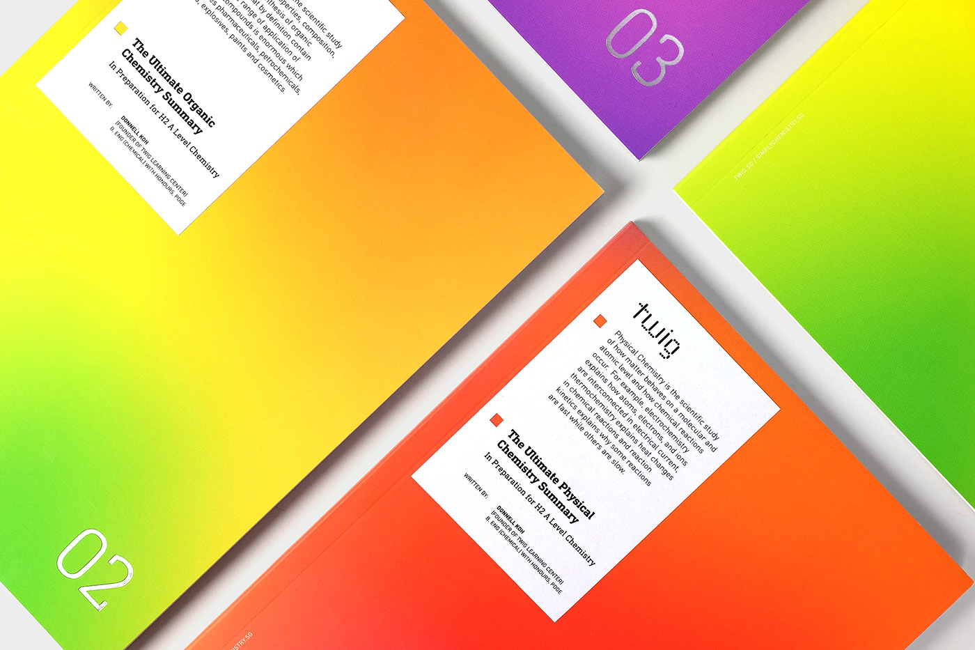
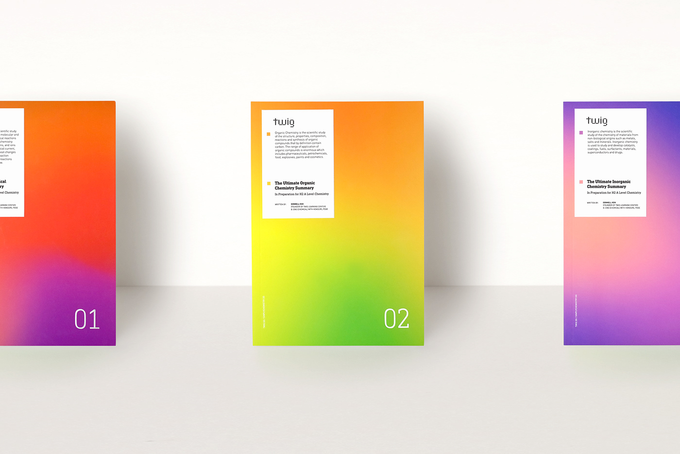
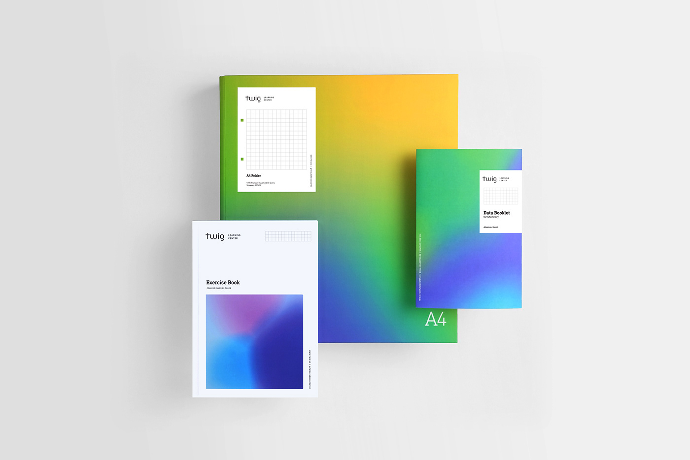
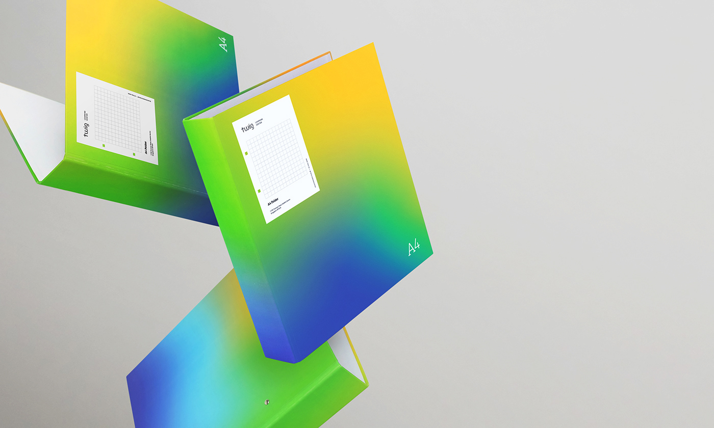
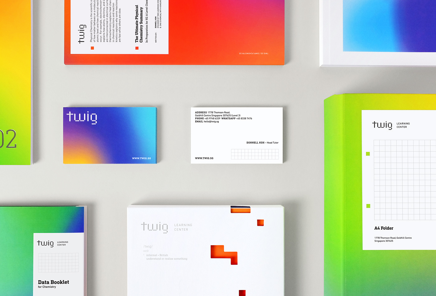
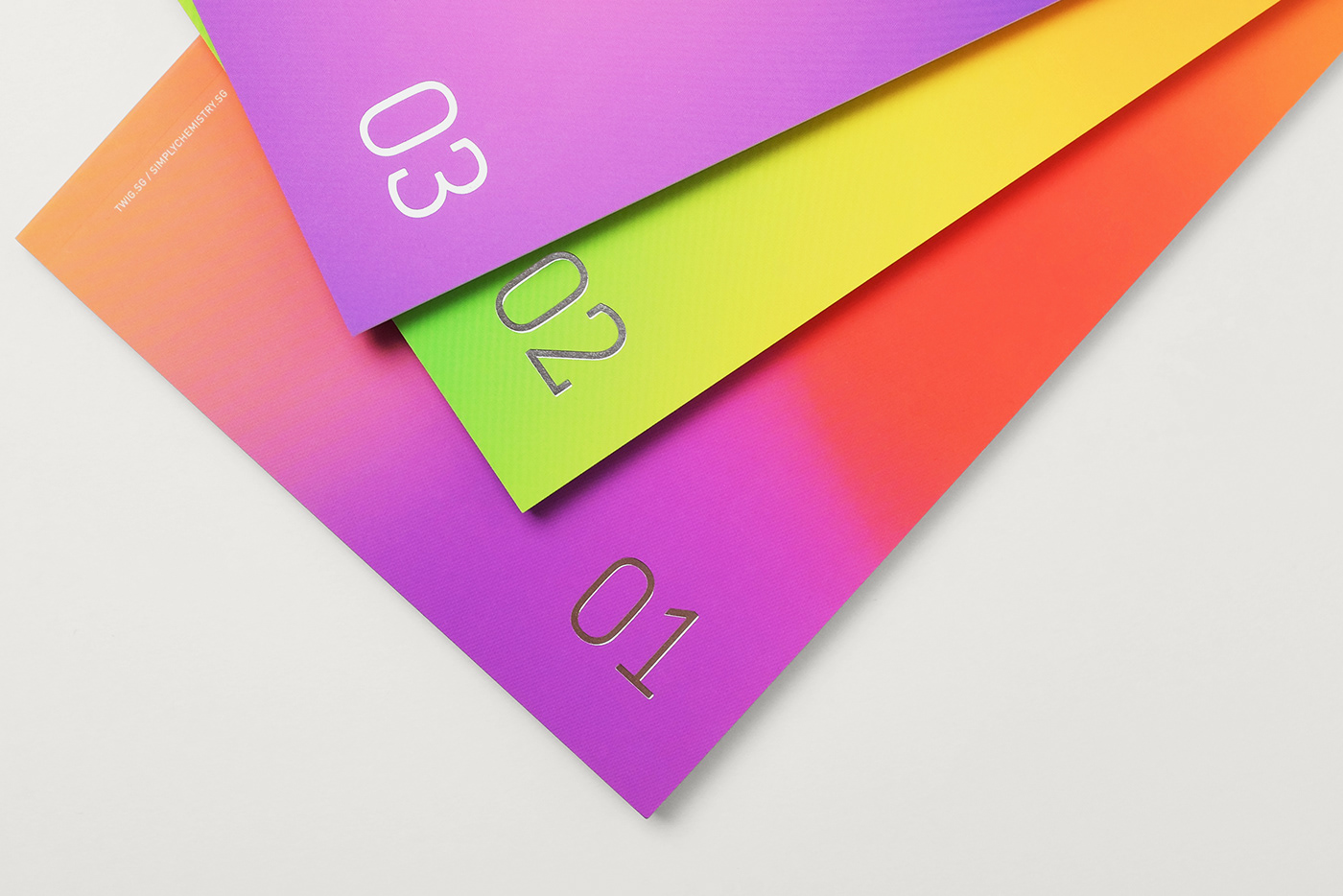
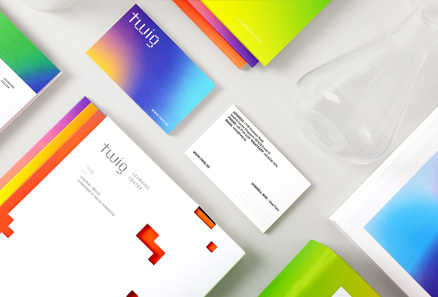
Radiating a sense of fun, colours of the litmus paper colour chart were put together, creating different blends and gradients. The changing colours bring energy and warmth to the brand.
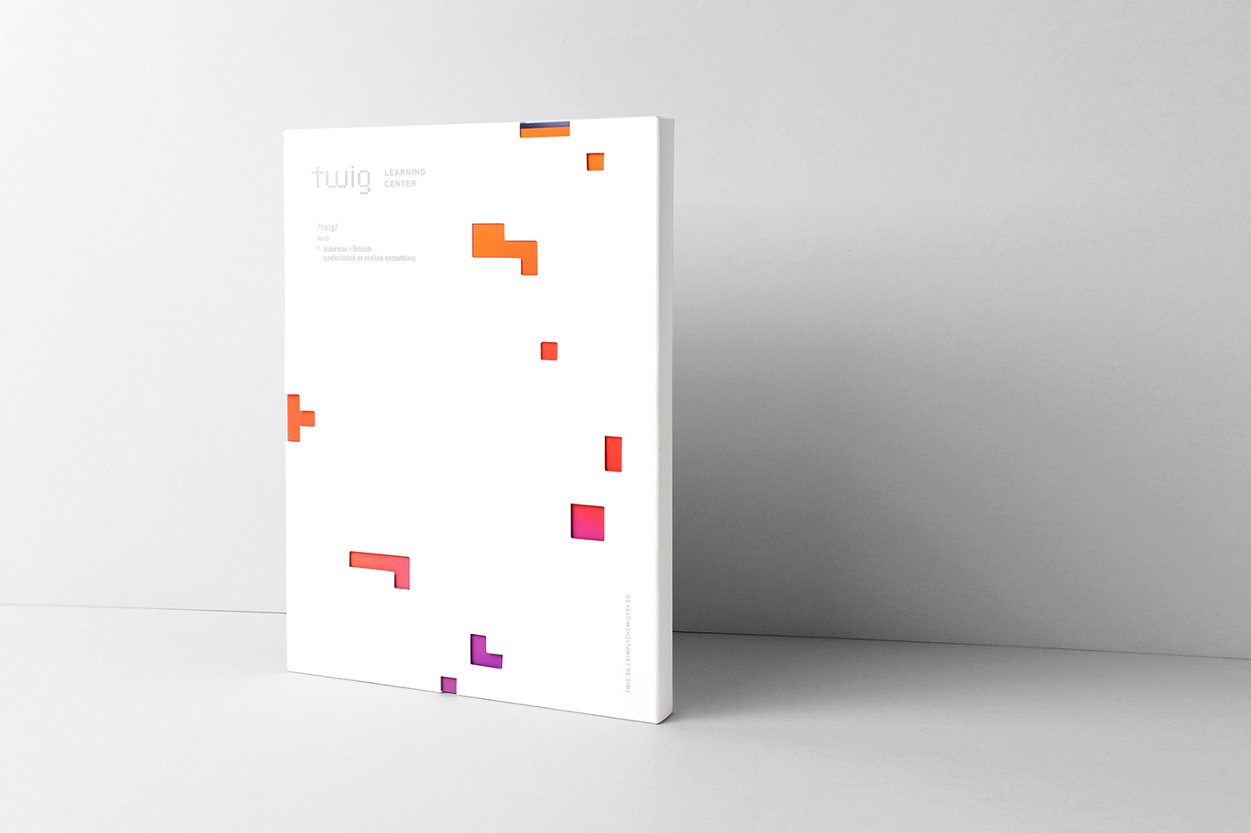
The striking colours and text collide playfully in applications of the brand, with overlays and size variations held together by a robust grid system. The Din rounded typeface complements the logo and combines personality with a calculated quality. Laminated papers and stamped finishes bring softness and tactility to the dynamic marque.