

Logo Design: "Draw Your Sword"


An illustrator contacted me asking if I could design a mark for his personal studio, and told me he wanted to use the name "draw your sword," a reference to a metal song somewhere.
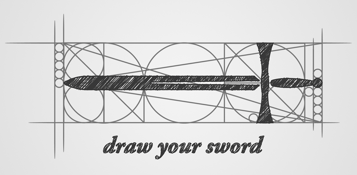
We looked at a few different possibilities, settling on the play on words of literally drawing a sword. Some of the early sketches had the action shown, with a pencil in the middle of sketching a sword, but in the end I chose to use an index to the pencil; its graphite trace. I went for a Da Vinci esque approach to the logo, making the drawing look like a carefully constructed diagram or blueprint, which fitted the client's illustration aesthetic.
I offered a few different styles and color choices, the "Da Vinci" style won out.


