The rebrand of a single office estate agent in Chelsea to give them more prominence and align with their target audience.
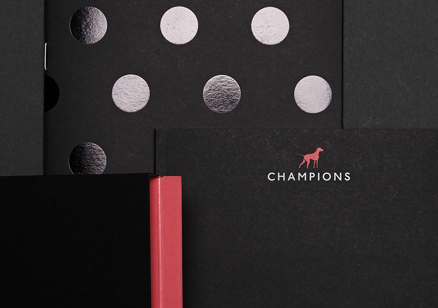
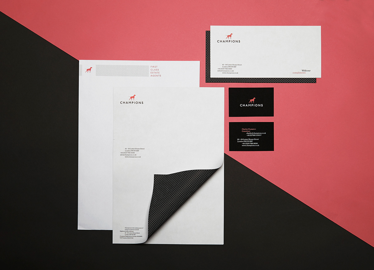
The marque of a pointer dog symbolises the brand values of Champions and employed a simple, bold colour palette of mostly black & white to convey their core ethics of honesty and frankness whilst feeling premium in the Chelsea setting. The accent of a rose colour and adds a hit of vibrancy.
I developed a dot pattern to add texture to the brand toolkit, taking influence from the halftone pattern of black & white imagery.
The rebrand launched April 2013
*This work was undertaken whilst I was Design Director at Ideas Factory (www.ideasfactory.co.uk)