Lean back, relax and enjoy our latest masterpiece. We invite you to relish the craft brought to life by Becherovka in liquid, and by Cocoon in design.
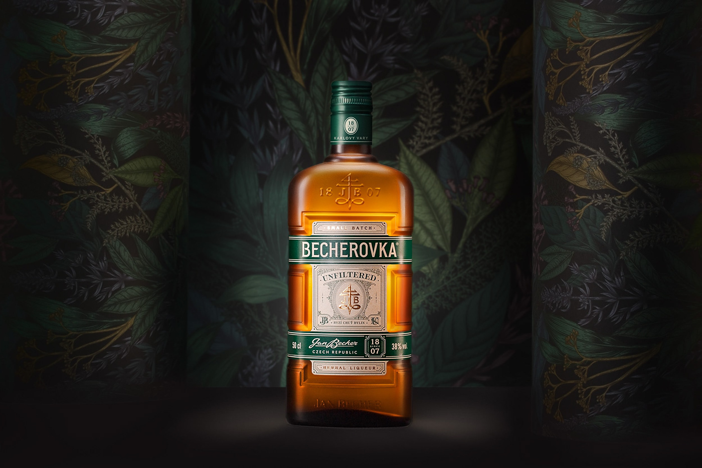
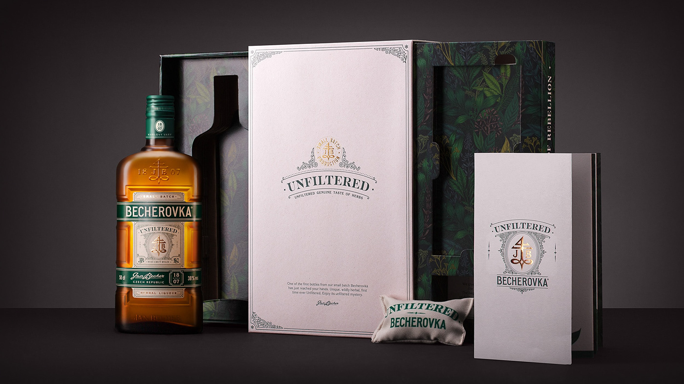
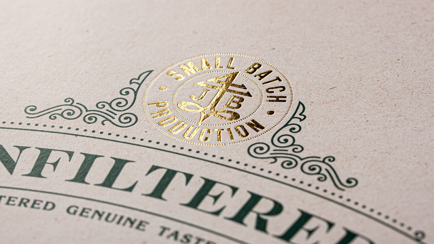
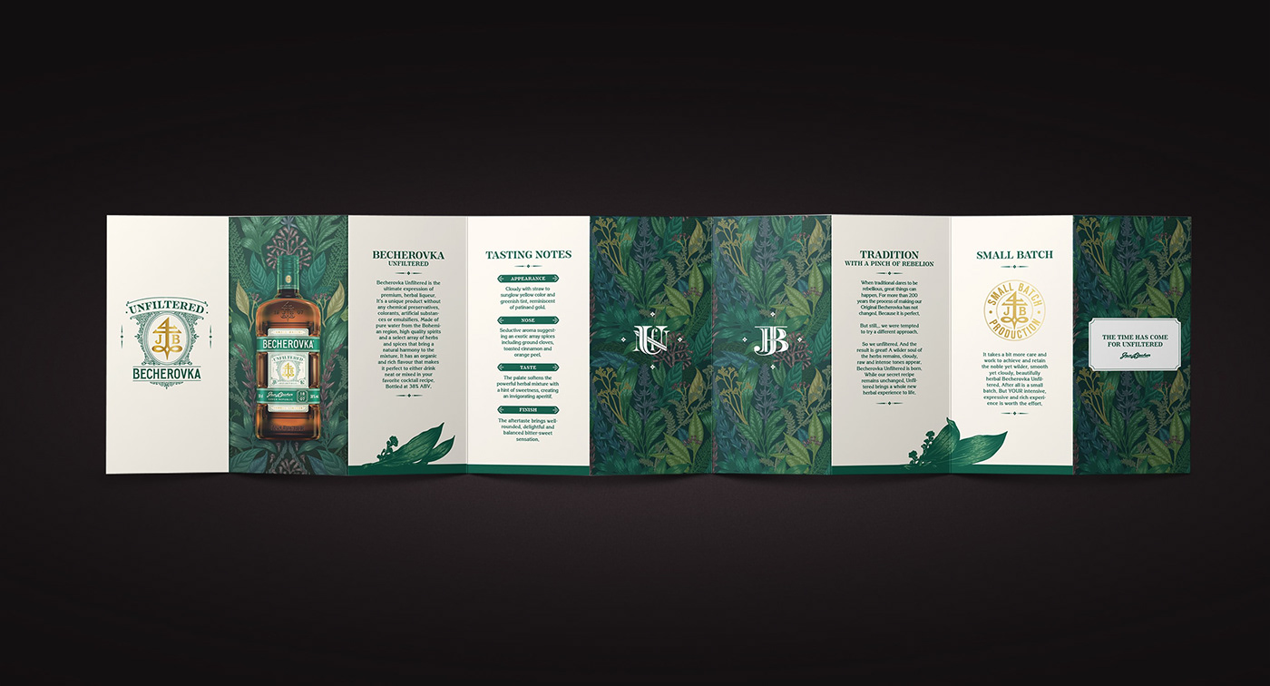
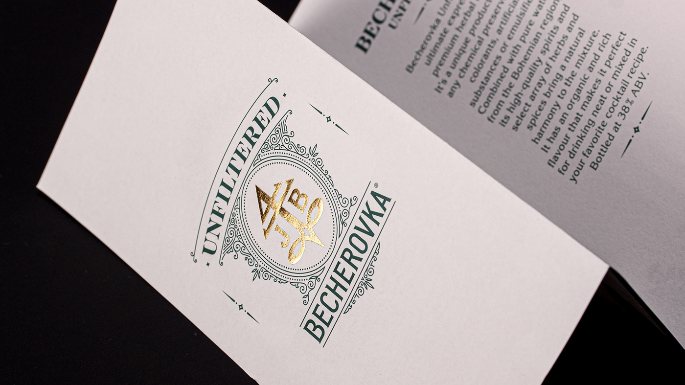
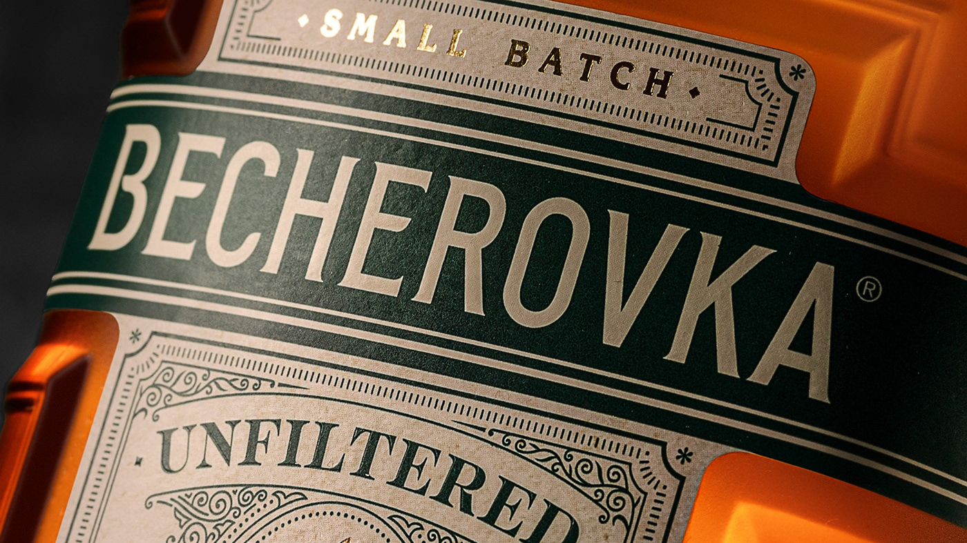
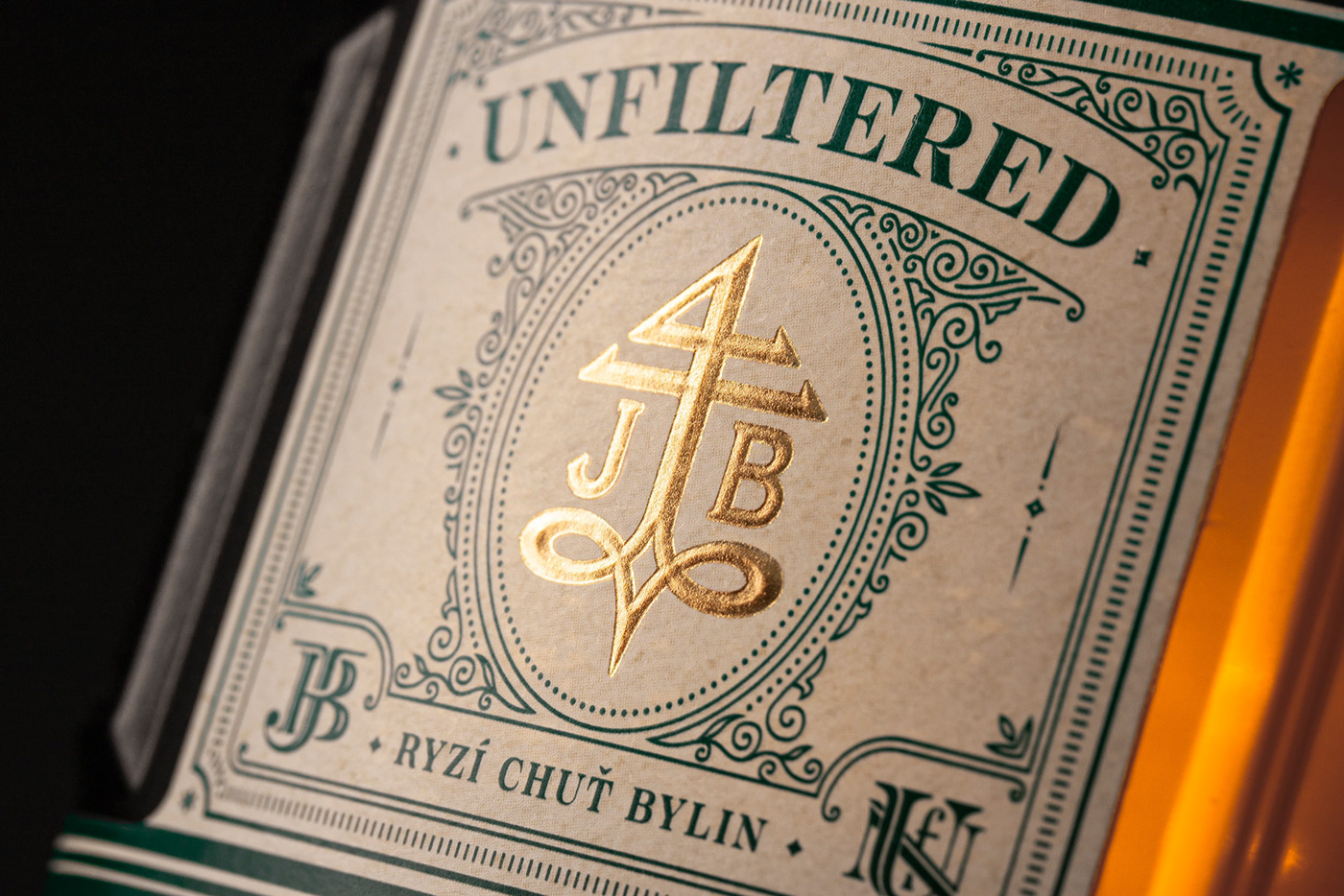
The original Becherovka recipe has always been a well-kept secret. The creation and successful production of its first-time-ever unfiltered herbal liqueur can be best described in the claim we developed for this new product: Tradition with a pinch of rebellion. Our visual concept has taken the direction of an absolute celebration of the herbal, traditional, and crafty spirit of this new premium sister of the original Becherovka. The label is inspired by the classical pharmaceutical style of visuality, bringing the uncomplicated feeling and the detailed crafting together in a perfect balance. Matt beige paper underlines the sensation, while forest green is used to replicate the wild, genuinely herbal taste.
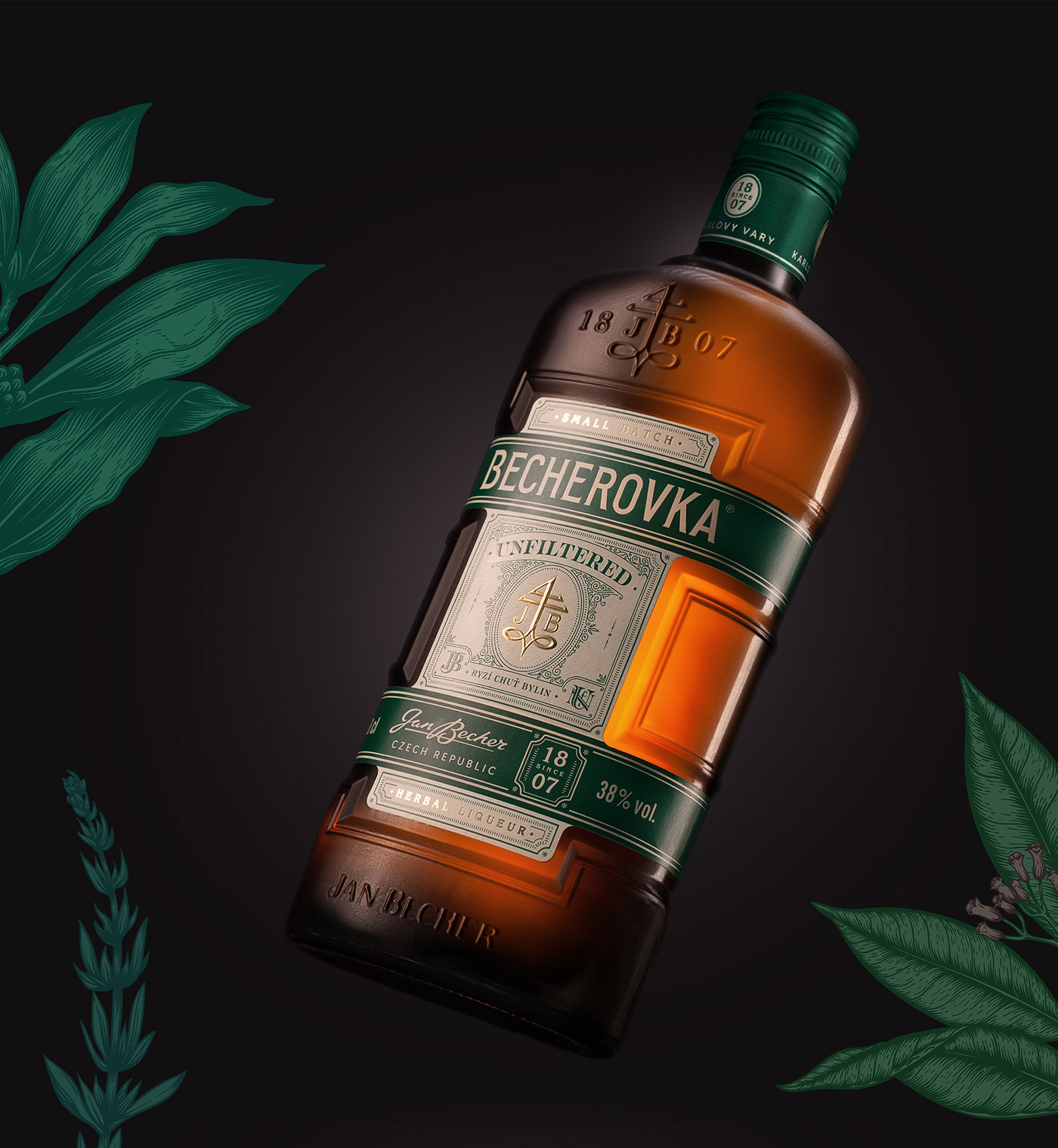
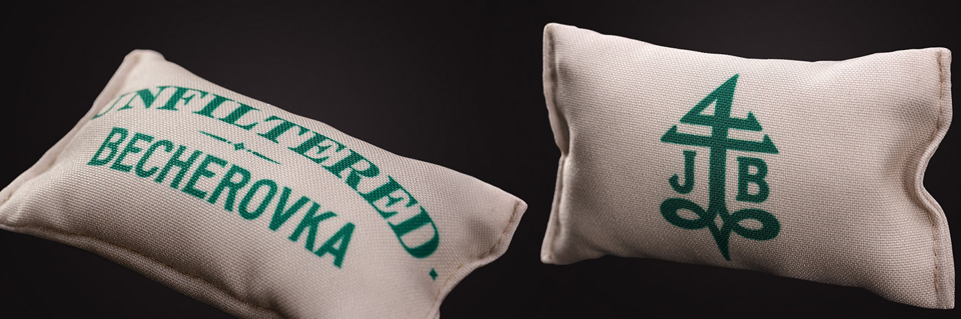
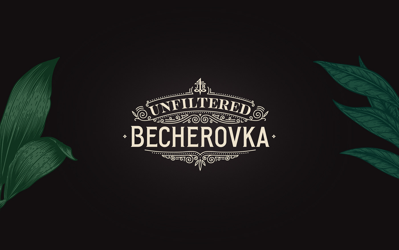
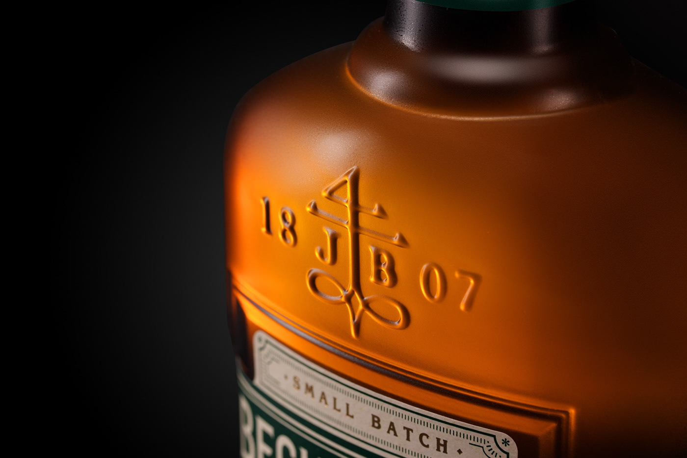
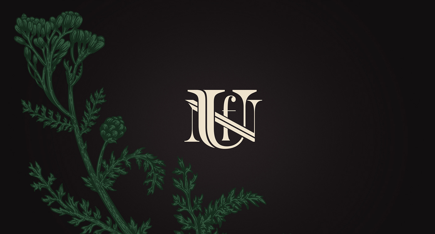
The devil is in the detail, and so is the craft. The traditional art of the maker was given tribute to by putting the brand symbol – the cryptogram – in the center. We used golden hotfoiling and embossing for the right stand-out. Monograms of Jan Becher and UNF (standing for Unfiltered) complimented that hero. All the elements were placed in a simple yet detailed graphical composition with the UNFILTERED sign crowning them. The claims „Herbal Liqueur“ and „Small Batch“, which emphasize the uniqueness of the product, were printed in gold.

But we did not stop here. A custom-made gift box was designed for influencers and bartenders to introduce this new spirit in a special way. This is where our case study splits into two. From the design of the bottle, we went on to working on the full VBI, creating the key visuals for communication and non-traditional outdoor media, realizing a huge photoshooting of packshots (you gotta see those!), and more. Stay tuned, coming soon!