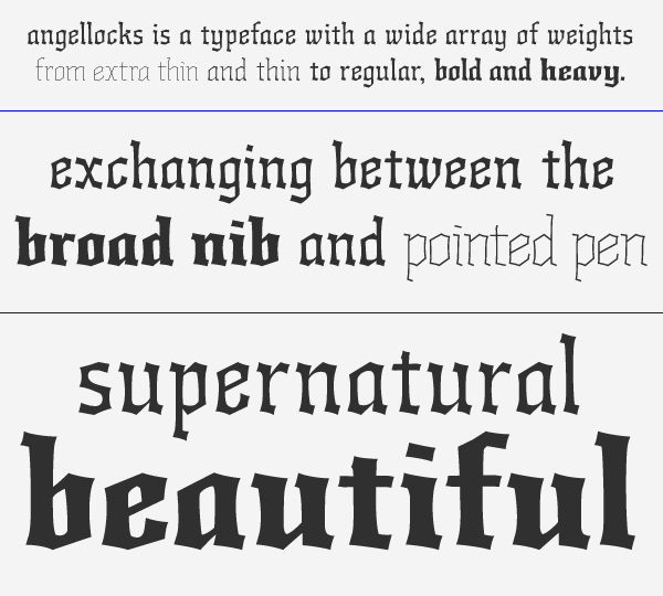
Angellocks is a multi-weight fraktur experiment, based on research into script and faith.
The roots of western calligraphy, and following from that, western type, can be traced to the ancient scriptorium, where monks painstakingly illuminated and copied religious texts. The broad nib was the tool of choice, and with the texts, the monks would try to recreate and communicate the splendor of heaven.
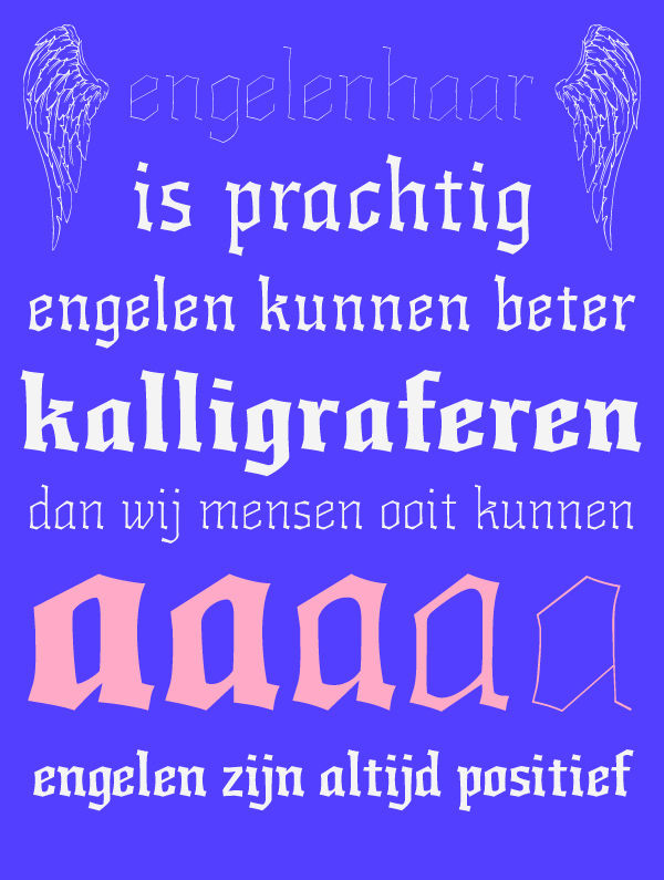
But monks were only mortal men, their calligraphy could only reach as far as their tools allowed them to. This makes the truth undeniable: Divine beings such as angels are better calligraphers than mankind. How would angel calligraphy look like? Would they create an entire different form? Would there be no connection to our western script? Would they be able to change from broad nib strokes to pointed pen halfway a letter?
My conclusion was that angels needed to be able to communicate with their flock by script, so the basic forms of the letters would be the same, as there had to be a reason why the letterforms have changed from ancient runes to the scripts used in the various scriptoria. The forms would of course not be limited by the width of a nib, the technical limitation, but they would be able to expand and contract and use extreme ductus.
The typeface has various weights, ranging from the extra-heavy to the ornamental
extra-thin 'tinsel', or 'angelhair' weight.
This is an ongoing research.