Teal - Branding and Website
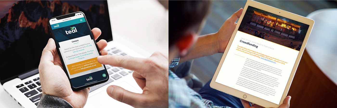
Teal is a friendly and convenient service that helps people find the right finance for their startup or early stage business. It aims to be simple to use, helpful and impartial and we were asked to carry these values through to the branding and website we created.
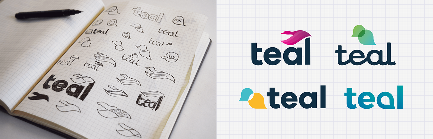
Our client gave us the name and basic colour scheme to run with and we set to work. As Teal is a species of duck and with ducks being infamously talkative creatures, our initial concepts lead us towards combining the duck with numerous symbols for communication – the crux of the business.
Whilst we were happy with the progress we were making, the main problem we faced was being caught between the two ideas, with neither the duck or the communication element being as legible or obvious as we would have liked.
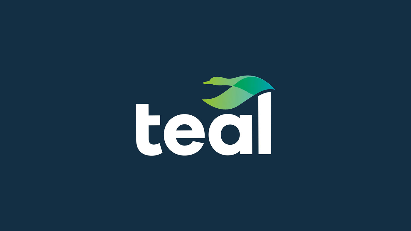
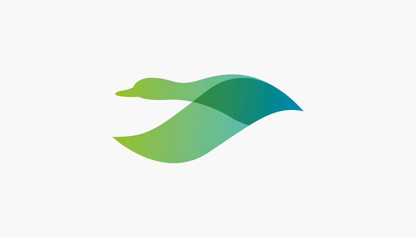
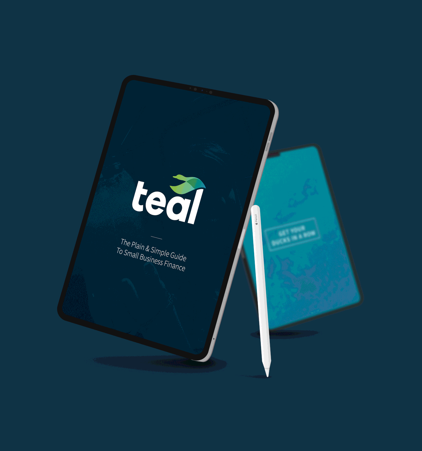
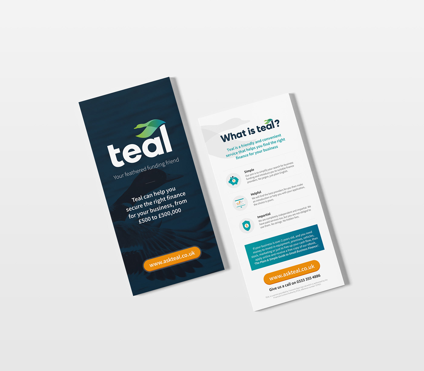
The final logo uses the duck as a memorable element that can be repeated by itself, across the brand. The free flowing shape emphasises the simplicity and hassle-free nature of the advice process, whilst the colour gradient is suggestive of the progress being made from initial application to final financial advice.
We kept the font clean, simple and in lower case to further reflect the core principles of the brand – simple to use and friendly.
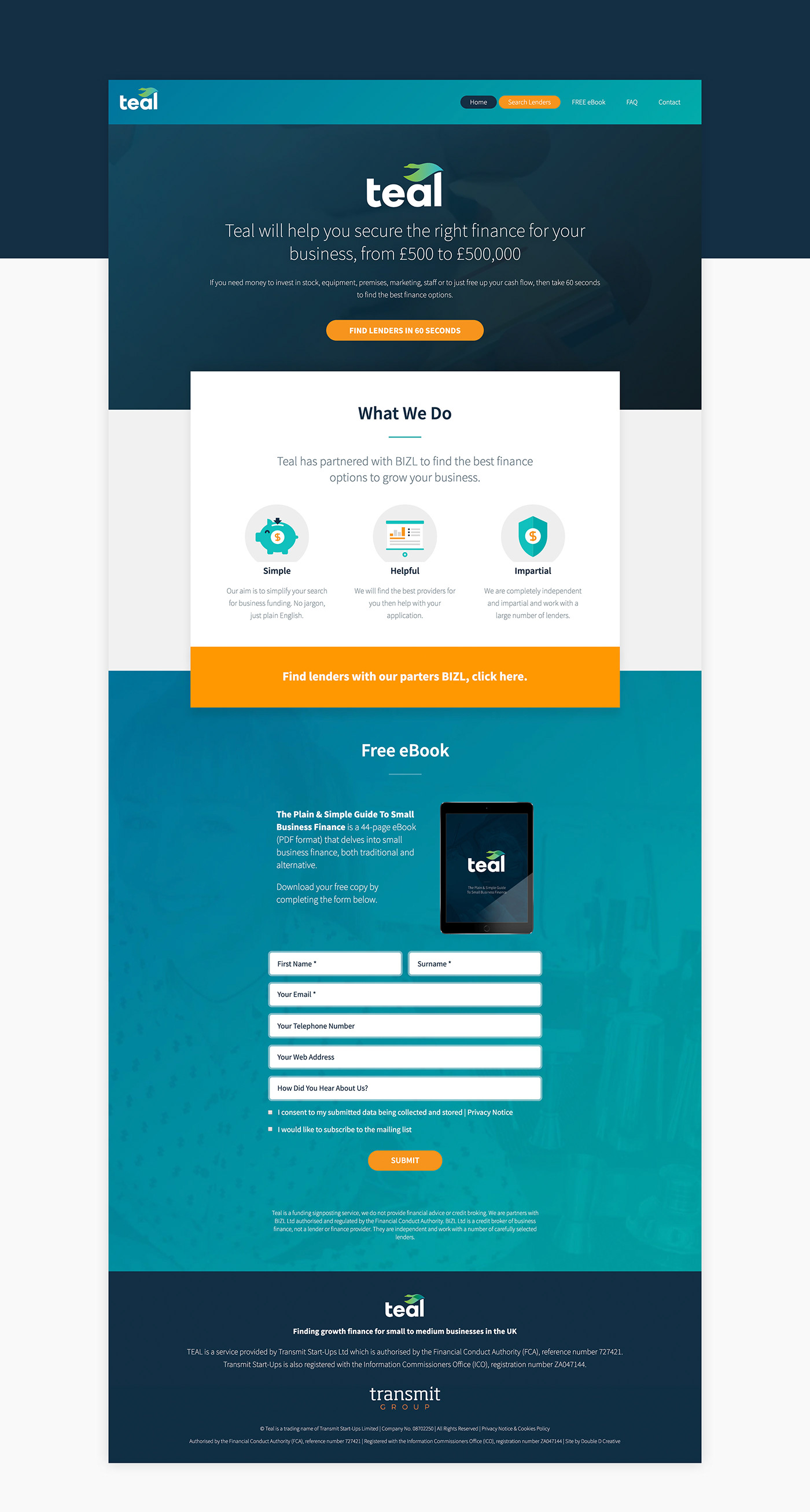
Visit the site: https://askteal.co.uk/

From the Client
” We approached Double D with a very vague brief, as usual, for our new service, Teal…. We are launching a finance helpline for small UK businesses. It’s going to be called Teal and we need a brand creating from scratch, a website, an e-book and probably some other stuff too. Go! And, once again, they created something that was a perfect fit for our target audience. We were determined not to look like an old-school financial institution so when they created a very contemporary looking brand, with an approachable feel, we were very happy. And it contains a (teal) duck, which ain’t a bad thing…”
Rich Myers, Commercial Director


