Sudtipos is very happy to announce the release of Rondana, a new addition to the serie of fonts designed by the master calligrapher, designer and illustrator Gabriel Martínez Meave from México.
—
About Rondana.
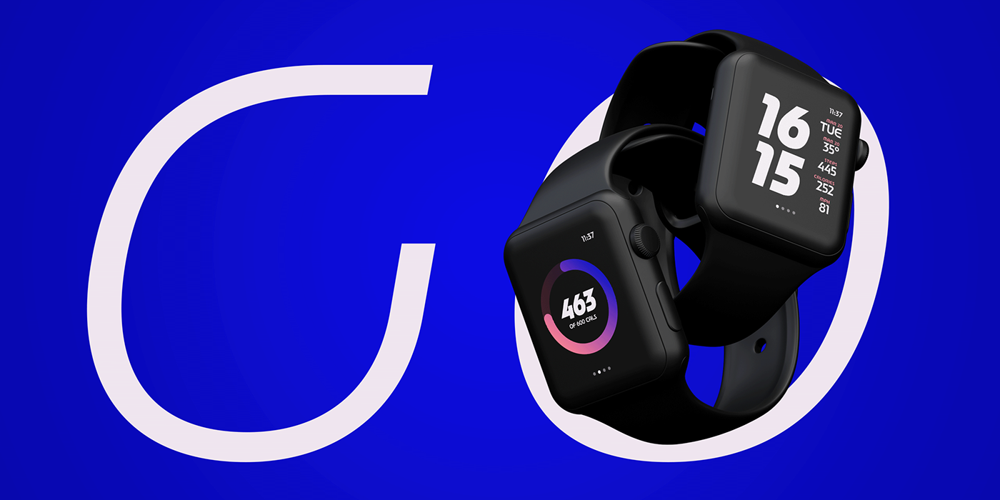
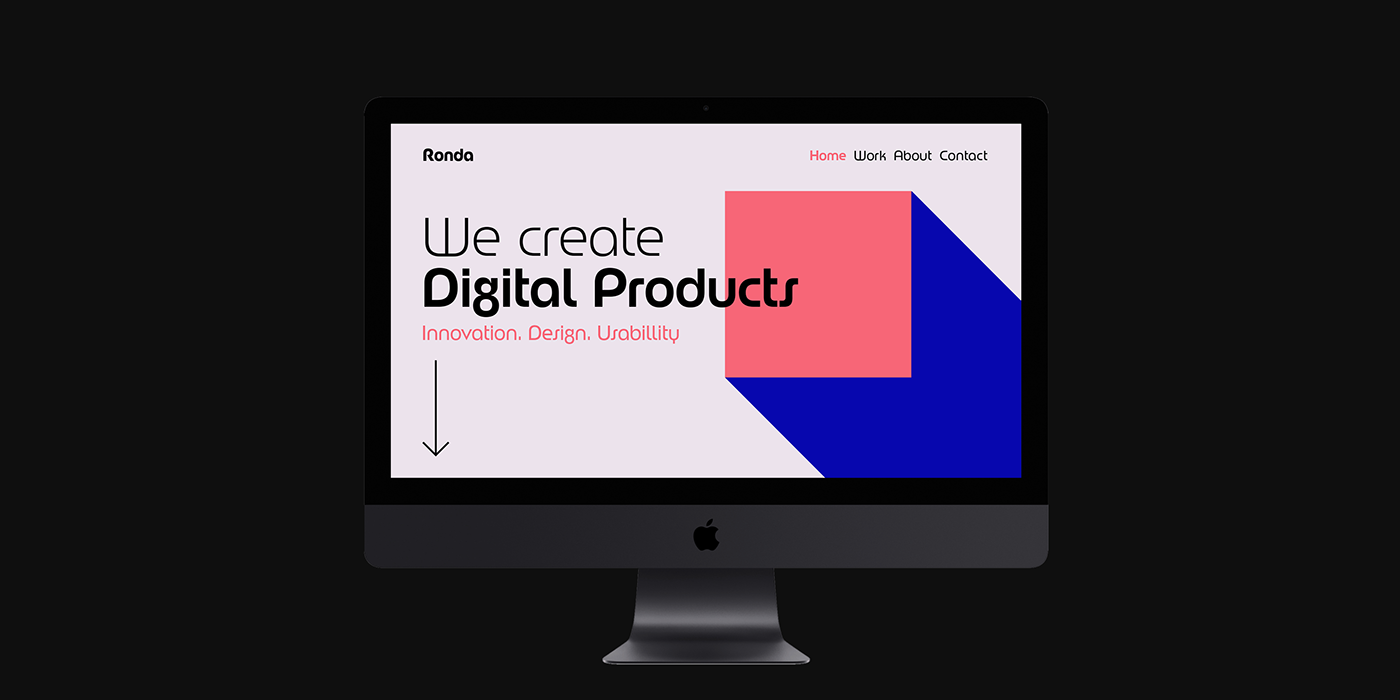
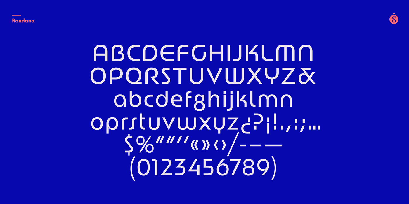
Crafted in the best tradition of the geometric sans-serif, Rondana is a typographic tribute to the the retro-futuristic aesthetics of the 1960s and 70s, as well as an exercise in purity of line.
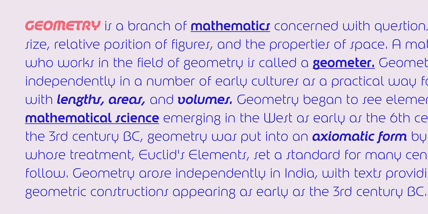
However, its spirit is decidedly non-bauhausian, since its strokes intentionally deviate from the dull, obvious, ruler-and-compass construction; its arcs and curves being more complex, tending towards a slightly square shape, imbued with subtle modulations. This sums up to a more organic, flowing, extroverted personality than the one just expected from the use of plain, simple geometry.
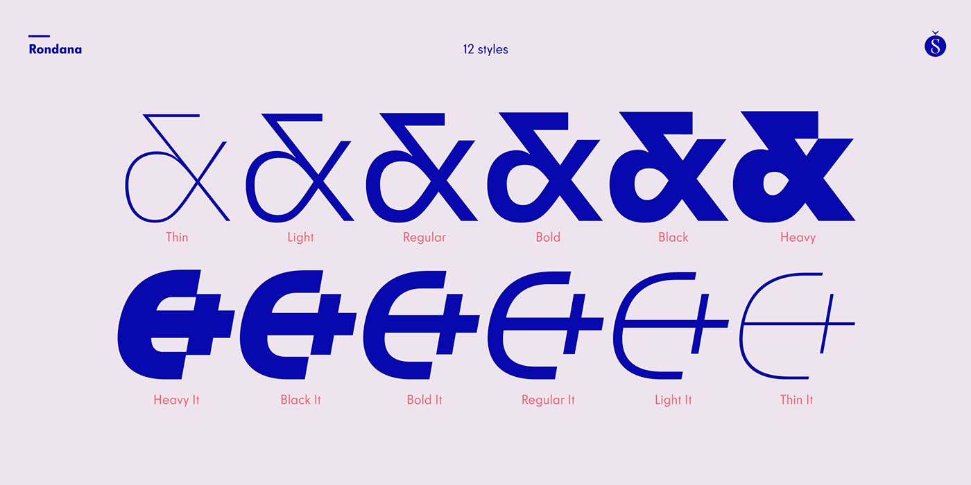
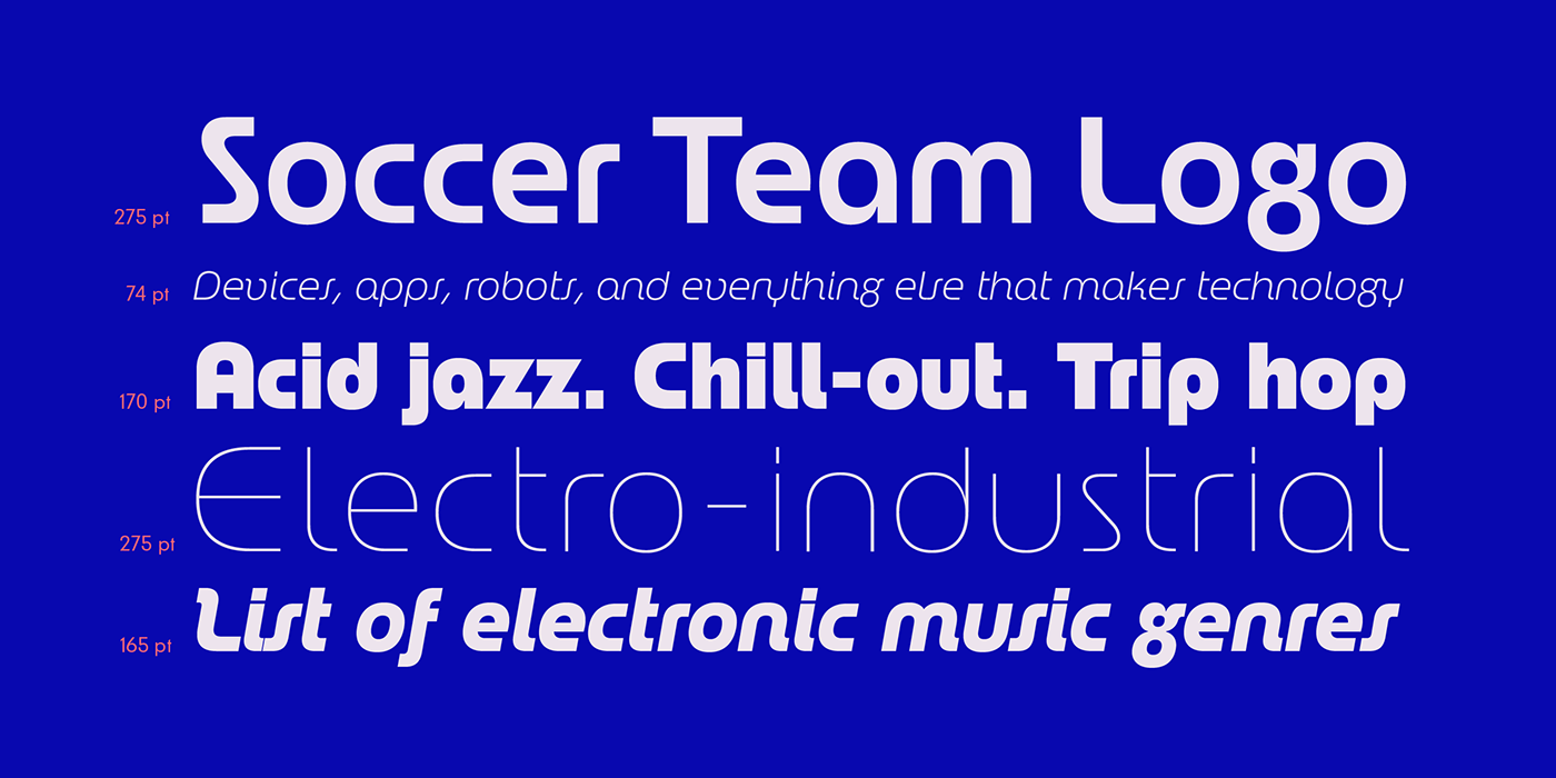
Another feature is the conscious use of non-standard shapes for many signs, that are quite legible but somewhat unexpected, such as the E, the g and the ampersand; making Rondana an excellent display face and also giving a particular flavor to the text composed in it, especially in its italic variants —which are, by the way, designer italics in their own right and not just an oblique version of the roman.
Rondana comes in twelve variants comprising a wide spectrum of weights, allowing for an extremely diverse range of expression.
Available at Sudtipos.