Student Work
DISCLAIMER: This project has no connection to the original brand. This is purely student work done for a course at California State University Long Beach, and was not created for profit or to rival the original company's brand or logo.
DISCLAIMER: This project has no connection to the original brand. This is purely student work done for a course at California State University Long Beach, and was not created for profit or to rival the original company's brand or logo.
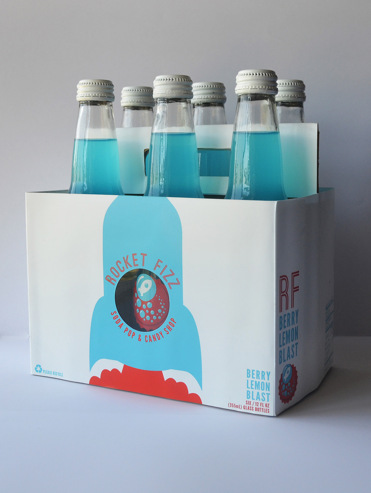
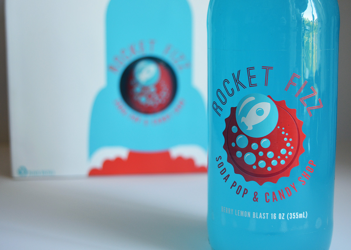
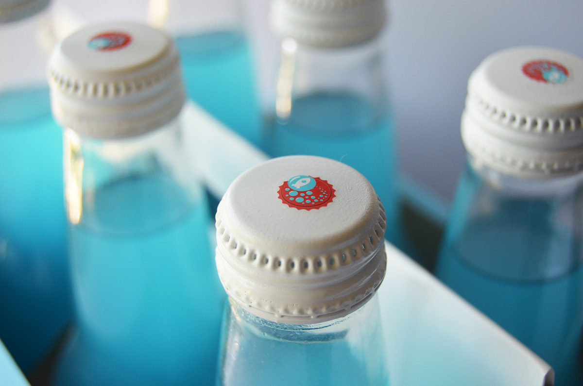
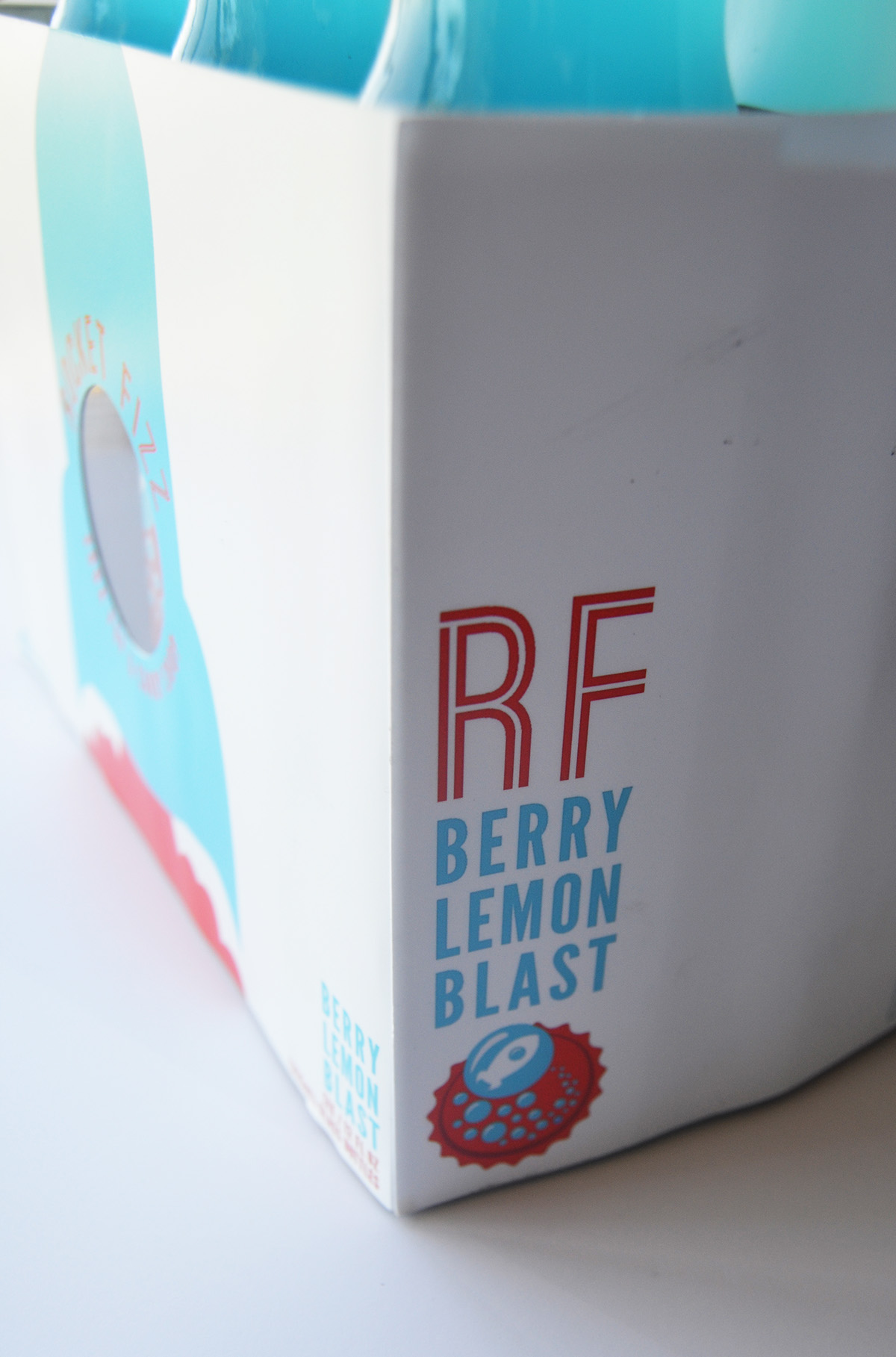
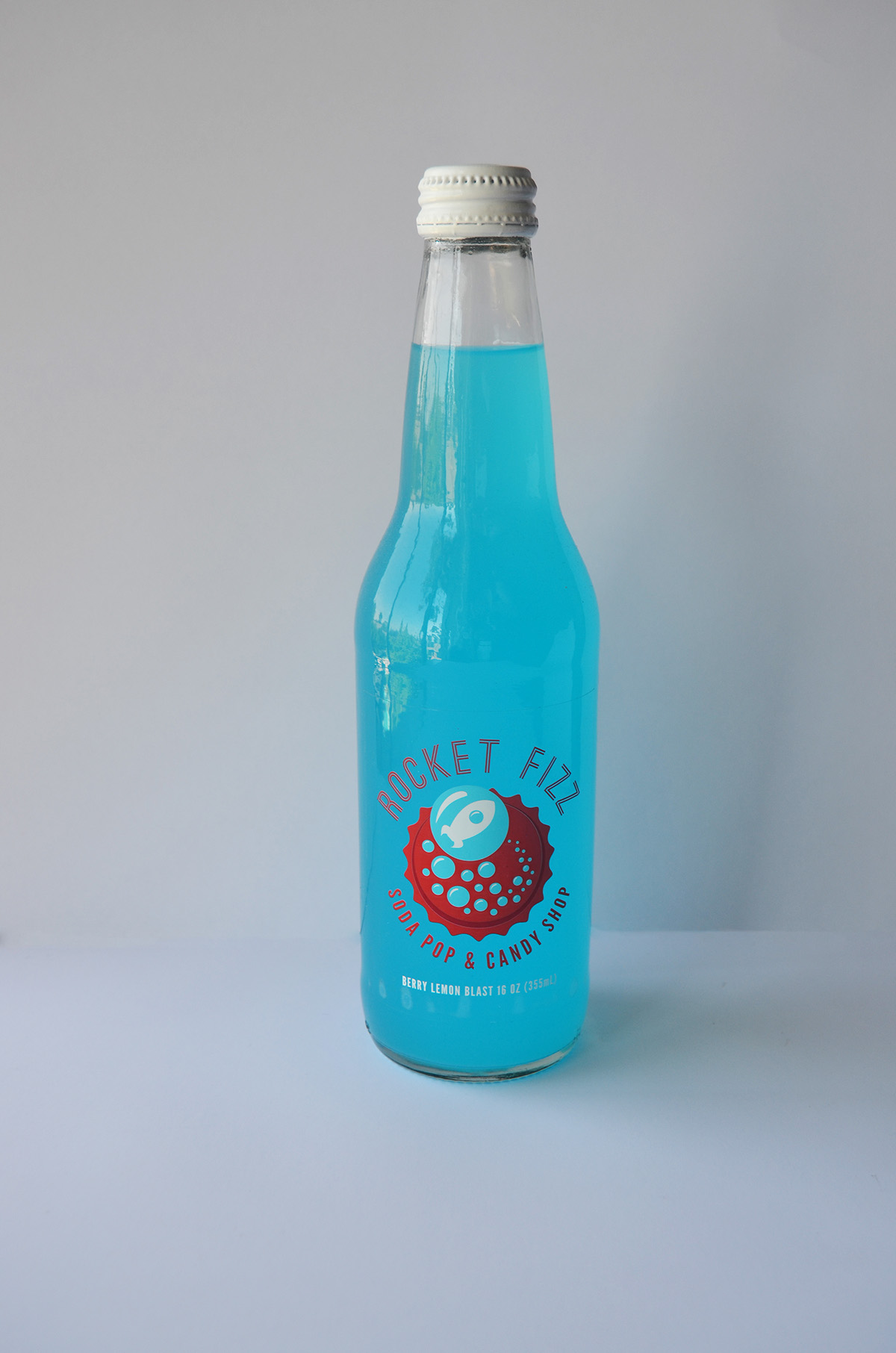
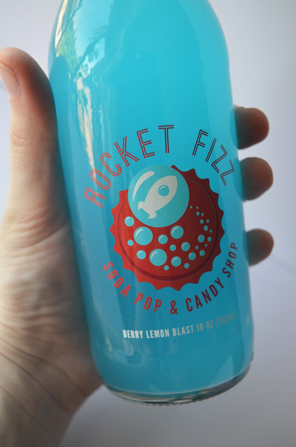
This project is based on a soda pop & candy shop chain focused providing consumers with unique soda flavors as well as a almost every candy available. Their style has a 1950's throwback feel where they try to not only appeal to kids, but to adults as well with a sense of nostalgia. This design utilizes a color system that takes it's lead from the American flag as well as a clean and simple style that creates the feeling of 1950's American life when neighbors were friendly and kids were wide eyed and carefree and there was no place you'd rather be than the local soda pop shop.