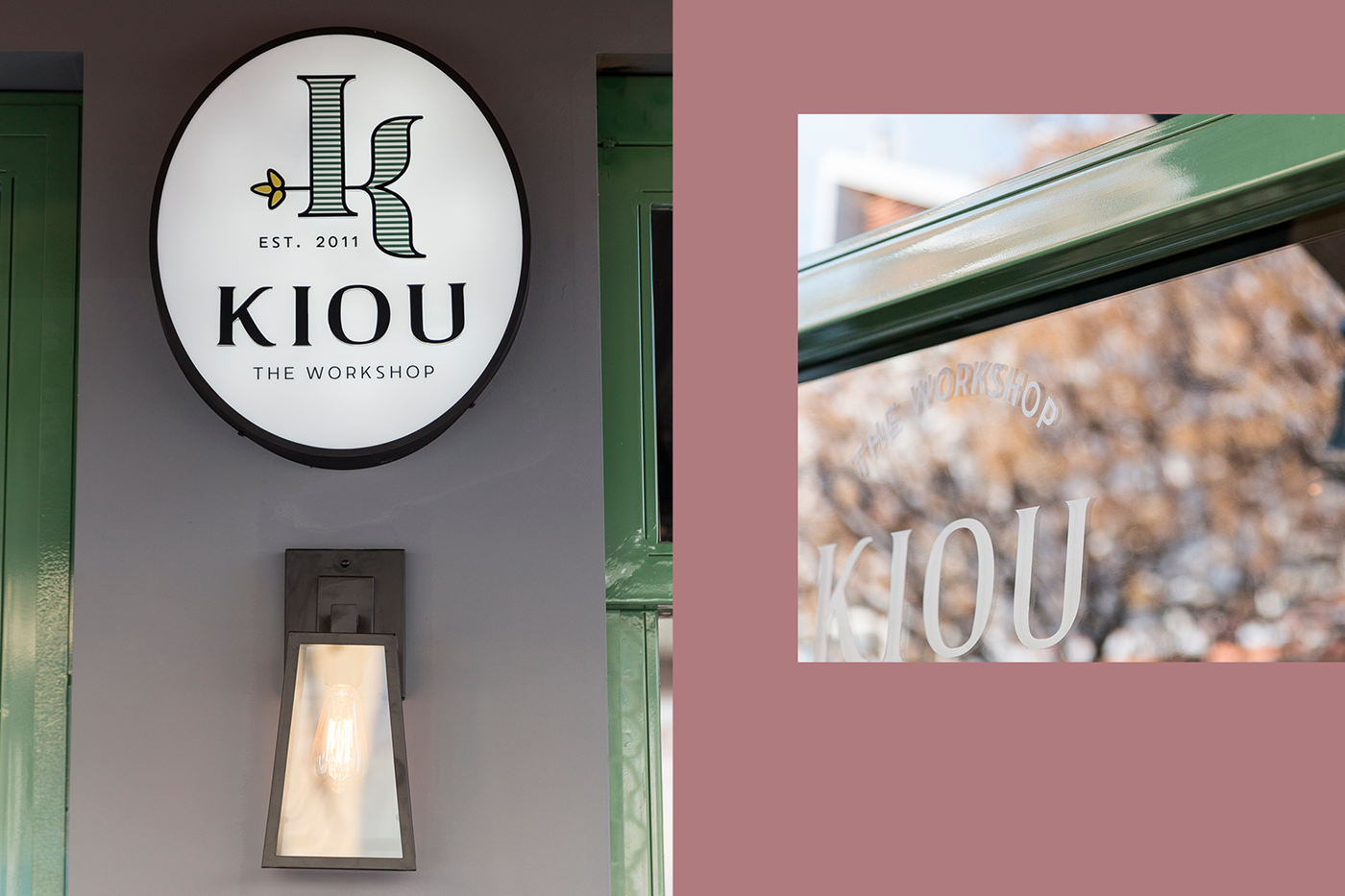
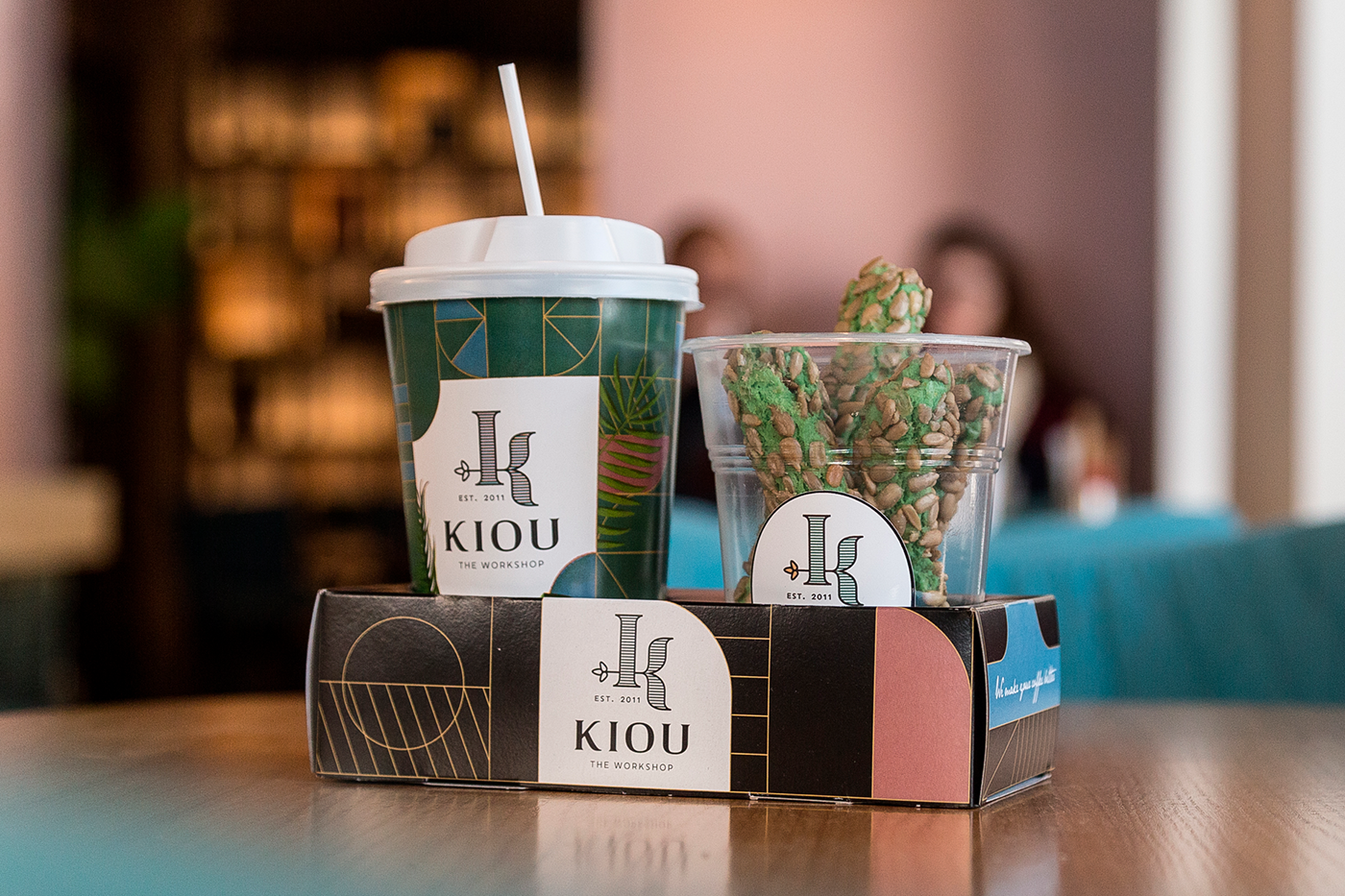
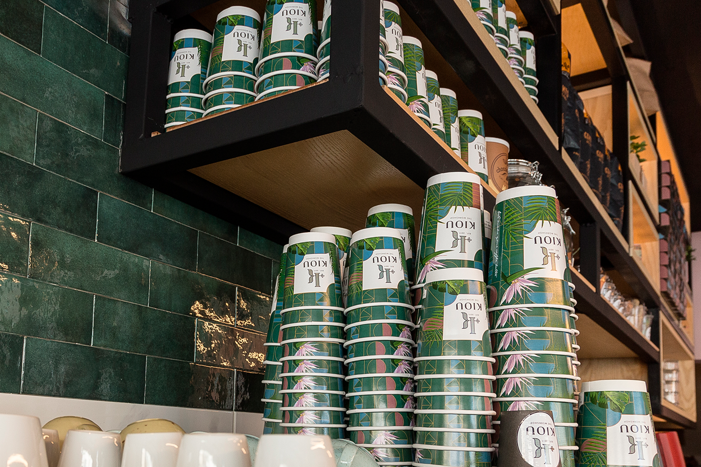
Rebranding, with logotype and a series of applications for KIOU coffee – bar, focusing at the new workshop and its tasteful salty and sweet specialties.
We developed the new identity positioning at the epicenter the family’s name initial letter, presented through art nouveau forms and colors, as to be harmonized with the decorative character of the shops. Both logo and applications designed in order to communicate the messages of a fresh, distinctive elegance, which is …. delicious as well.
We developed the new identity positioning at the epicenter the family’s name initial letter, presented through art nouveau forms and colors, as to be harmonized with the decorative character of the shops. Both logo and applications designed in order to communicate the messages of a fresh, distinctive elegance, which is …. delicious as well.
Photos by: Zisis Dalakouras