


Organization of Hope
BRINGING VISUAL CLARITY TO AN AMBITIOUS UNDERTAKING
I’ve never met a person with more letters behind their name than Dr. Patrecia Williams (PhD, PMP, CBM, QMS, CNE, CNC, CLSSMBB, RCP, PRS, RPS). Her credentials are impressive, but her determination is what’s truly inspiring as she passionately applies her education to projects that make a difference in her community. The Organization of Hope was built to deliver a comprehensive array of services to children, parents, aging adults, formerly incarcerated individuals, entrepreneurs, and pets of deployed service members. My challenge was to bring visual clarity to the grand opening so that her mission wasn’t lost in the scale and complexity of her vision at large.


Project Goals
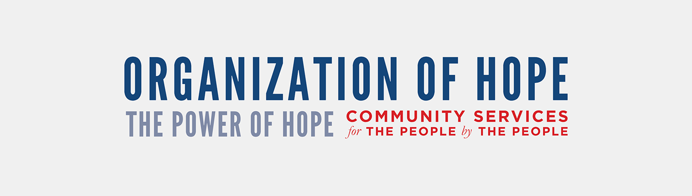
Establish the Message and the Brand
Operating in government spaces she’d started her brand by commissioning a seal but came to me for a more commercial logo to supplement it and matching material to clarify the mission, vision, and structure of the organization.
Create Takeaways for Extended Impact
Various attendees at the Open House would have interests in different offerings, some potential investors and others potential citizens seeking service so we needed to create print material that would highlight individual interests.
Challenges
A Complex Organizational Structure
The organization consists of three business units, including two non-profits, and a for-profit targeting six audiences through individual entities. At first glance, the range of services seems unrelated and overwhelming.
A Limited Timeline for Execution
With less than six months to launch, equipment had to be tracked down and transferred, designs had to be conceived and approved and products had to be defined and produced, all outside the commitments of our normal 9-5’s.


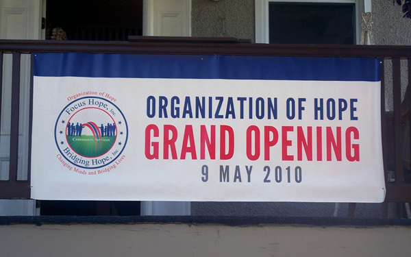
The venue for the Open House was a home that the organization had purchased and refurbished to be used as a group home for youth in foster care. Six Rooms were outfitted with props to reflect the services provided and I created door signs to give attendees an overview of the business units represented within. In the front hall of the home, I volunteered to work the day of the event by manning a table of surveys and promotional material next to the booth and kiosk designed to highlight the organization as a whole.


The most referenced visual out of the slide decks crafted to run on the kiosk at the event was a breakdown of the organization that oriented the entities and business units into a “Band of Hope” giving a simple picture of the core structure.


Lesson Learned
Referrals come with Risks and Rewards
This opportunity began with one of the VP’s at my job popping his head into my office asking if anybody had time for a quick task for a client. As the nature of the engagement became clear I had to establish boundaries to ensure that my primary employer had no conflict with me taking it on. I had to consider the perception of benign requests like accepting deliveries of proofs and equipment to my office and manage the project in a way that steered completely clear of even the perception of impropriety. In hindsight the extra steps were worthwhile as I was grateful for the opportunity to contribute to establishing something that has done so much good for so many and components created for this event have gotten years of use in the interest of promoting hope and providing help across the region.


