Sudtipos is very happy to announce the release of Integra as part of a serie of fonts designed by the master calligrapher, designer and illustrator Gabriel Martínez Meave from México.
—
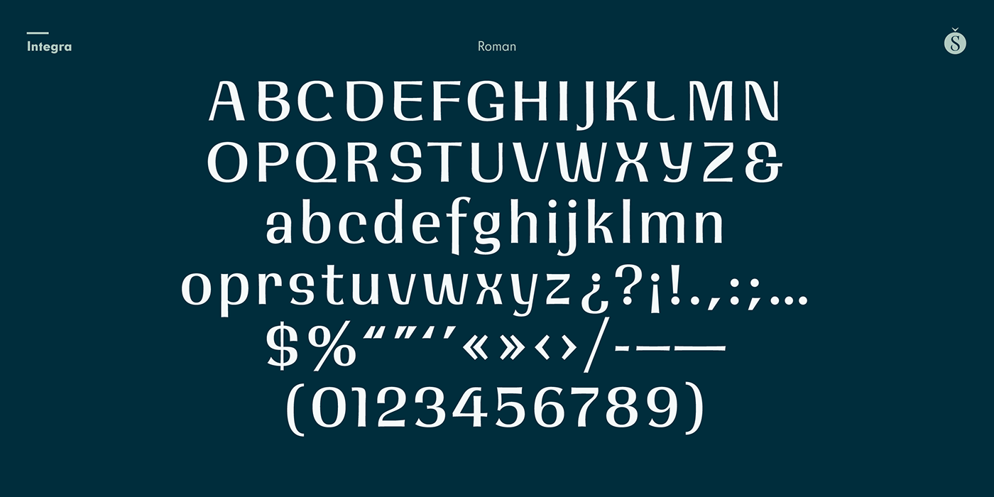
About Integra.
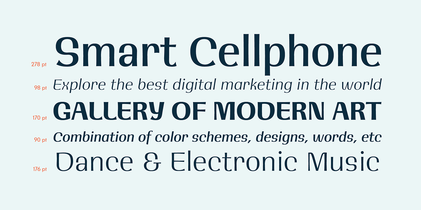
Semi-serif? Semi-sans? Emerging from the hazy border that divides Sans from Serif, Integra aims to integrate both styles in a cool, elegant, contemporary fashion.
With its sleek anatomy, flared terminals and almost non-existent straight lines, Integra was inspired by the stressed, modulated, unserifed letterforms incised in the early 15th-century ledger tombs at Santa Croce church, in Florence, and the neoclassical grotto inscriptions at Stourhead, in England, dating from mid 18th- century. However, Integra gives a contemporary, even futuristic twist to these references by featuring original, audacious shapes on key letters like L, E and X; as well as with the modern, generous proportions of its lower-case; infusing it all with a flowing, luminous, Latin American feel.
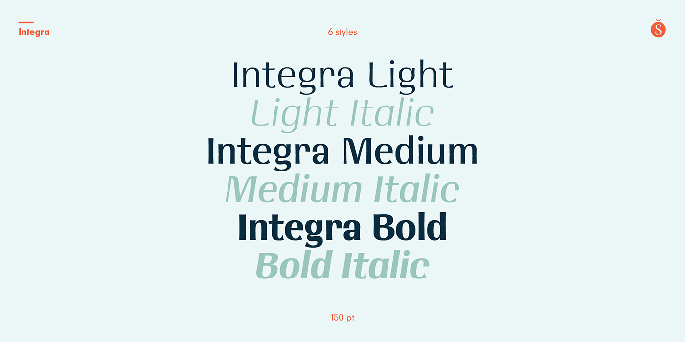
Integra comes in several weights and italic styles, for text composition and display usage. Its rounded counterforms and arch-like shapes lend texts a spacious, neat, architectural quality, perfect for sophisticated content.
Available at Sudtipos.