


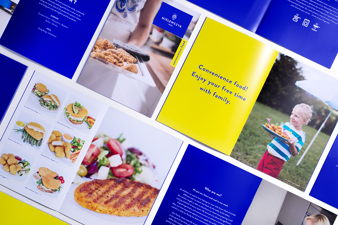
MIELEWCZYK is a family company manufacturing fresh and processed food. A brand with tradition, proud of its Kashubian roots. mielewczyk.pl
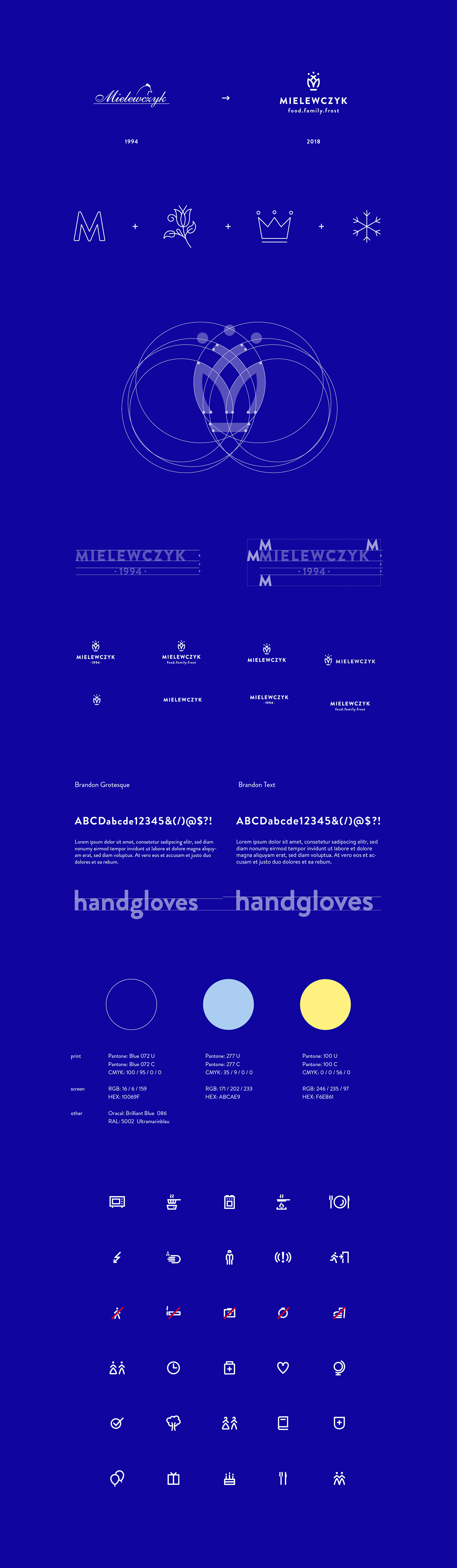
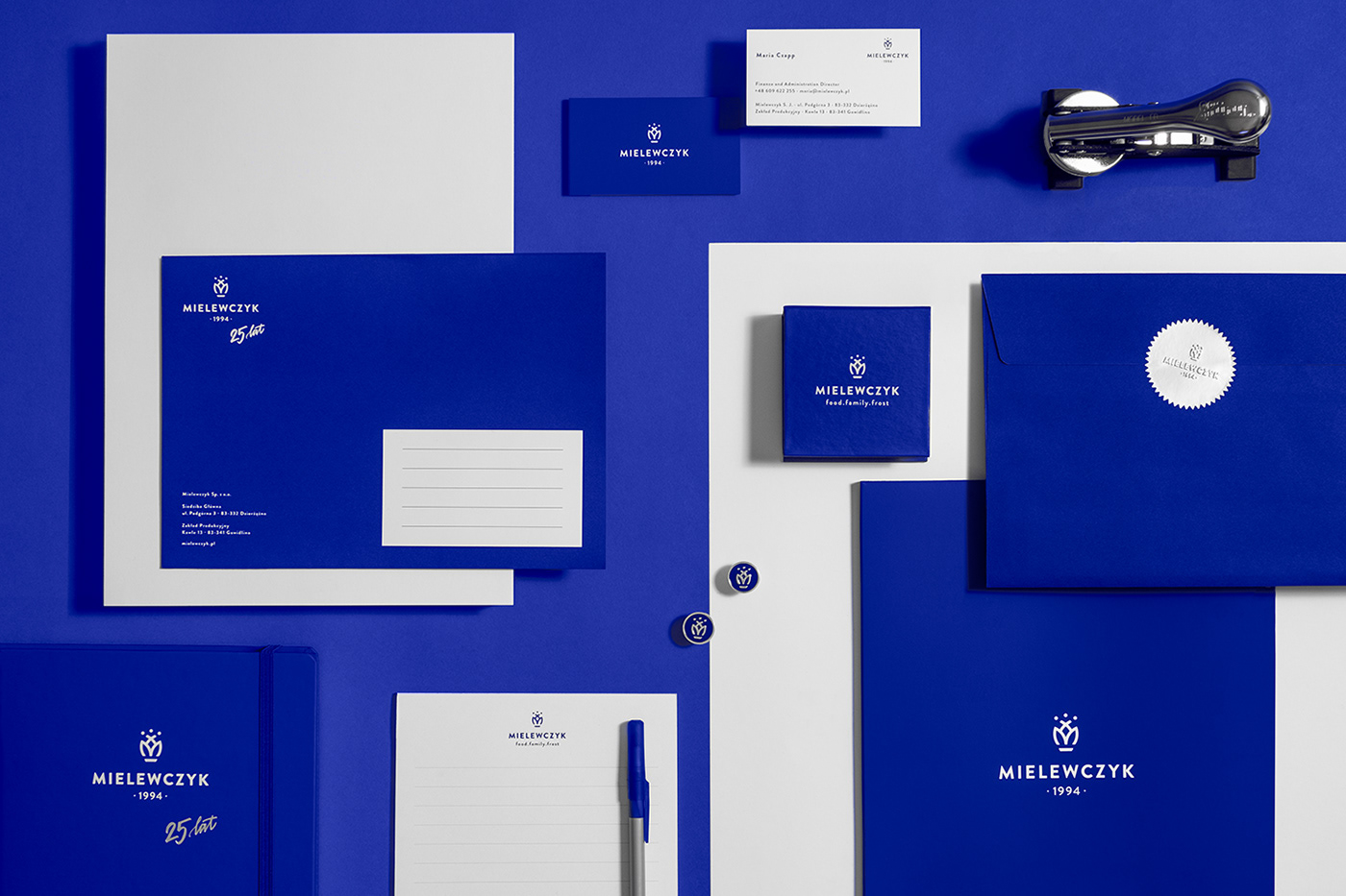
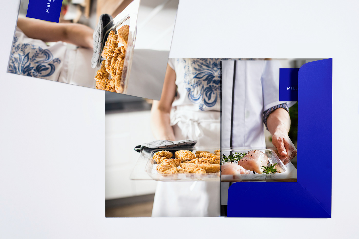
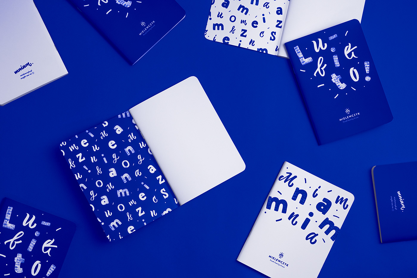
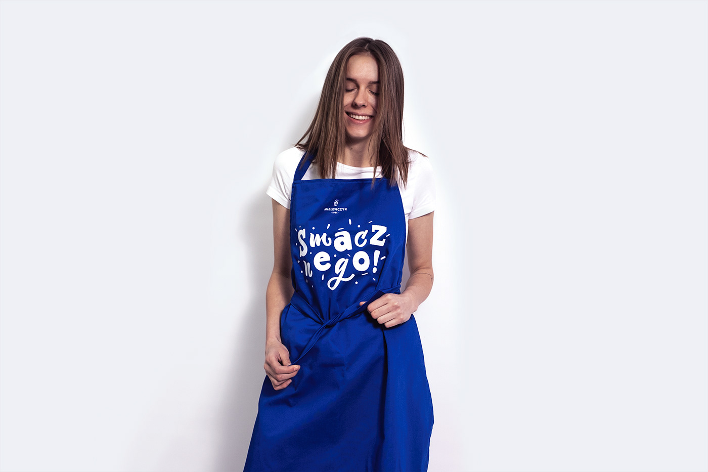
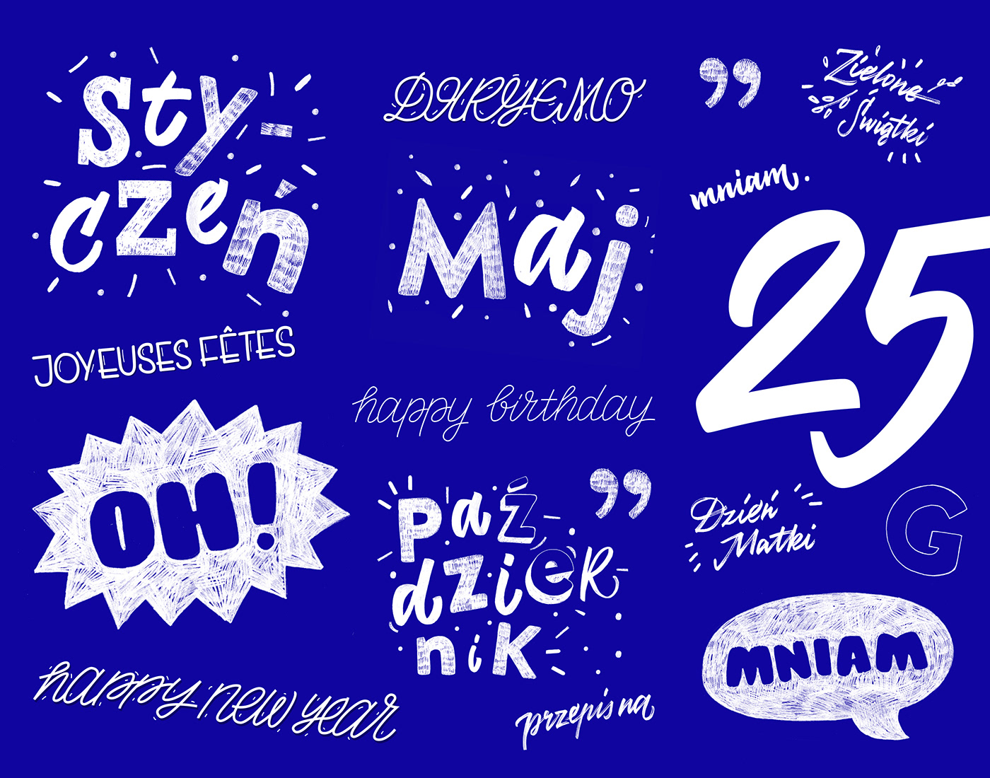
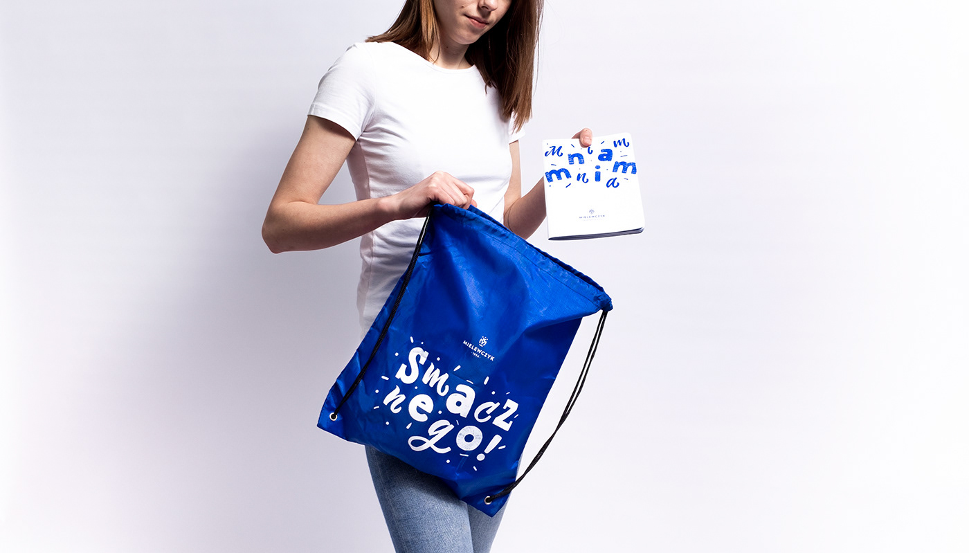
art&chips studio was responsible for its rebranding, including the logo, visual identity, website, an internal company app, ephemera, promotional products, photo shoots: commercial and products, brochures, car fleet, wayfinding, and document templates: invoices and contracts. To the basic visual identity, we added a motive of friendly lettering which allowed us to preserve the pleasant atmosphere of a family dinner.
MIELEWCZYK is a company with 25 years of experience and has made itself know as one of the top producers of Convenience Food in Poland. This is why we are pleased that they chose us to create their brand identity.


concept design: kasia pakuła & alice szymankiewicz & karol rzepka
logo design: kasia pakuła & szymon sawicki
website
design: alice szymankiewicz & kasia pakuła & karol rzepka & eugenia tynna
development: karol rzepka & adam częstkowski & mateusz szczukowski
motion: szymon sawicki
typography & lettering: eugenia tynna
typography & lettering: eugenia tynna
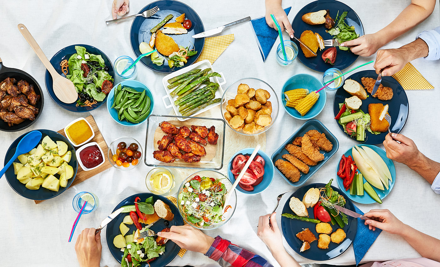
commercial photoshoot no. 1
photos: dominika śnieg
concept & stylization: kasia pakuła & mikołaj sałek
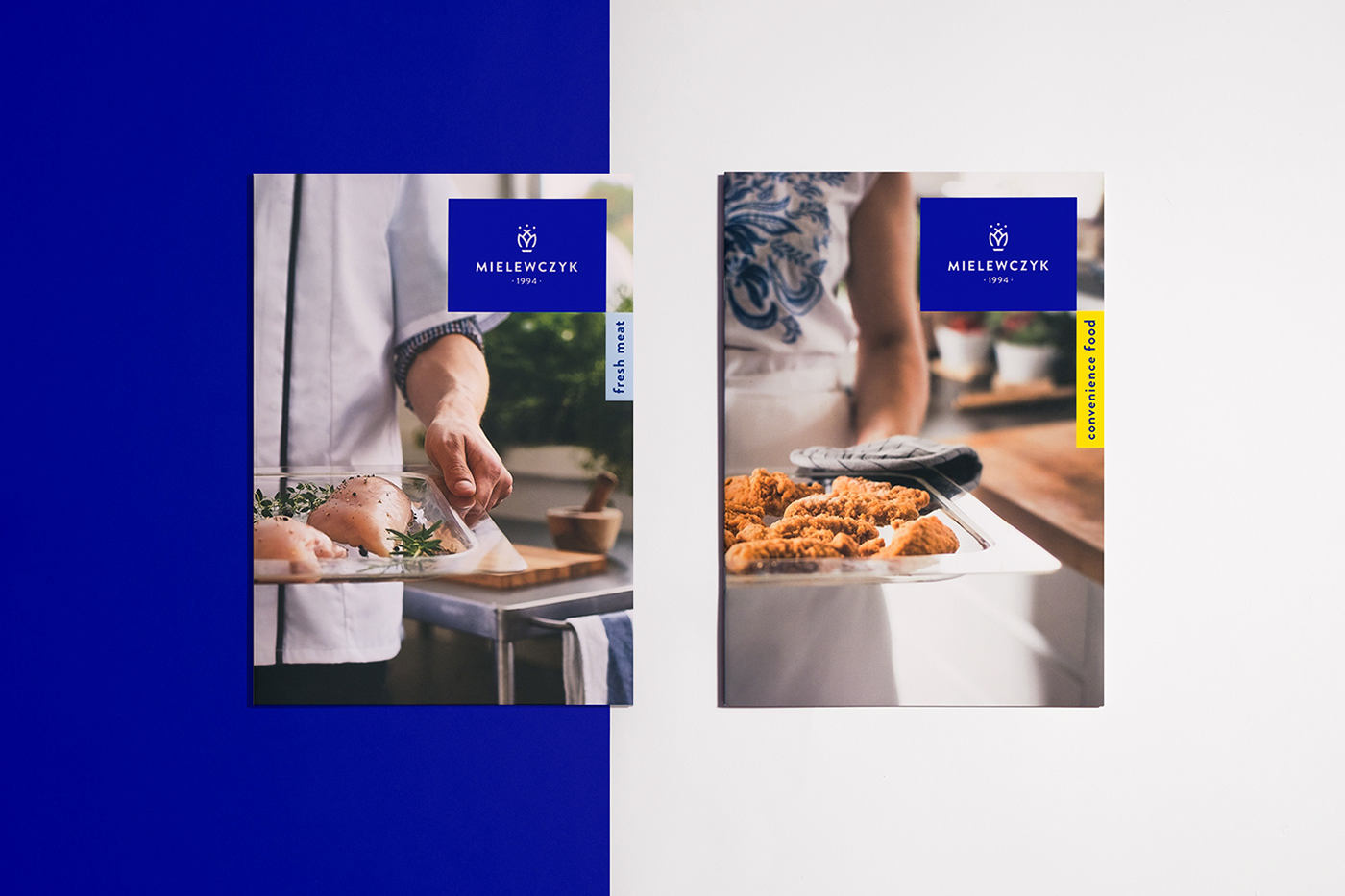
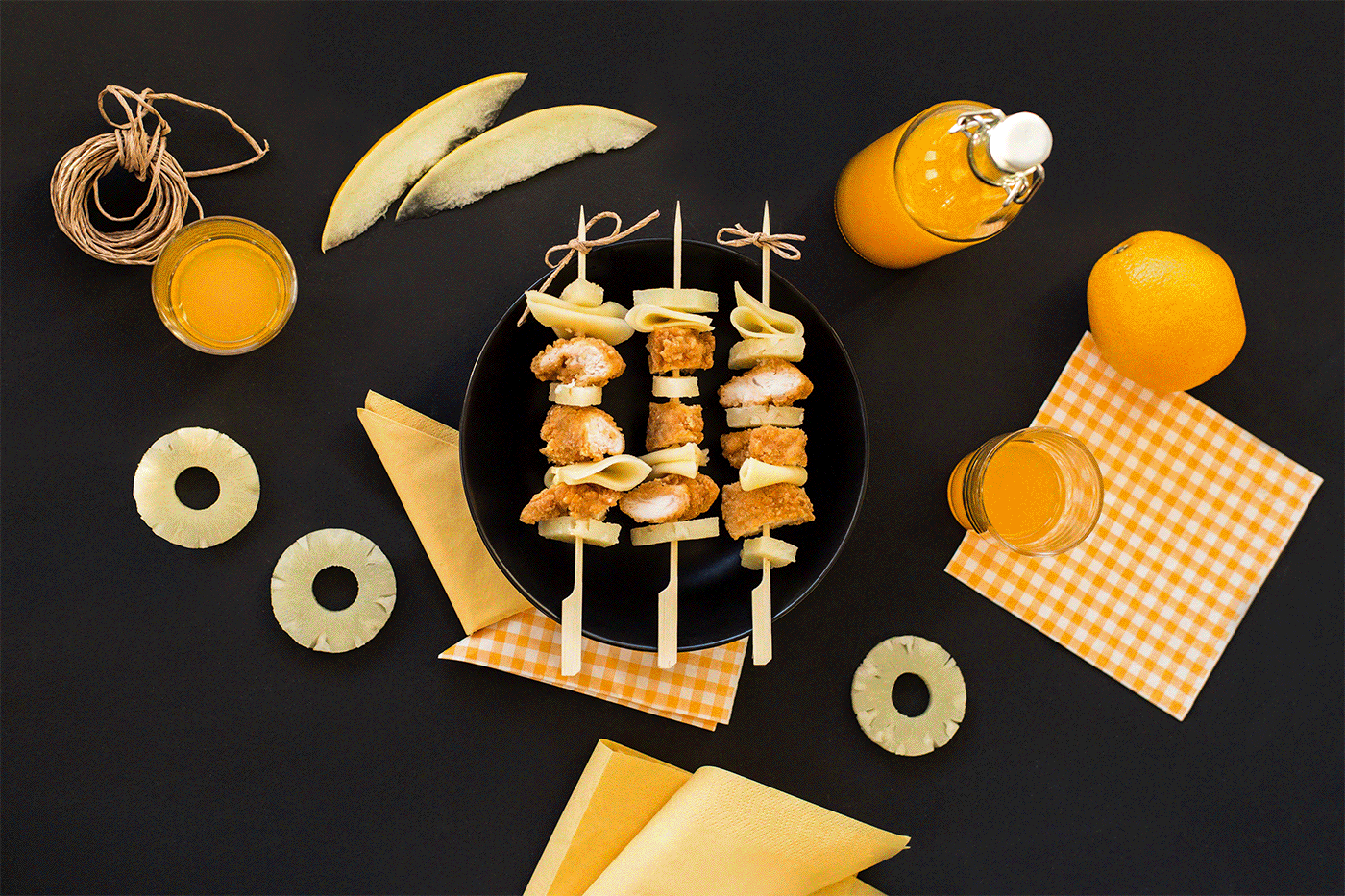
commercial & product photoshoot no. 2 & 3
photos: dominika śnieg
concept: kasia pakuła & karol rzepka & alice szymankiewicz
food stylization & retouching: kasia janczewska
project photos: krzysia brzozowska & kasia janczewska & aga habasińska
client: Mielewczyk Sp. z.o.o. mielewczyk.pl


