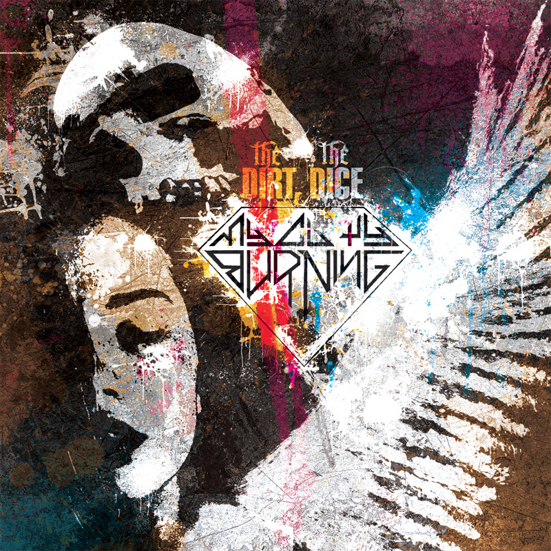
Album artwork for My City Burning's 2013 album "The Dirt, The Dice."
The album specific logo is derived from 80s thrash metal logos (the text), combined with a style element from the tattoo/hardcore scene (the diamond). The band touches on many subgenres of the 'loud', but these two in stand out the most.
The artwork itself was to reflect the subject matter, consisting of the positive and negative aspects of life; love, death, handling loss, celebrating life and so forth. The color spectrum also sprouts from this idea; covers in the genre are usually very dark and sober, which did not seem fitting for the music and diversity.