Between history and modernity
The logo for the city of Bergamo is based on a rhomboidal module, which recalls the pattern of the architectures and the texture of the harlequin mask.

Moodboard

Basic module

Composition of the logo

Taz font used for the typography, with a kerning of 60 pt
The colors are inspired to harlequin and represent the modernity of the lower city, while the grays are refer to the medieval origin of the upper town.
The logo was designed in two versions. The main is the vertical one, while the horizontal one ensures the readability of the typography even in small sizes.


Vertical and horizontal version of the mark

Negative and B/W version of the mark

Colors used in the CMYK version of the logo

Percentage of Black used in the B/W version of the logo


Corporate image


Touristic map of the city


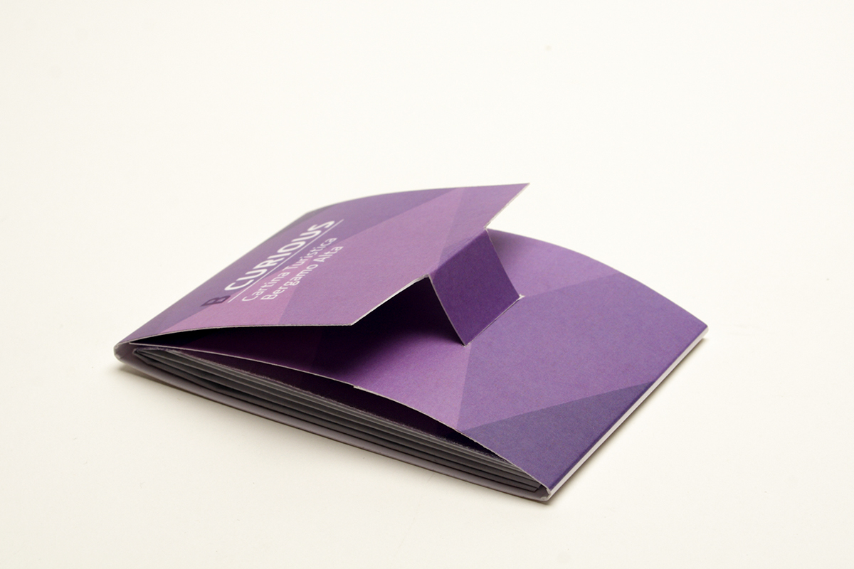
Merchandising

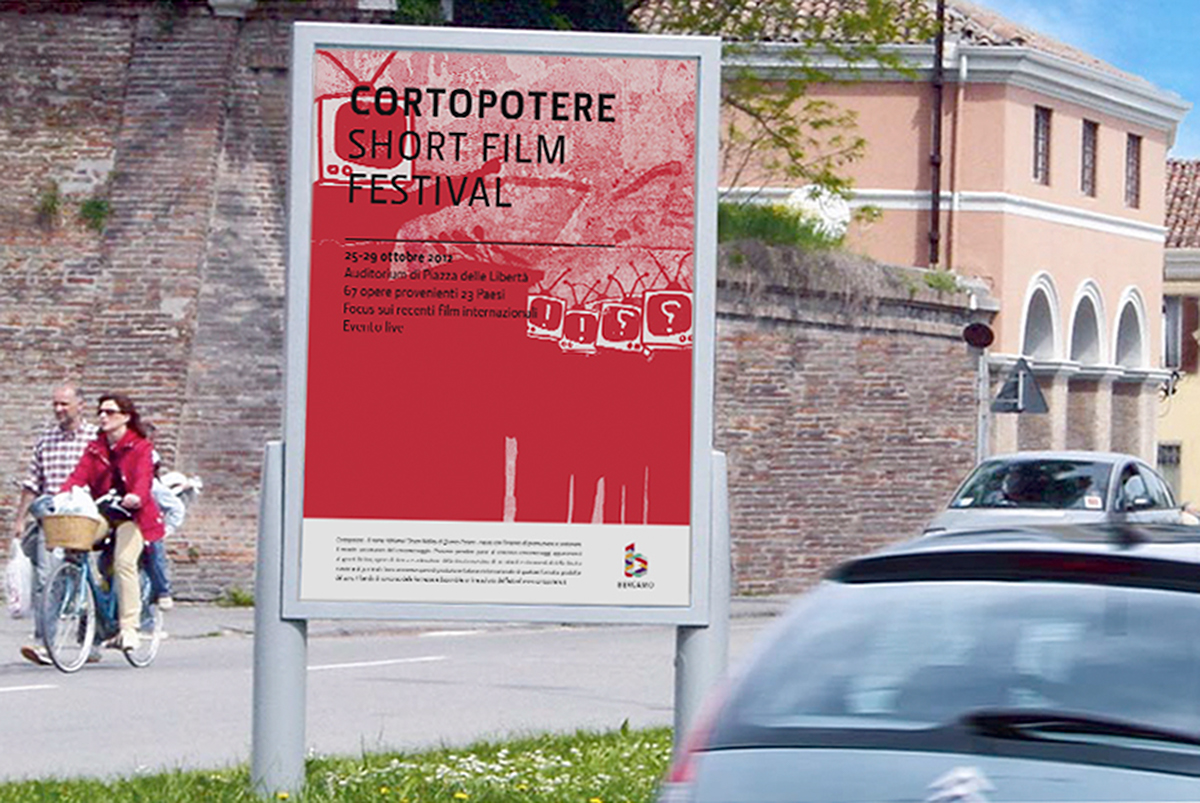
Events posters
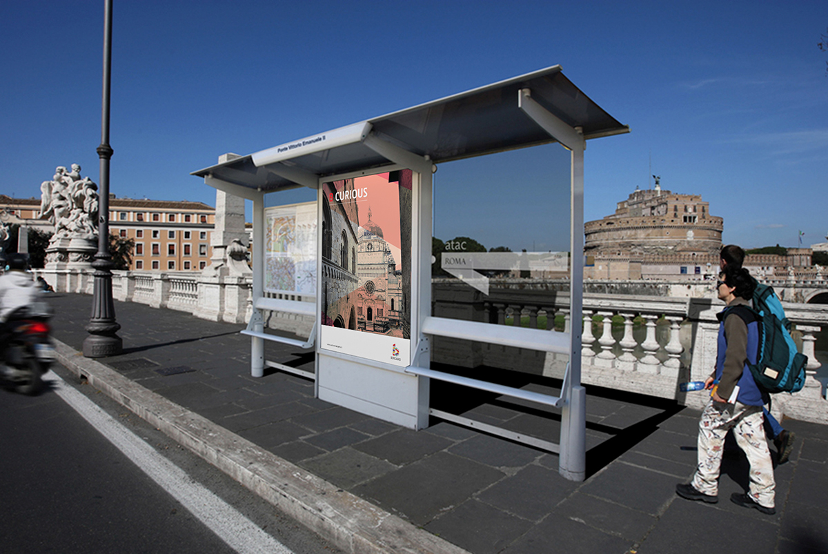


Advertising campaign
Authors: Luca D'Onofrio, Chiara Quaggia, Lara Porro, Laura Spirito, Gina Acevedo
