


Concept EN
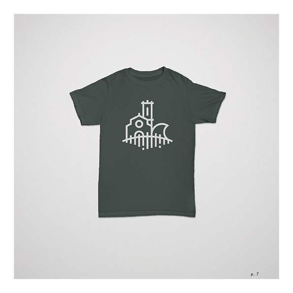
For the graphic representation of the brand for the village of Lourinhã, taking into account the applications in which it will be used, we opted for simplicity and transparency, in order to create a formality and a sense of identification between the audience and the brand itself . His appearance, though modern from the imagery point of view, maintains directly connected to the origins of the village. Thus, there is a ideological visual bridge that remains in the mind and that communicates three key points of the village. We opted for the stylization of a dinosaur, not only to not restrict the brand to just one of the points of interest in the area, but also to open the visual horizons and bring a new vision of the village.


