Geode Watch Co.
Trademark & Packaging
Trademark & Packaging
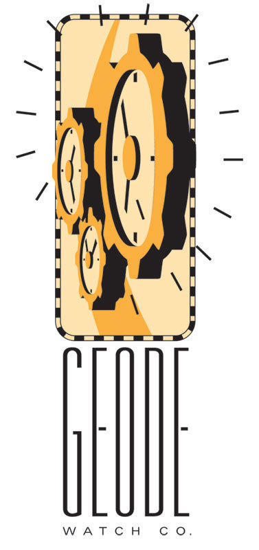
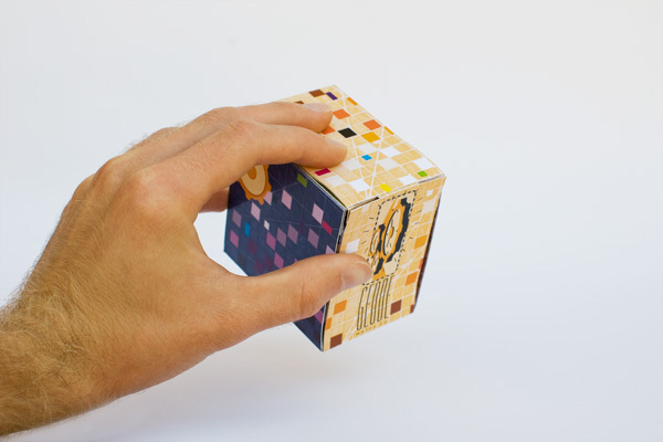
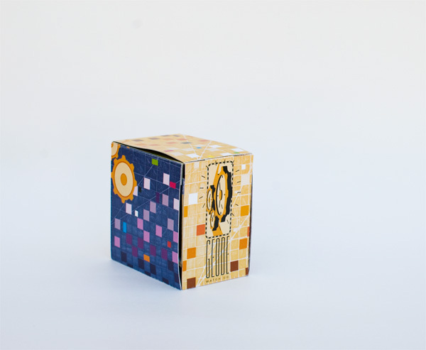
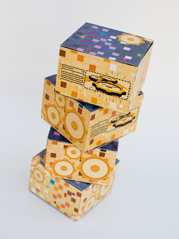
The client requested a simple package design as well as a trademark appropriate for a watchmaker. For the logo, I chose to focus on the inner workings of clock machinery by including interconnected cogs while still using elements that are reminiscent of telling time. The outside of the package features a complementary color scheme that "wraps" around the box, while colored squares add feelings of cold-to-warmth as they approach the opening flap. The interior is meant to make the customer feel as if they are discovering their new watch within the rocky crust of the earth, and the flap folds down to display the product. This is in sync with the watchmaker's "rugged" leather-band designs. Watch boxes can be stacked next to each other to create interesting connections.
CMYK on card stock, translucent paper, and poster board for reinforcement.
CMYK on card stock, translucent paper, and poster board for reinforcement.


