
This typeface - the third in the Zetafonts Signature artist-designed fonts - was hand drawn by italian illustrator Matteo Berton and lovingly digitized by Zetafonts to be used as main lettering font of his lavishly illustrated re-telling of the classic Jules Verne tale Voyage au Centre de la Terre edited by La Pasteque.
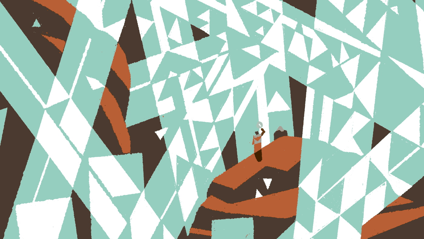
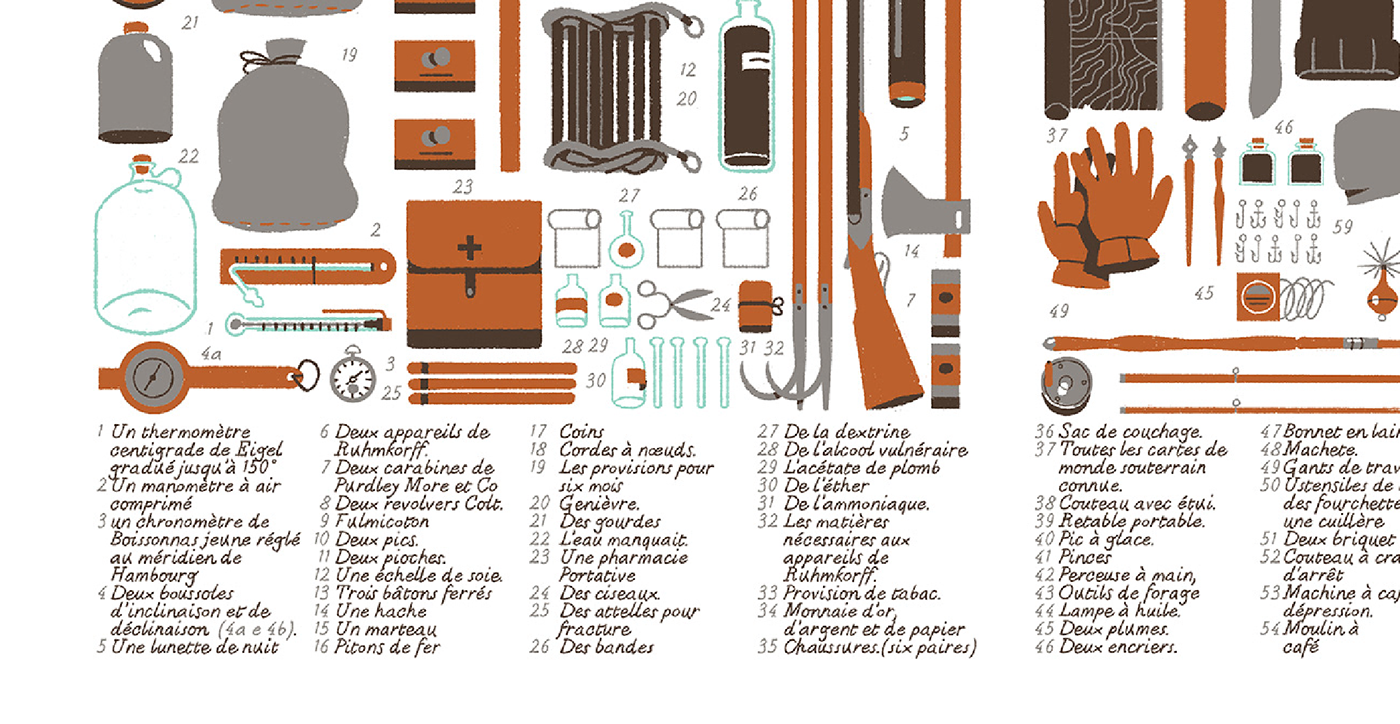
Born to complement the artist unique digital painting style, the typeface follows the Didot proportions with handmade quirks and differences. The chalky, rough finish is designed mainly for small point text size, to give a natural appearance to small texts, captions and any time you need hand-written notes to look realistic, elegant and readable.
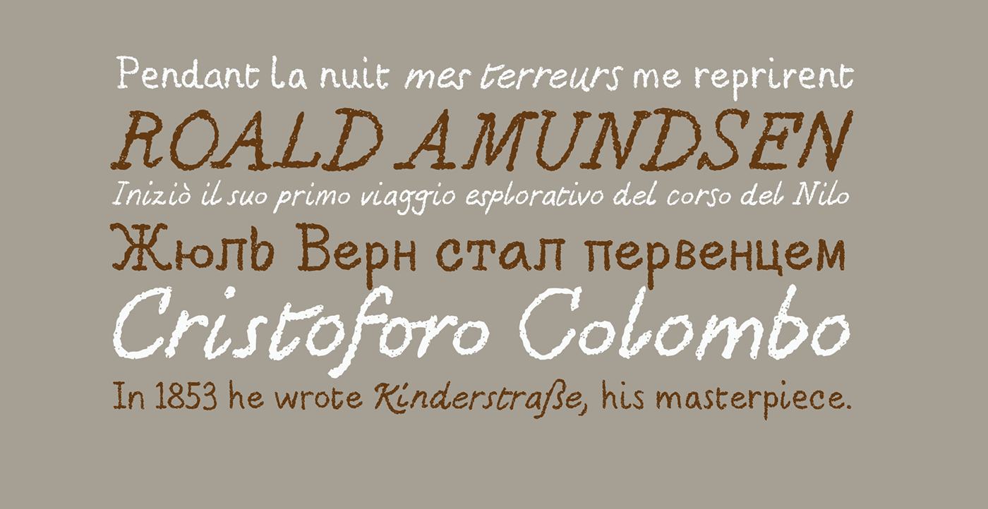
The typeface covers over seventy languages using latin alphabet, and includes also cyrillic glyphs for basic russian coverage. It comes in two weights, both with multiple character sets, alternating thanks to open type ligatures.


Go to www.zetafonts.com/berton-voyage to download the free for personal use version of the typeface. Affordable commercial licenses avalaible.


