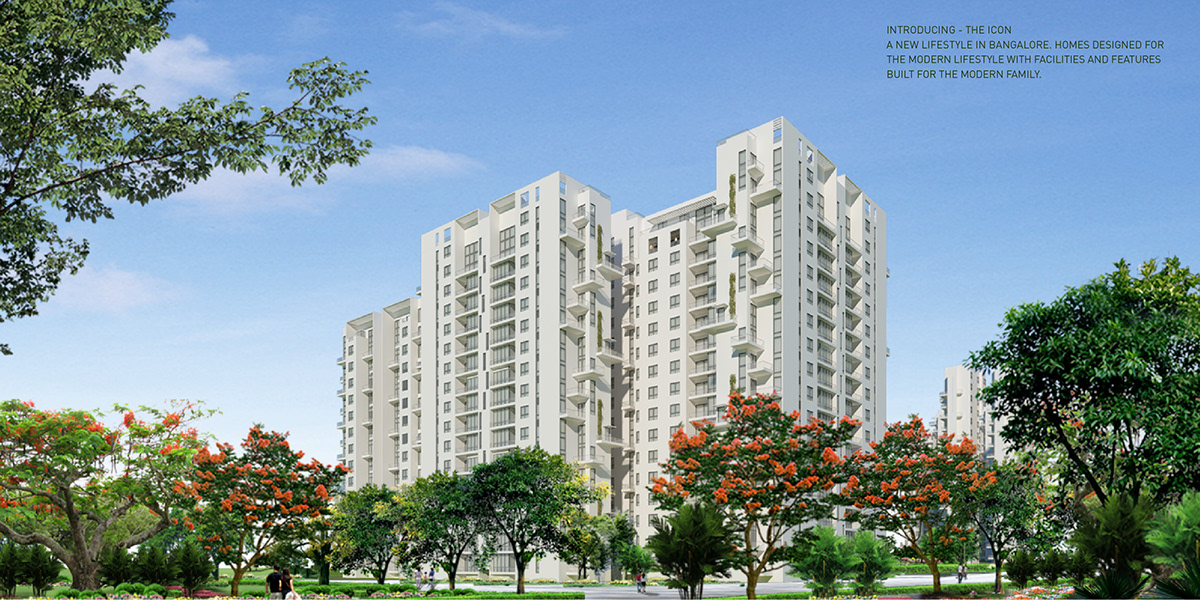
The ICON is a township project in Bangalore, being developed by the real estate group, GCORP. The concept for the entire branding was to convey the message that The ICON is ushering a new lifestyle in Bangalore. The ICON is going to offer you all conveniences and luxuries that you need as well as safety features that are so important. Its also the first township to have a LEED Gold certification and the fact that it is energy efficient needed to be highlighted.
The logo was developed my creative director, but taking his vision forward, in terms of other collaterals and promotional materials was my responsibility.
Logo and Business Stationery

This was 3 page [ 2-fold] flyer. This allowed me to present a large render of the building and at the same time have enough space to list my features and amenities. The flyer also had a pocket on the center section to hold floor plans of the buildings and apartment renders.


This was the main marketing brochure. At 30cm x 30cm and hard bound, it made for a nice coffee table book. The brochure spreads are made up of large images, specific to the features and amenities to convey the luxury being created. There are spreads that talk about the location of ICON and what is unique to it. There are also spreads that have testimonials from residents of other residential projects undertaken and developed my GCORP.


