Infographic survey: Navigating the Cloud 2013
.-.-.-.-.-.-.-.-.-.-.-.-.-.-.-.-.-.-.-.-.-.-.-.-.-.-.-.-.-.-.-.-.-.-.-.-.-.-.-.-.-.-.-.-.-.-.-.-.-.-.-.-.-.-.-.-.-.-.-.-.-.-.-.-.-.-.-.-.-.-.-.-.-.-.-.-.-.-.-.-.-.-.-.-
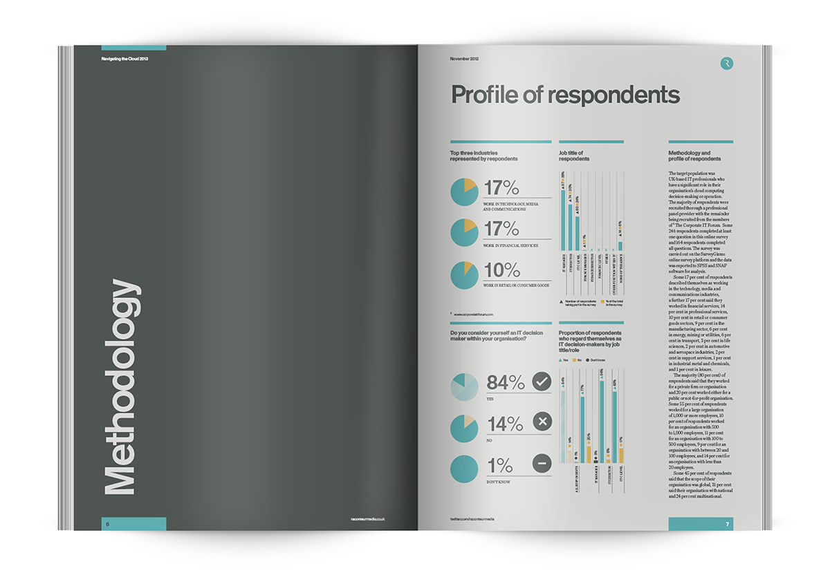
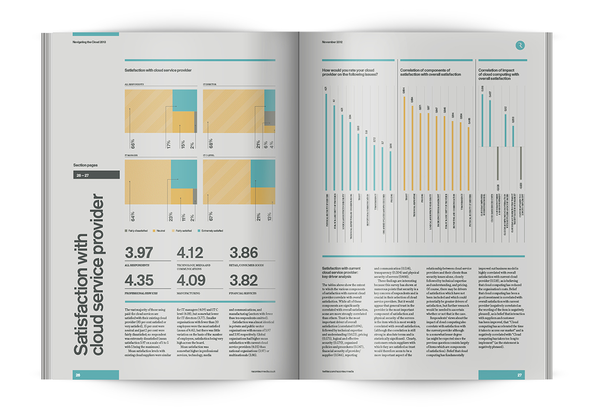
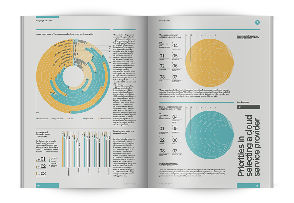
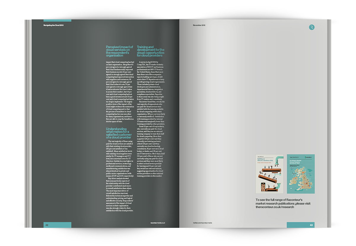
The Design Surgery recently completed a 44 page survey for Raconteur Media. The project was largely dominated by infographics to create an easy to read, data-rich project that has great visual impact. A project like this shows how the balance between data visualisation, graphic and editorial design can make a spreadsheet of even the most basic of datasets into a visually engaging document.
The Design Surgery recently completed a 44 page survey for Raconteur Media. The project was largely dominated by infographics to create an easy to read, data-rich project that has great visual impact. A project like this shows how the balance between data visualisation, graphic and editorial design can make a spreadsheet of even the most basic of datasets into a visually engaging document.