


— Obsequium
Rebrand of a Sydney-based regulatory compliance business

Obsequium, meaning ‘compliance’ in Latin, is the primary focus of our clients’ business.
The unique proposition offered by this innovative, Sydney-based organisation is their complementary service offering. Part law firm, part risk consultancy & part training provider, which enables their clients to benefit from a truly holistic, efficient & refreshing approach to regulatory compliance.
Fable&Co. were commissioned to strategically rebrand this progressive & ambitious consultancy. We began by conducting stakeholder research before articulating a unique brand positioning strategy, which inspired the core foundations for the design of the new brand identity.
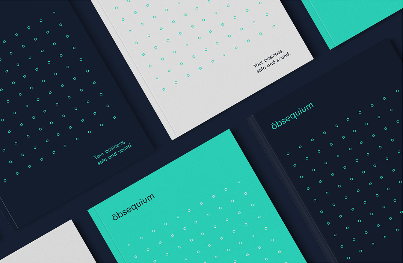
The ‘o’ within the new logo & wordmark is designed intentionally as a perfect circle – representing perfection, completion & unity. This reflects the holistic nature of Obsequium’s unique approach & business offering, through seamless integration of complementary legal services – providing a truly comprehensive & transformational proposition.

The logo & wordmark is depicted with a simple, abstract halo hovering above the O, representing Obsequium’s ability to provide clear guidance & direction. This minimal line asset is, in fact a diacritic accent, called a macron. A macron is used as an identifier for clear, communicable & distinct pronunciation. Parallels were drawn between these formidable qualities & Obsequium’s ability to dramatically simplify their client’s risk &
compliance challenges.

The new identity included the creation of a highly versatile graphic device, comprised of a grid of small circles. The uniformed grid represents the many possibilities that each of their clients have to consider. Obsequium provide shrewd insights & guidance, simplifying the often complicated process. They navigate their clients efficiently through a uniquely
tailored & highly robust process to achieve business compliance.


The vibrant, turquoise used throughout the identity injects a sense of energy & creativity to the brand. Acting as a beacon of light, they lead the way through potentially muddy waters, advising on the best strategy for now & for the future.
The striking turquoise is complemented with a deep French navy, which provides the identity with a confidence & assuredness. This strong, bold colour palette represents Obsequium’s abilities to navigate complexities through the team’s vast experience, passion, knowledge & unconditional professionalism.


Basic rules of how the new identity should be applied were compiled in a comprehensive set of brand guidelines, which include logo use, tone of voice, colour usage, imagery & graphic devices.
We demonstrate the new identity in action through visuals of the branded office environment, innovative merchandise & a complete suite of corporate stationery.
These guidelines are a valuable tool in ensuring consistency & maintaining brand strength.


"Continuing to work alongside Jason & the team at Obsequium is a real pleasure.
They support all our efforts & encourage us to push creative boundaries on their behalf. The Fable&Co. crew are all delighted with the results. It continues to be a shining example of a transformational proposition & modern brand identity, within a traditionally conventional & somewhat formal industry."
- Matt Jones, Brand Artist
Follow Us On Instagram


