


Premessa
Partendo da un’attenta lettura del prodotto/servizio oerto dal cliente e dopo aver analizzato l’offerta della concorrenza abbiamo individuato le seguenti esigenze:
• differenziarsi, bisogno di originalità e di identità. I naming dei negozi di articoli per l’infanzia si somigliano fra loro e richiamano l’attenzione sulle marche più famose più che sulla loro personalità;
• creare un naming caldo ed emozionale, che induca il target ad identificarsi a livello emotivo;
• evitare di chiudere il target soltanto al mondo femminile (mamme), ma estenderlo ai papà e a tutti i potenziali acquirenti di regali legati al mondo dell’infanzia (regali per compleanni, battesimi, anniversari ecc).
Proposta di Naming
Concept “Vezzeggiativi e coccole”
Il naming Cucicù, per assonanza e connotazione affettiva, ci porta immediatamente nel mondo del bambino.
A metà fra il gioco e le coccole, fra vezzeggiativo e lallazione, ispira subito simpatia e tenerezza.
Foreword
Starting from a careful lecture of a product/service offered by the client and after having analized its competition offer we have individuated the following necessities:
• a want to differ from the others, a need of originality and own identity. Namings of shops with articles for babies/kids are similar one to another and, what is more, they call client's attention more to famous brands they sell than to own personality;
• a need for a warm and emotional naming which leads the target to identify himself with the brand on an emotional level;
• to avoid limiting target just to the femine part of clients (mums) but to extend it also as to a male part of clients (fathers) as to other potential buyers of gifts related to the world of childhood (birthday gifts, christening gifts, anniversary presents etc.)
Naming proposal
Concept "Cossets and cuddles"
The naming Cucicu for its vowel rhyme and its emotional connotation brings us directly to the baby's world. In a half way between a game and cuddles, between cossets and babbles, ispires liking and tenderness.
Typeface and logo design

Il logo è stato progettato in modo da risultare morbido, moderno e richiamare l’infanzia.
Il simbolo, ricavato dalla lettera “ù”, rappresenta un pulcino, comunemente associato al neonato.
Il carattere tipografico è stato progettato ad hoc in modo da dialogare a livello di forma con il simbolo.
Il simbolo, ricavato dalla lettera “ù”, rappresenta un pulcino, comunemente associato al neonato.
Il carattere tipografico è stato progettato ad hoc in modo da dialogare a livello di forma con il simbolo.
The logos has been designed in such way to result soft and modern and to recall a childhood.
The symbol, extracted from a letter 'u', represents a chick commonly associated with newborns.
The font has been designed ad hoc to dialog with the symbol on its form level.
The symbol, extracted from a letter 'u', represents a chick commonly associated with newborns.
The font has been designed ad hoc to dialog with the symbol on its form level.
Texture design

Colours

I colori scelti sono: l’argento per dare un’immagine elegante e l’arancio per dare un senso di gioia e vivacità.
The chosen colors are: silver to give an elegant image and orange to give a sense of happyness and vivacity.
Colour combinations

Minimal dimension

Font to be used

Branding


Print Design:

Biglietti Auguri (Stampa Offset a 2 colori: Pantone argento 877 e Arancio Fluorescente 804, Carta Favini Twist 290 gr.).
Greetings Cards (Offset Printing in 2 colors: Pantone 877 silver and 804 Fluorescent Orange, Paper Twist Favini 290 gr.).
Greetings Cards (Offset Printing in 2 colors: Pantone 877 silver and 804 Fluorescent Orange, Paper Twist Favini 290 gr.).

Biglietti da Visita (Stampa Offset a 2 colori: Pantone argento 877 e Arancio Fluorescente 804, Carta Favini Twist 290 gr.).
Business Cards (2 Color Offset Printing: Pantone 877 silver and 804 Fluorescent Orange, Paper Twist Favini 290 gr.).
Business Cards (2 Color Offset Printing: Pantone 877 silver and 804 Fluorescent Orange, Paper Twist Favini 290 gr.).

Inviti, Biglietti per Auguri e Biglietti da Visita per Cucicù (Stampa Offset a 2 colori: Pantone argento 877 e Arancio Fluorescente 804, Carta Favini Twist 290 gr.) - Sporta (Stampa Flessografica a 2 colori: Pantone argento 877 e arancio fluorescente 804) - Nastro (Raso Arancione e Stampa Serigrafica Spessorata Bianca).
Invitations Cards, Greeting Cards and Business Cards (Offset Printing 2 colors: Pantone 877 silver and 804 Fluorescent Orange, Paper Twist Favini 290 gr.) - Paper bag (2 color Flexographic Printing: Pantone 877 silver and fluorescent orange 804) - Ribbon (Satin Orange and White Silk Screen Printing shimmed).
Invitations Cards, Greeting Cards and Business Cards (Offset Printing 2 colors: Pantone 877 silver and 804 Fluorescent Orange, Paper Twist Favini 290 gr.) - Paper bag (2 color Flexographic Printing: Pantone 877 silver and fluorescent orange 804) - Ribbon (Satin Orange and White Silk Screen Printing shimmed).

Nastro (Raso Arancione e Stampa Serigrafica Spessorata Bianca).
Ribbon (Orange Satin and Silk Screen Printing shimmed White).
Ribbon (Orange Satin and Silk Screen Printing shimmed White).
Shop photos

Interior design by D+ Studio.


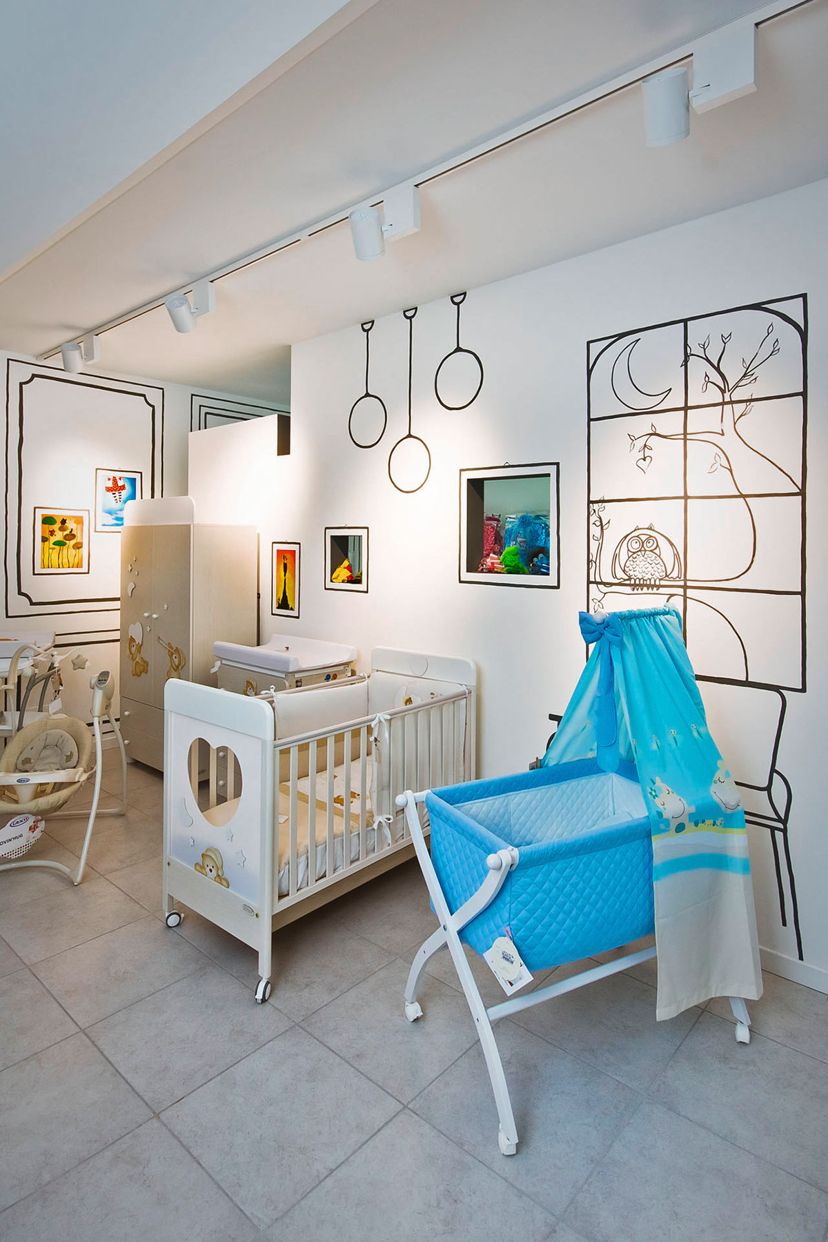


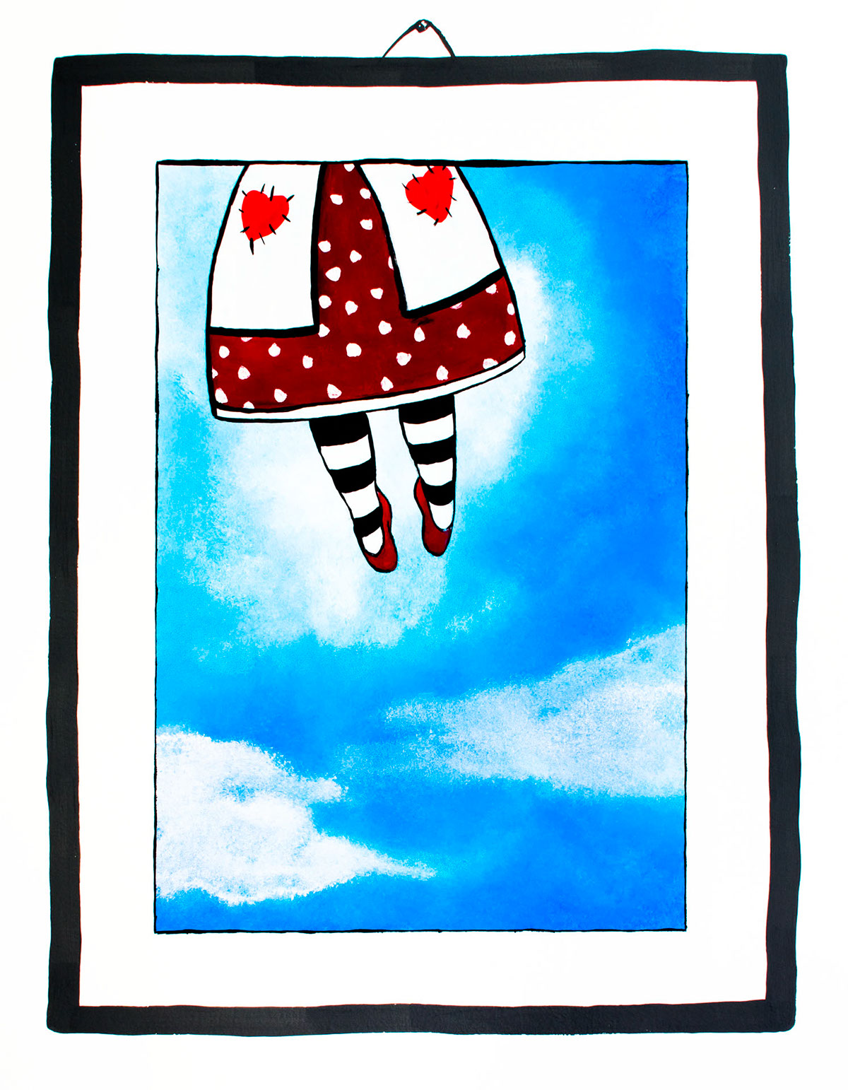

Illustration and decorations by Teresa Palestini.
Thank you for watching our work.


