In 2011 the studio Kiko Farkas/Máquina Estúdio was convited to enter the competition for the redesign of the IMS, the most important brazilian private institution connected to culture.
Its goal is to promote the development of cultural projects mainly in five areas: photography, literature, libraries, visual arts and Brazilian music.
Briefing
Present and future, this is the idea that IMS wants to pass: a private institution that administrate publics goods, aiming to open and enlarge the access to a growing public.
Elegance, sobriety and beauty are important caracteristics, but the identity has to focus on the idea that IMS is for all and not for a few.
The redesign must also consider the technologic innovation that is already taking place in the IMS activities and will lead the future of the institution.
ANALYSIS OF THE ORIGINAL IDENTITY

The original IMS logo presented quite a few problems, either of composition or of technical reproduction.
The centralized composition and the temple shape gave an antique feeling of conservative nobilty, with a single point of view and an inner truth.
The stroke presented various problems of readibility in the small applications such as book spine, one of the most common use for the logo.
The centralized composition and the temple shape gave an antique feeling of conservative nobilty, with a single point of view and an inner truth.
The stroke presented various problems of readibility in the small applications such as book spine, one of the most common use for the logo.

Application of the logo was really confused and random.
FROM TEMPLE TO SQUARE
This was the leading concept in the work of redesign of the identity, multiply the points of view and make it more democratic.
This was the leading concept in the work of redesign of the identity, multiply the points of view and make it more democratic.


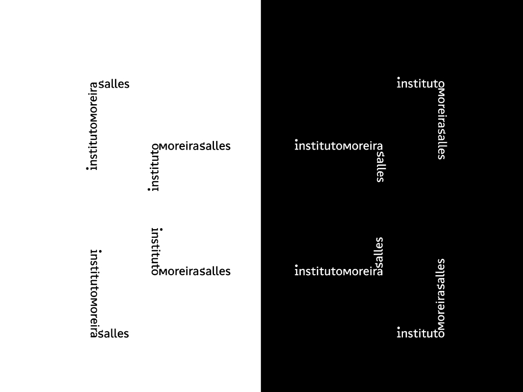
AN ELASTIC SYSTEM
A system that considers different levels of communication, from best readibility to best flexibility
A system that considers different levels of communication, from best readibility to best flexibility