ARLEKIN
the typeface for kids
Arlekin was designed as my graduation project. The font was created for a web portal for children and their parents. Thus, it has characteristic features of a screen font, which mostly are: larger "x" height, simple shapes, rebust details, wider sapcing. What is more, the font readability went through a web font test successfully. Also, it was warmly welcomed among children between 4 and 6.
There are two versions of the typeface. The primary one is prepared for a screen. As letters were well-recognised and friendly to children a version for prints was designed as well. It includes different variants of several letters and the spacing has been reduced.
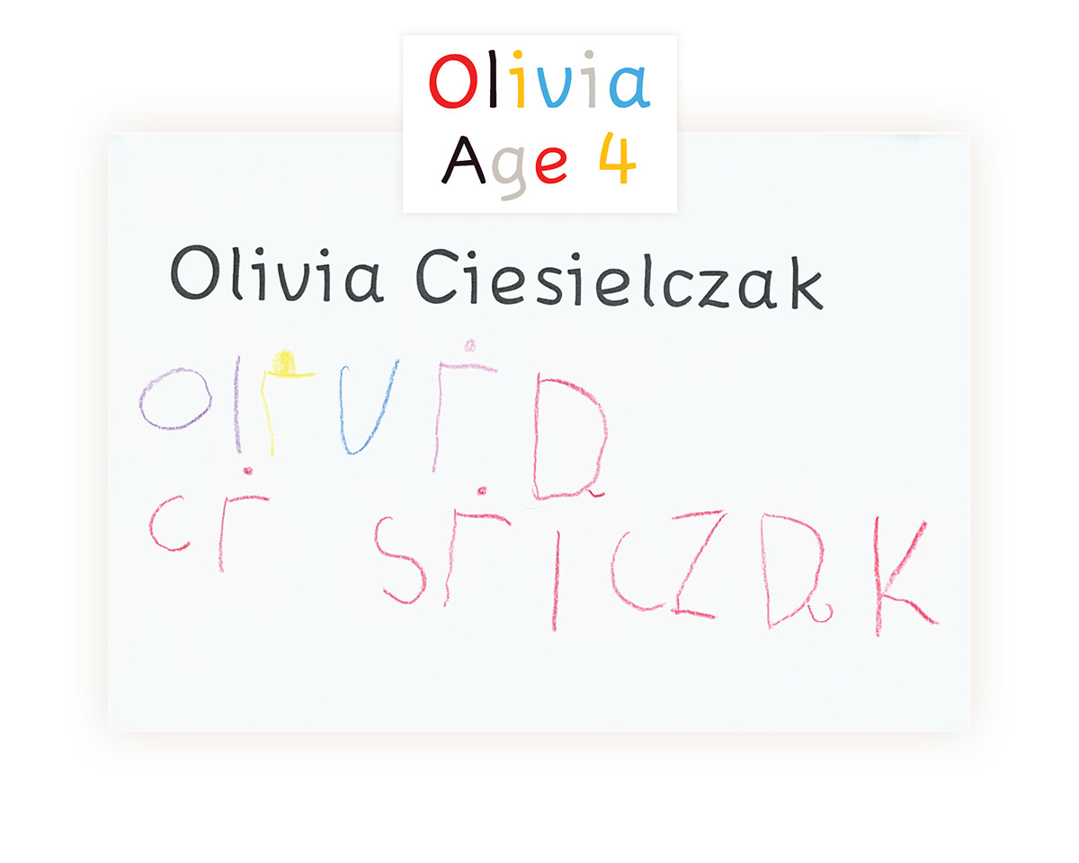
The shapes of the letters were carefully chosen. I have learnt a lot of from my 2-year-old son, who already knows capital letters. He couldn't, for instance, recognise letters with serifs. If a letter "M" was too wide he called it "W". "O" could not be too narrow, since he thought it was a "D".
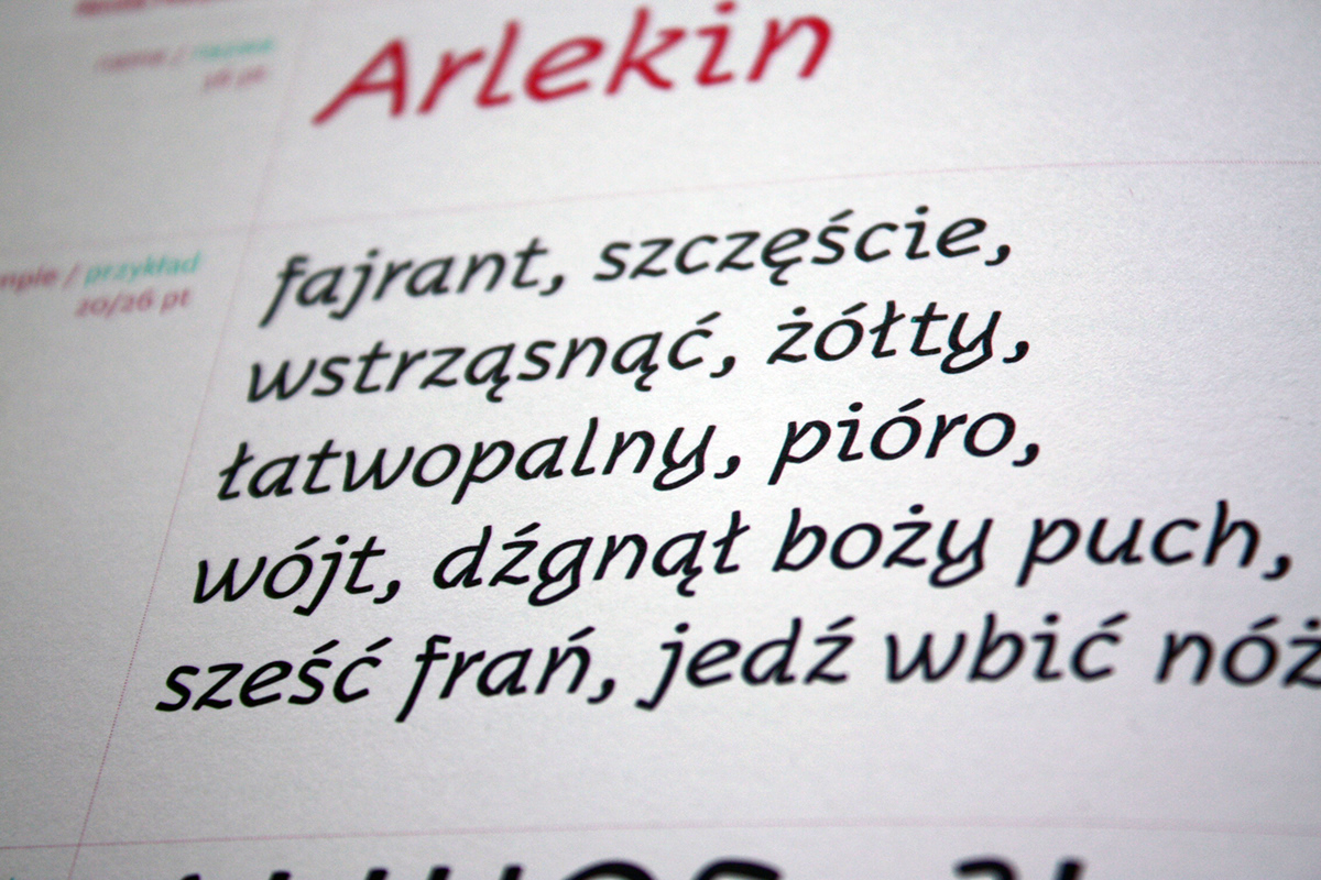
Learning from experience and tasks that were performed during the workshops Ala has a pen I designed a cursive variant of my typeface. The knowledge gained on handwriting helped me to define the proper shapes of letters. The broken nature of Gothic letters made the font more dynamic and practicing calligraphy complemented the signs adding some interesting details. All these factors influenced Arlekin Italic, which in contrast to Arlekin Regular reflecting a gentle character of the children’s world, shows its different aspect i.e. activity and energy.


Children between 4 and 6 working with Arlekin

Arlekin in use: on the screen, on the flag of a cardboard castle, as letter stickers on a kid's table, on a birthsday t-shirt, Regular and Italic in the text ,


Arlekin Italic in "Fajrant" book; the book is available online