


Background
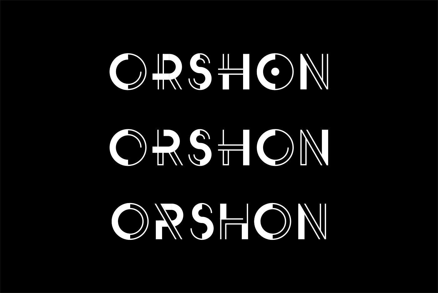
Orshon is a creative agency based in Tel-Aviv, who specialise in branding and digital design. I was originally approached by their founder Orel Ben David, who wanted to use the lettering from a concept I’d designed back in 2013 for his companies logo. Unfortunately, I didn't ever get around to making this lettering into a fully working font so instead, Orel asked me to design a bespoke logotype inspired by the concept design.
The Solution
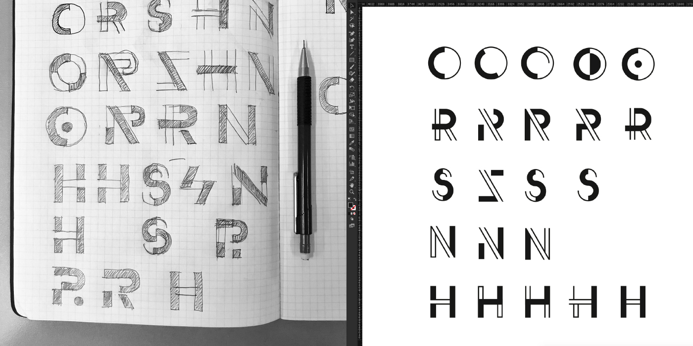
The concept (above) which the logotype is inspired by is a variant of my 'Fassade' typeface design. The letters are based on a simple geometric sans serif but built up of a combination of lines and filled shapes which have a high contrast, dynamic look. For the final design, I had to pay close attention to the thicknesses of the lines and also the space between each letter so that the design wouldn't break up at smaller sizes. The final design doesn't deviate away from the original concept that much but has a better overall consistency.


Additional Information
The 'Orshon' logotype designed and produced by Jonathan Martin, 2018.
All mockups designed and produced by Jonathan Martin, 2018.
Photography found on the digital mock-ups are for display purposes only and were sourced at: https://unsplash.com/ All other photography by Jonathan Martin, 2018.
The secondary typeface used in the mock-ups is Futura Book
Thanks for watching!


