Transforming a local neighbourhood bar in to something much more inviting.
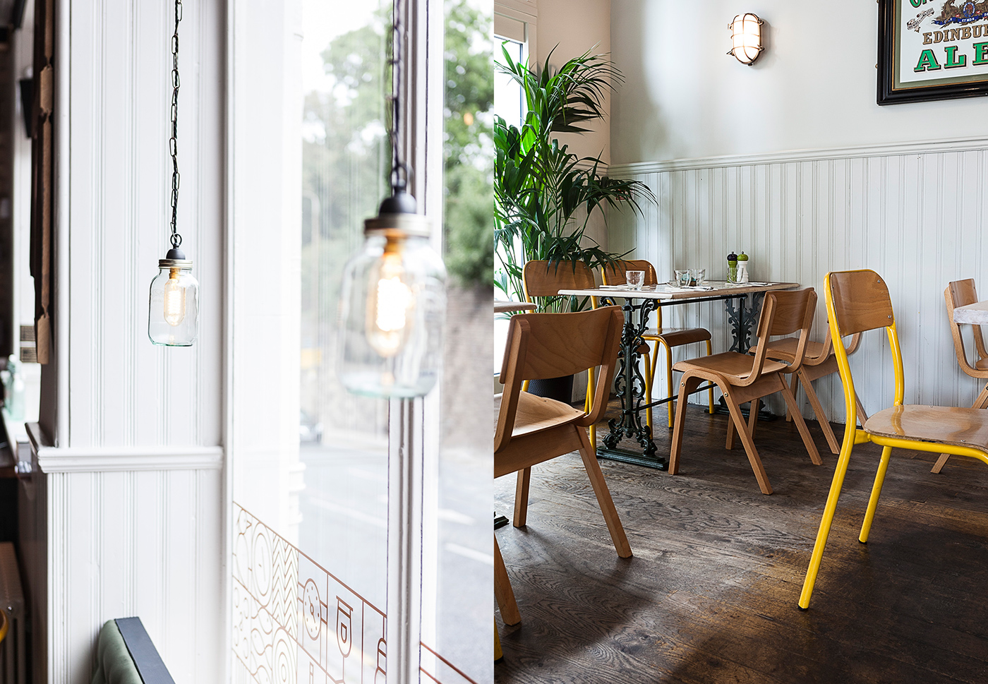
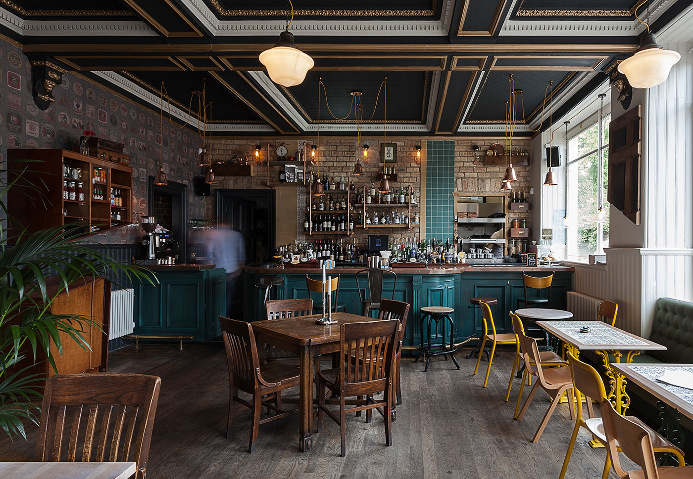
We were tasked with transforming a tired pub into a more welcoming venue, helping to establish the venue as a popular day-to-night neighbourhood destination as well as attracting visitors from across the city.
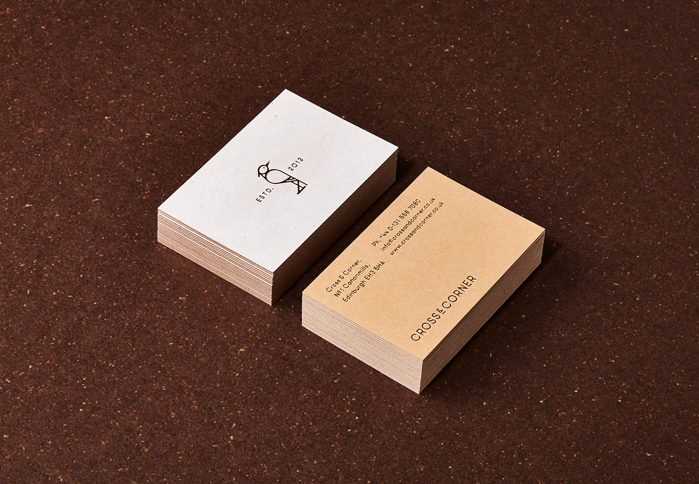
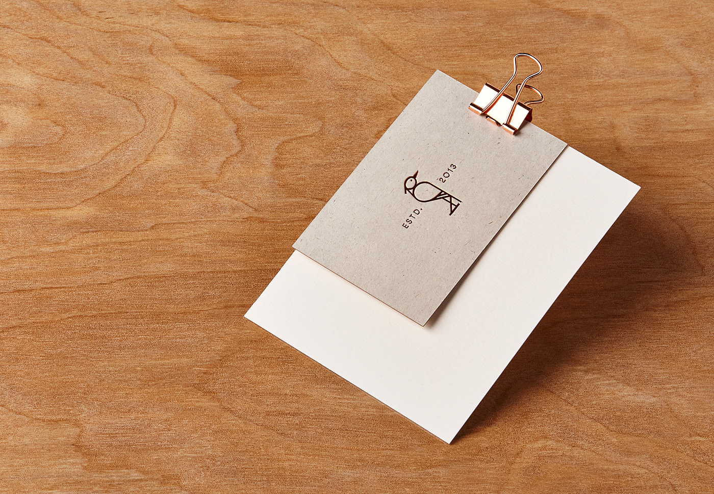
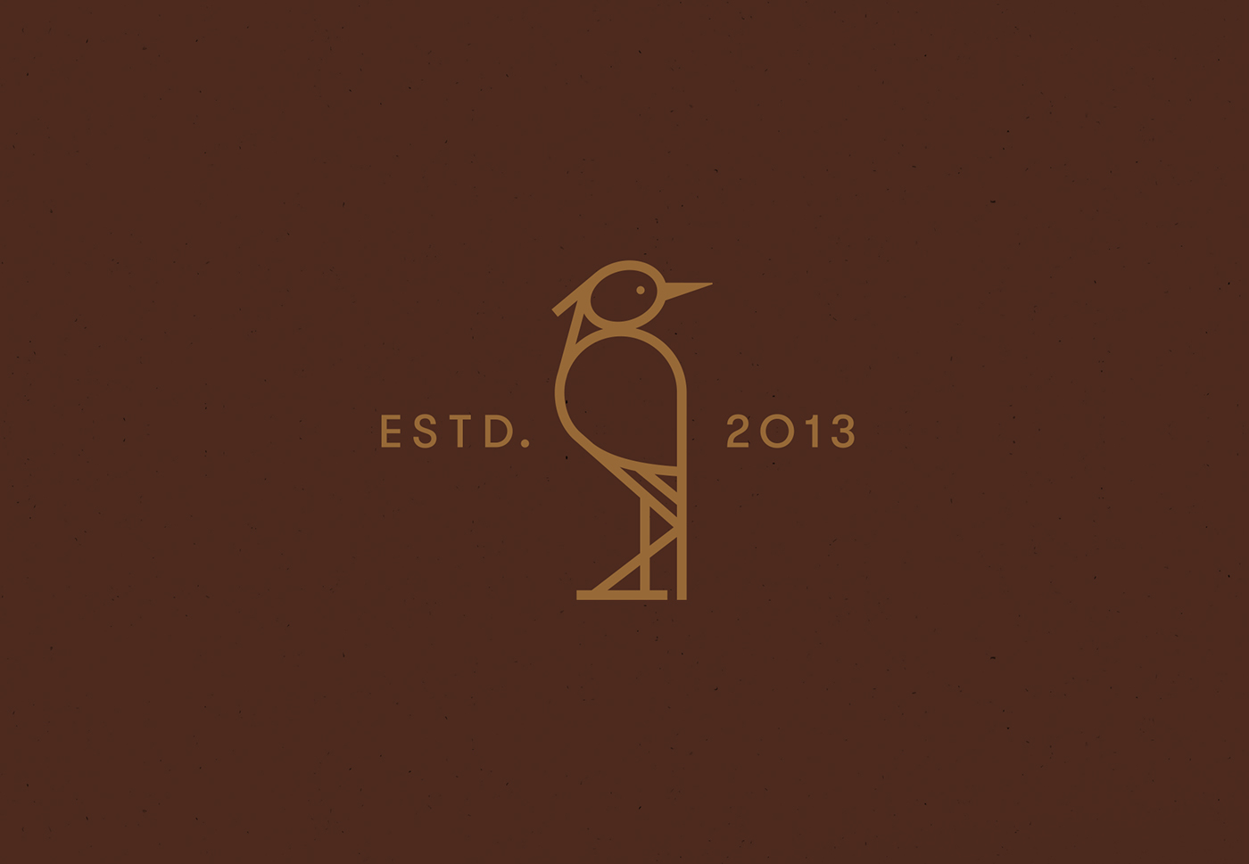
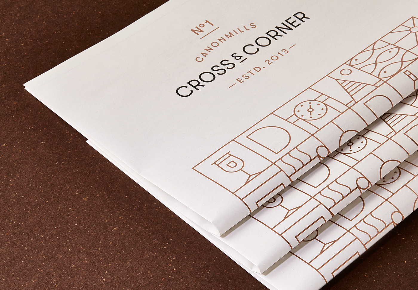
The first challenge was a change of name. Given the location (handily situated between a crossroad and street corner) we suggested Cross & Corner, a simple, ownable name that appealed to new and old customers alike. As a further nod to the venue’s location, we created a simple icon of a heron for the logo — a familiar and often spotted local from the nearby Water of Leith.
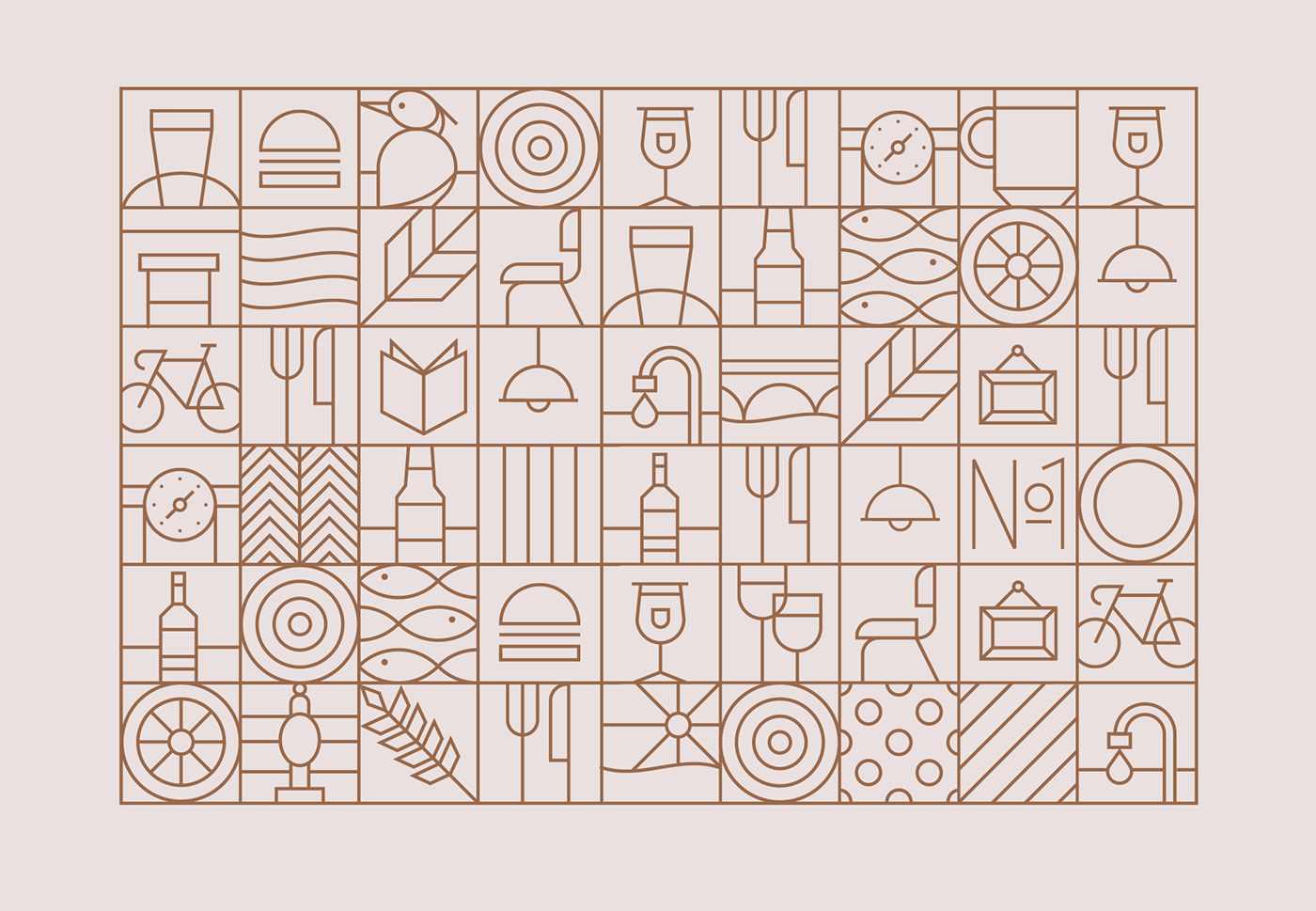
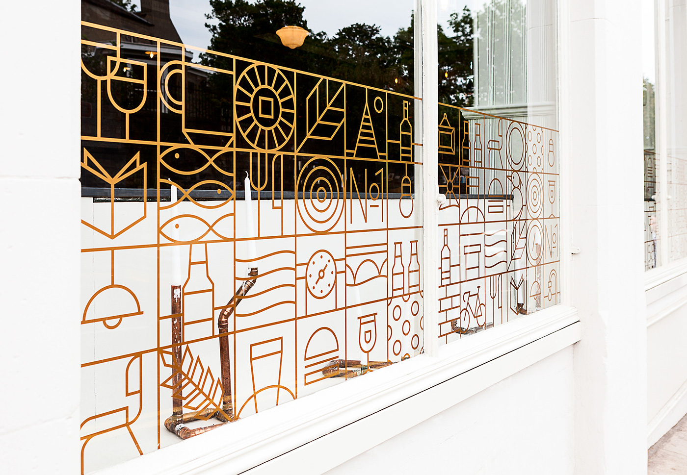
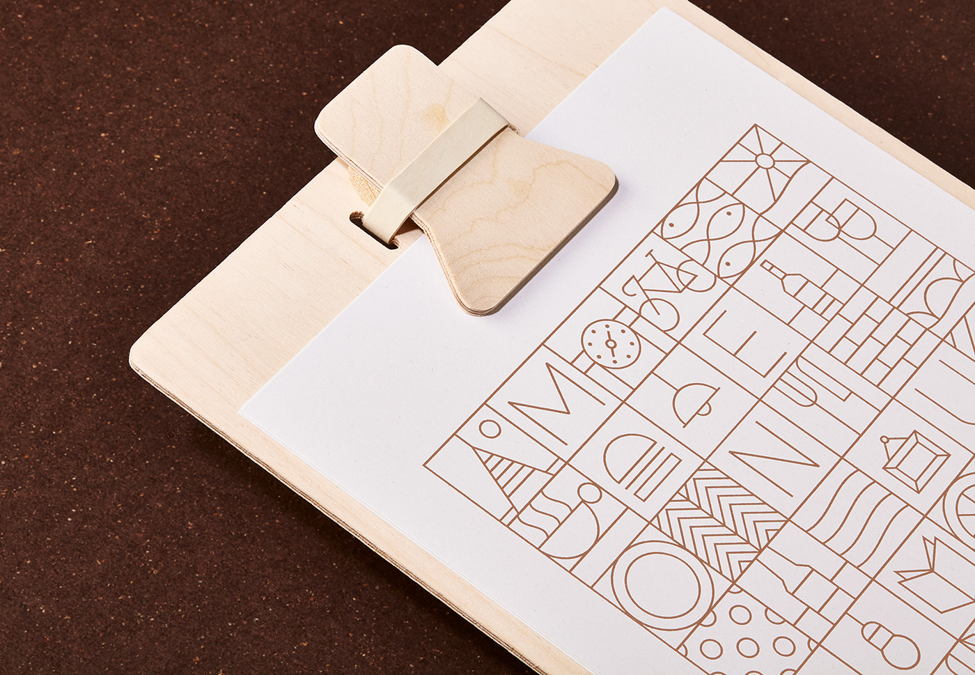
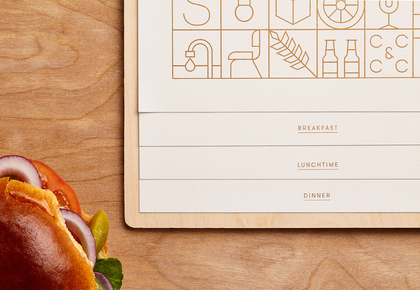
For items in-venue, we created a modular grid of icons inspired by the surrounding area, local community and what was on offer. These elements could be re-shuffled, re-arranged and re-scaled to work across a number of different applications.
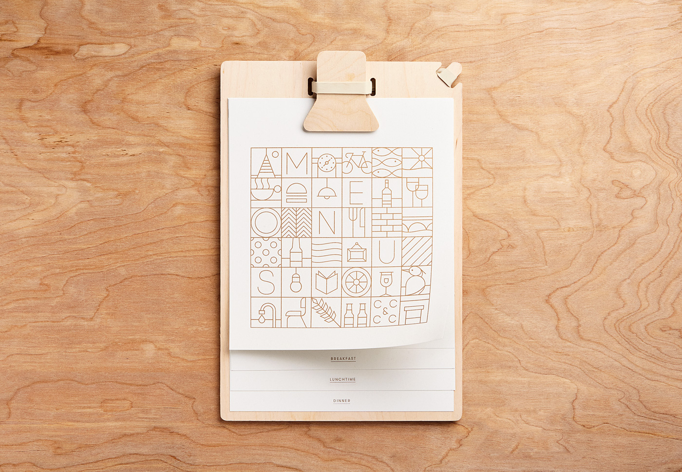
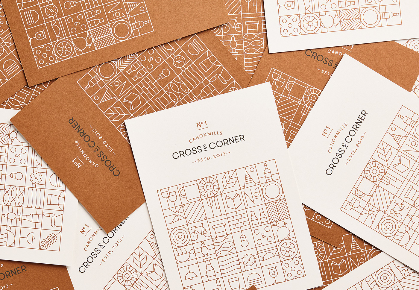
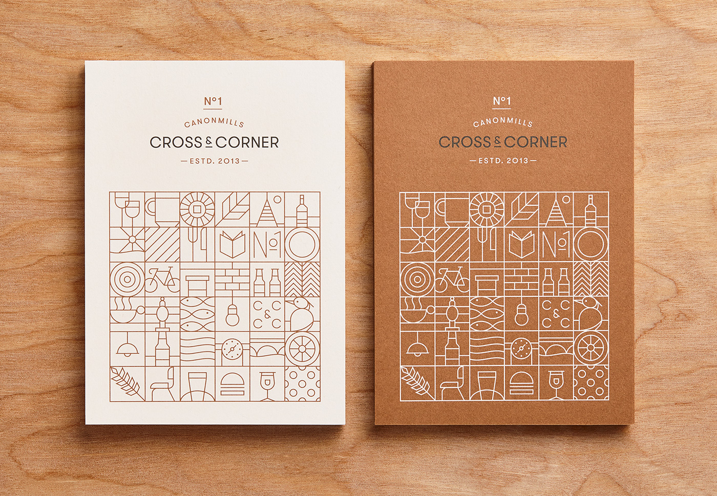
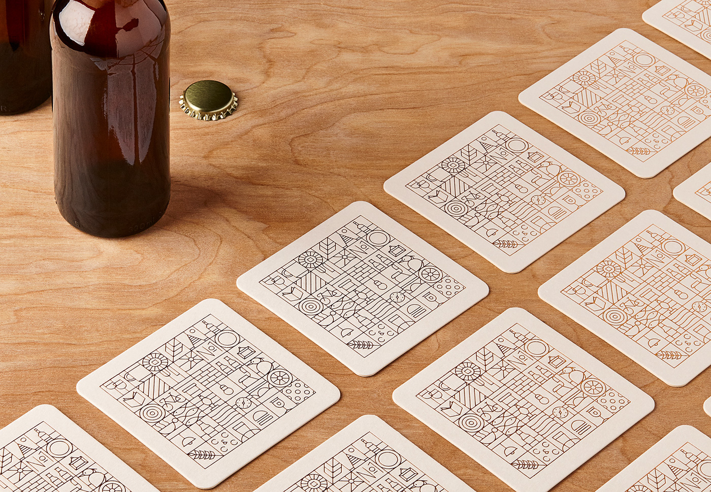
The contemporary style and simplified approach served as the perfect contrast to the eclectic interior design.