Elevating Holyrood Distillery's gin brand to brave new heights.
Working with the team at Holyrood Distillery we created and delivered the name,
brand identity, packaging and art direction for Height of Arrows — their much-
anticipated gin release.
anticipated gin release.


Having established a bold new direction for Holyrood’s refreshed brand home and inaugural cask programme, we were keen to roll out our thinking into the product
range, and when the opportunity arose to tell the story of their latest gin we were
inspired by their boundary-breaking approach.
range, and when the opportunity arose to tell the story of their latest gin we were
inspired by their boundary-breaking approach.
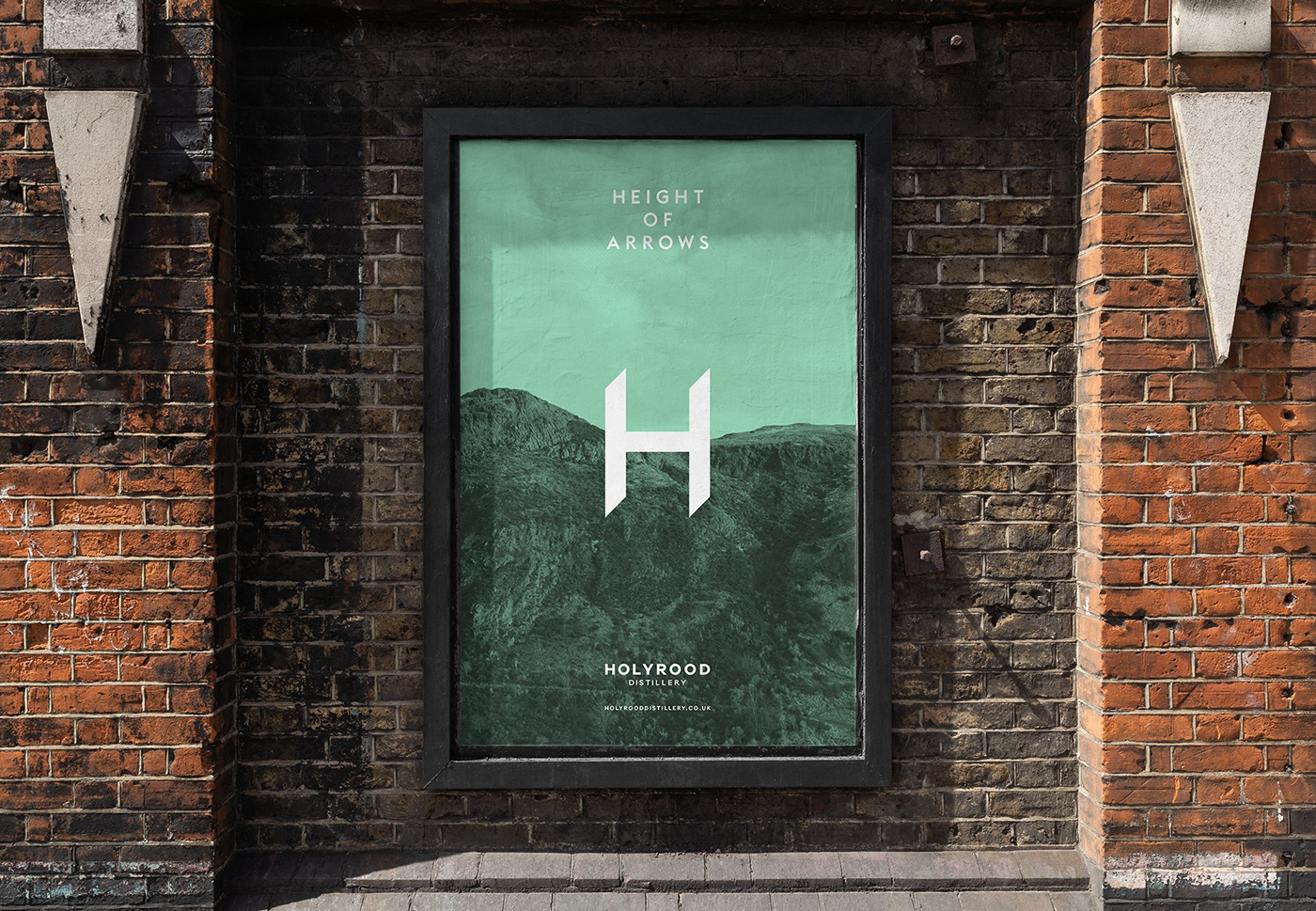
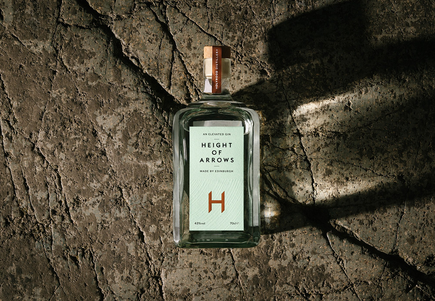
With a flavour profile, texture and mouthfeel that is evocative of a whisky drinking experience, Height of Arrows elevates gin to new levels, so we felt it appropriate to contrast a simple typographic approach with a layered emboss that references the volcanic rock formations found on Arthur’s Seat.

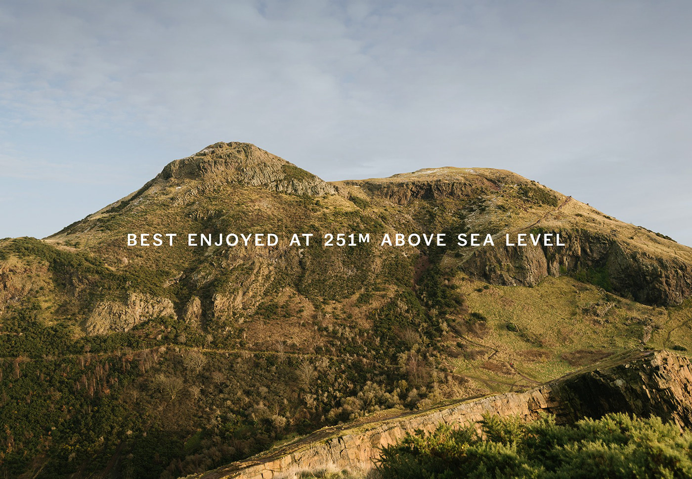

Why Height of Arrows? It’s a nod to Ard-na-Said, the Gaelic name for Arthur’s Seat,
which at 251m was said to be the maximum height an archer could fire an arrow.
Given the Holyrood team’s ambition to aim higher, not to mention their enviable location
in the dramatic shadows of this Edinburgh landmark, it felt right from the start.
Key to our brand work for Holyrood Distillery is a sense of place so we commissioned local photographer Murray Orr to capture a series of striking images on location at the
and on the slopes of Arthur’s Seat.