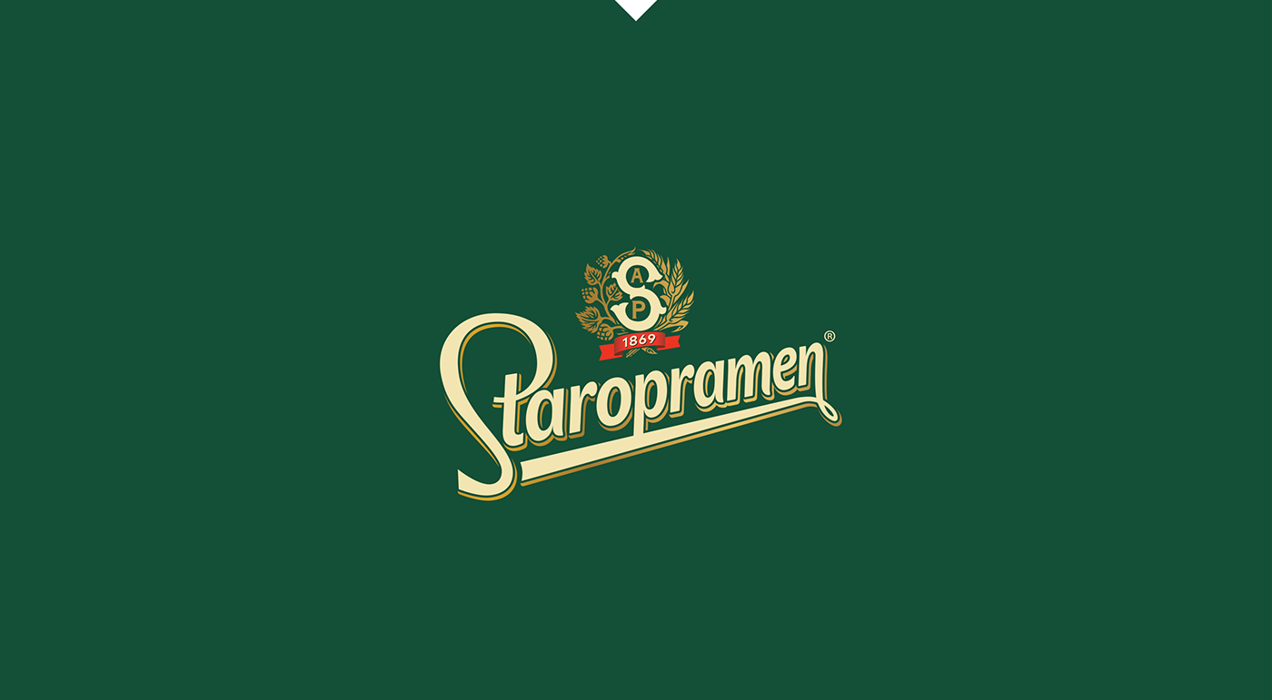

Branding Backwards: Staropramen
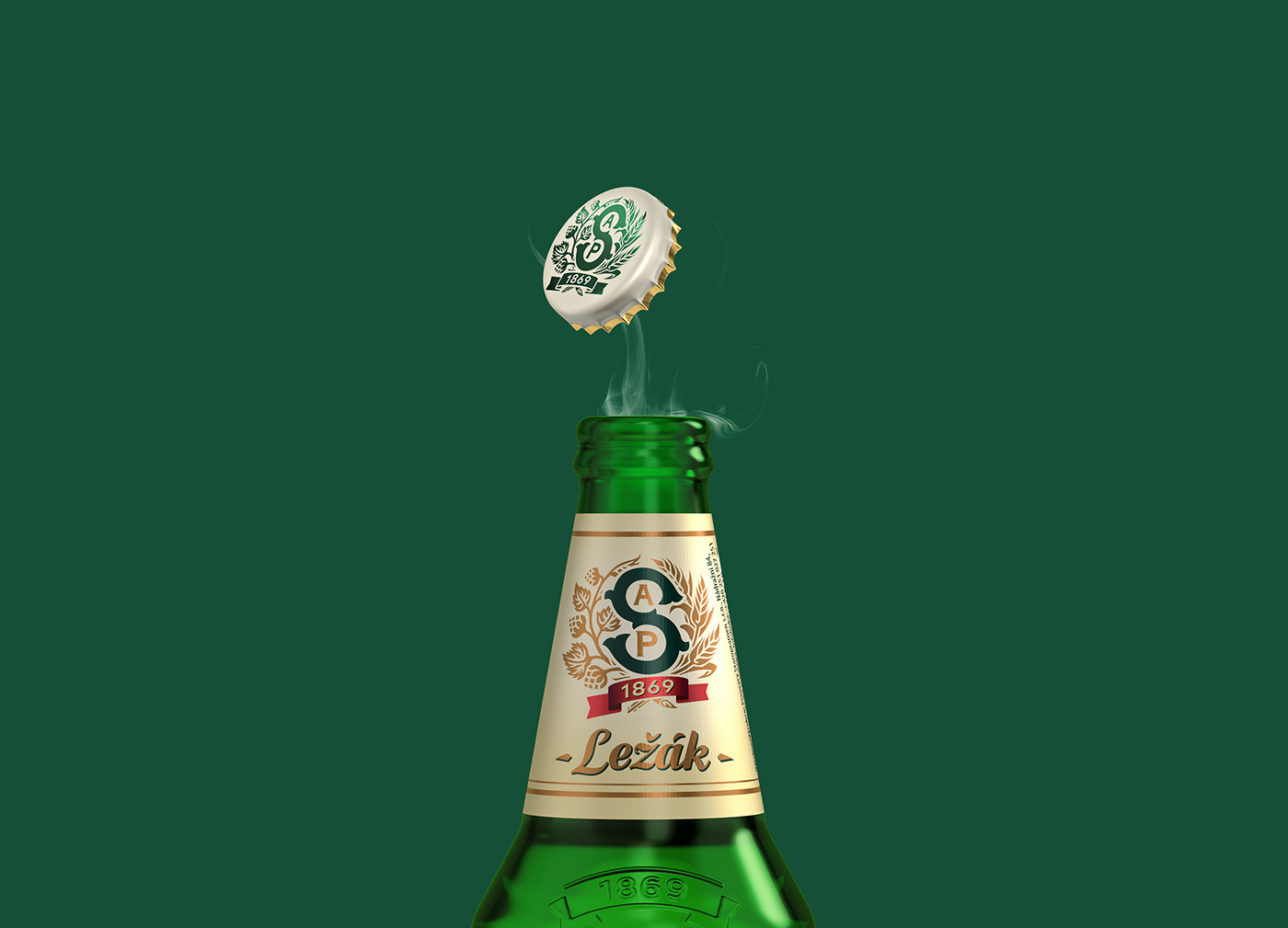
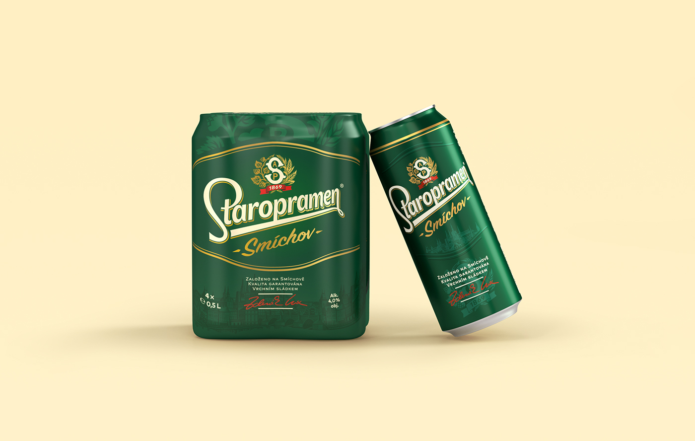
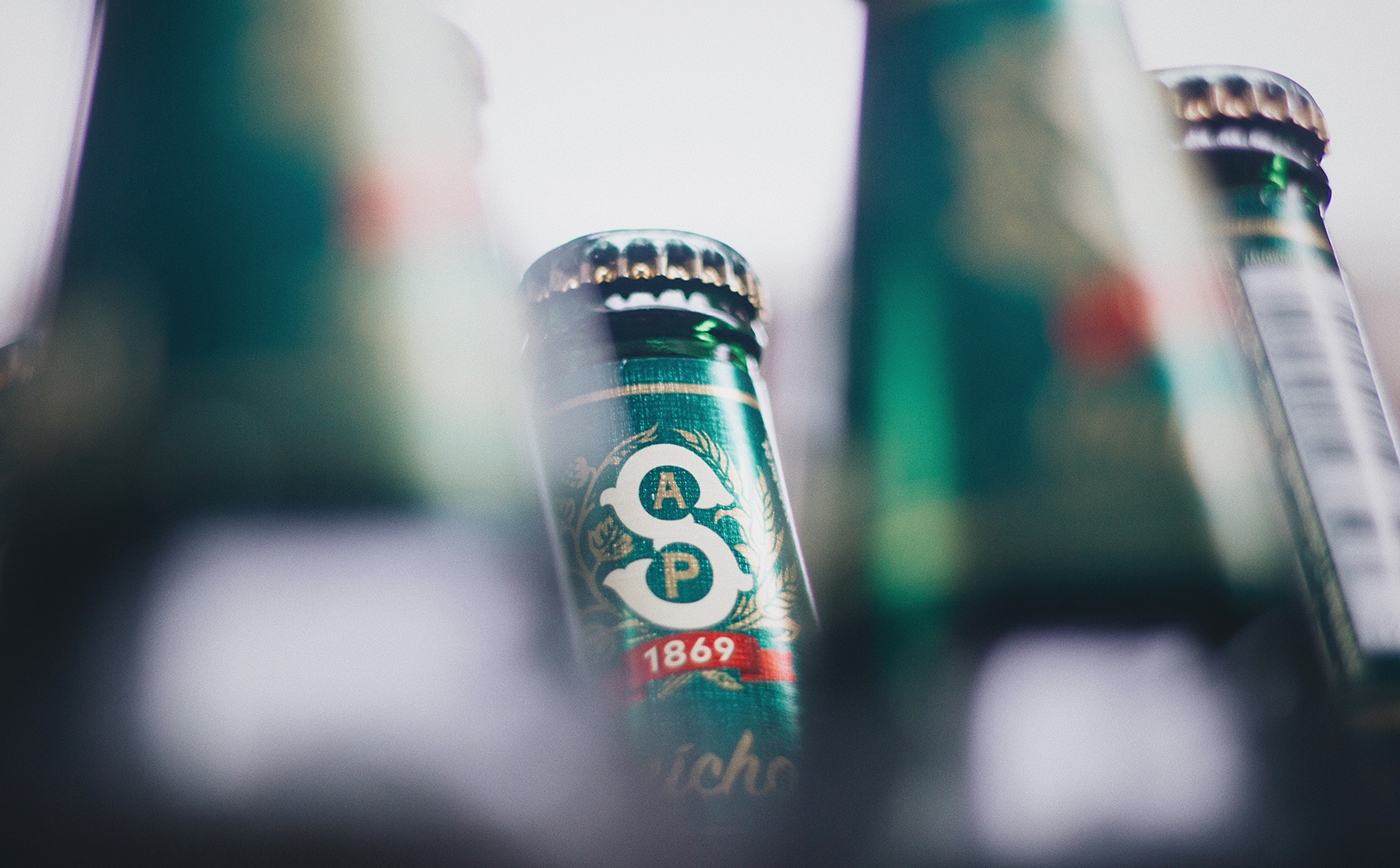
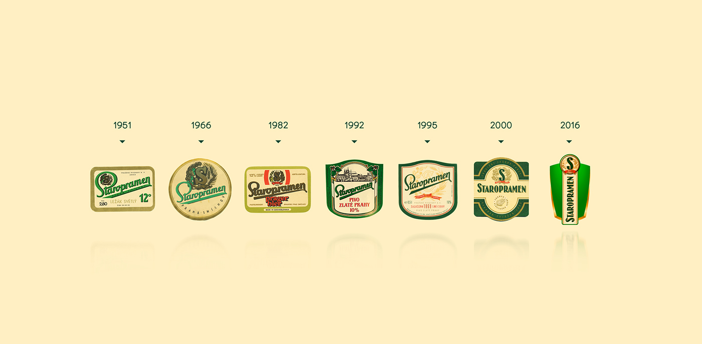
For the last 150 years, Staropramen has been brewed with passion in the Smíchov Quarter of Prague. For the past 15, we have worked with them to define a brand essence worthy of their traditional values. Today, we reach another finish line for an updated image that harkens back to its roots. Travel back in time with Staropramen and predict what the future could hold.
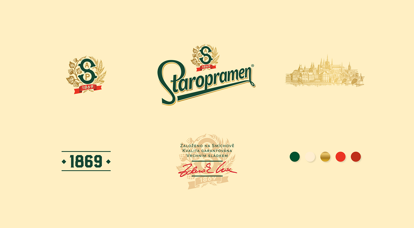
Our challenge was to give meaning to modern tradition. Staropramen holds tightly to their Czech heritage while welcoming the present day. The Smíchov area has changed quite a lot in the last century, but the essence of Staropramen’s recipe with quality ingredients has never disappeared. The brand is aligned with the future, yet never loses sight of their proud origins.
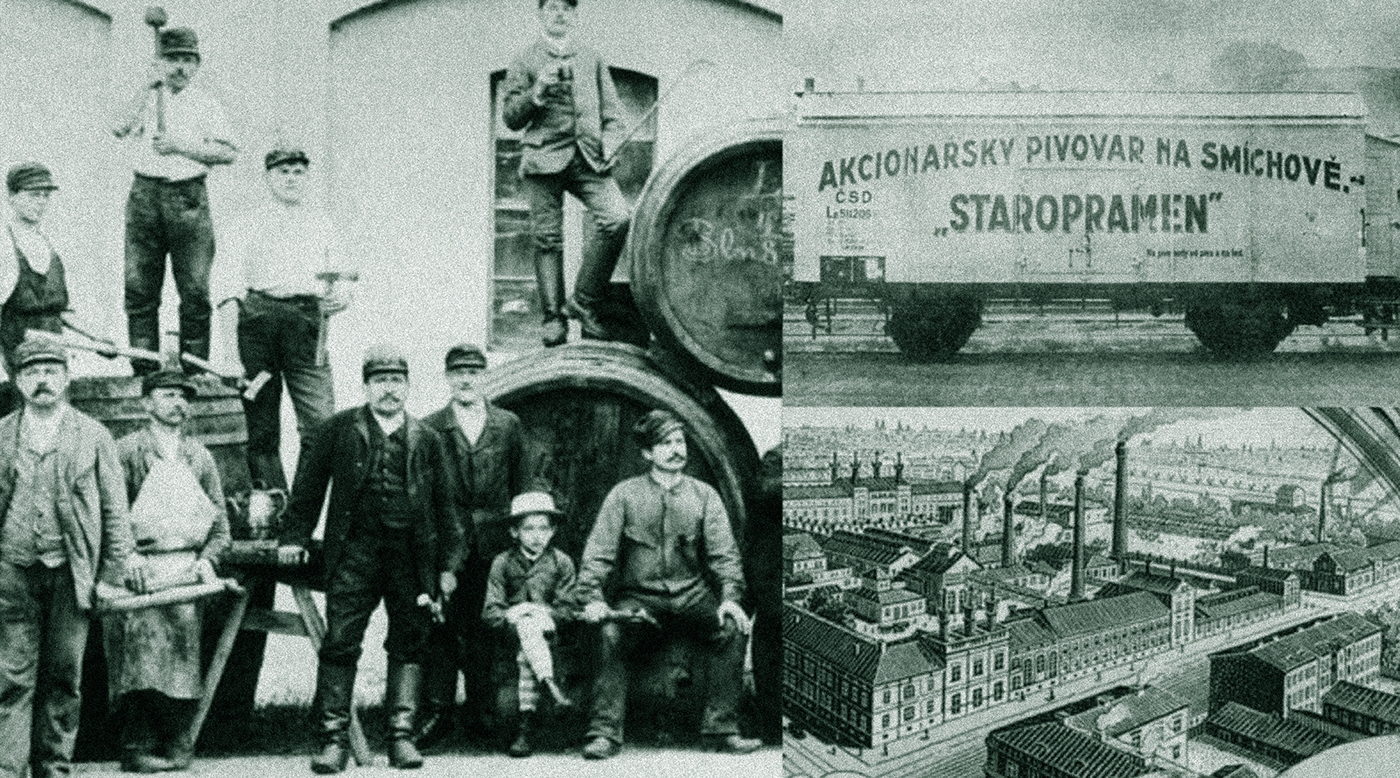
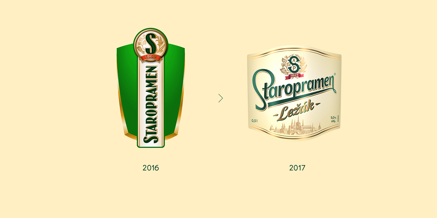
Staropramen unified their local and international identities by returning to key values such as a rich history of craftsmanship and proud ties to their Prague heritage. We enjoyed helping Staropramen honor the generations of dedicated brewmasters who have created a respectable name. Now, Staropramen beer is recognizable regardless of which country it is enjoyed in.