The 3 British Tenors
A Monogram - A Brand
When I was 17 I had the opportunity to study piano in a formal conservatory of music... since then, I have certain weakness for this kind of projects. From classical to popular, music has been my source of inspiration everytime I design. So you can imagine how happy I was when they told me they need a logo design for a trio of tenors in UK.
The project was very simple... they needed a monogram with the glyphs T3BT that had a classical spirit and at the same time a modern air. I did my best to take it further.
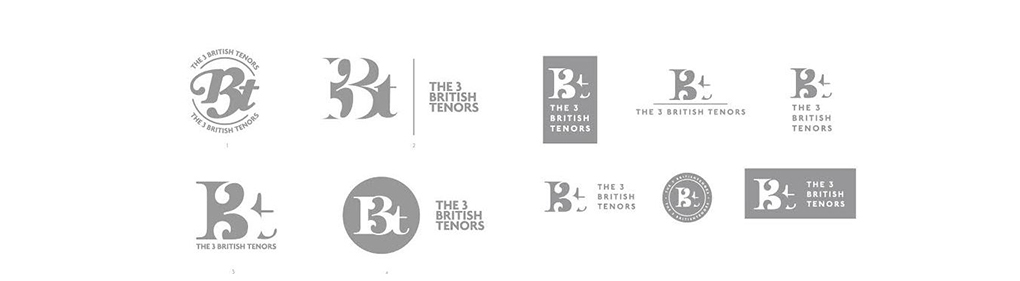
First approaches
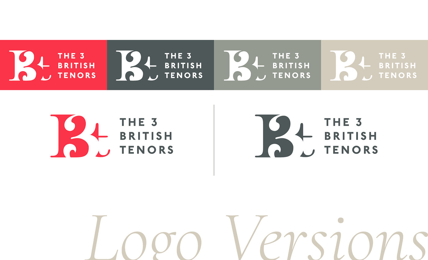


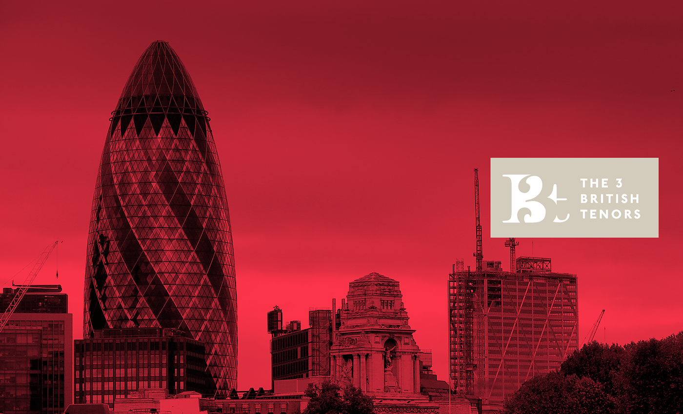
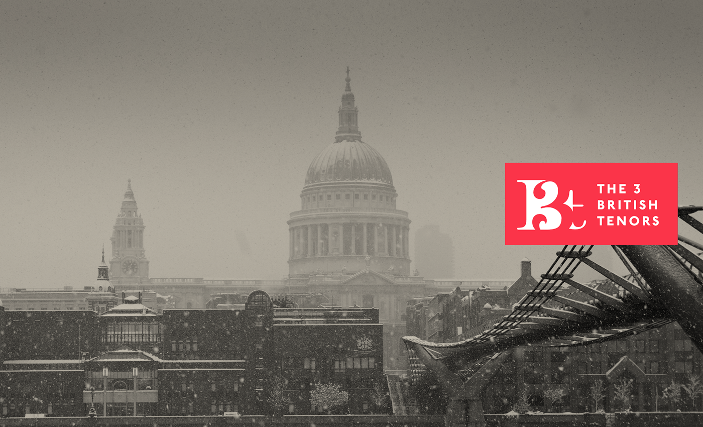
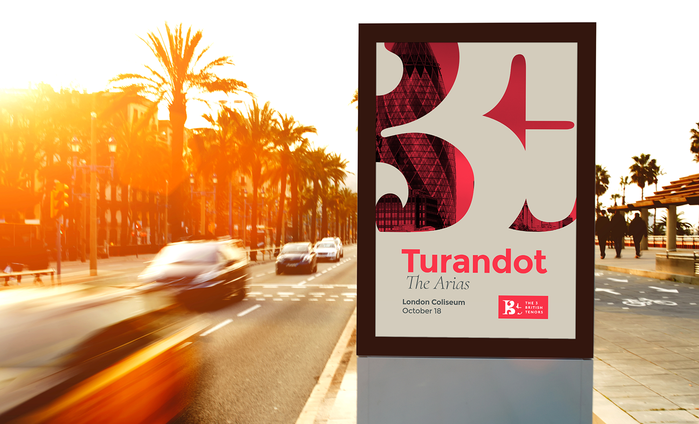
A neutral color pallete with a strong and emotional color. And on the other hand, a modern yet classical choice of Google Fonts combination that makes it easy to develop a Web Page in the future.