Hortis biro is a company whose core business is landscape architecture. The name of the company itself already represents the connection with nature; that is why the company sign we designed had to be something that also represented architectural design.
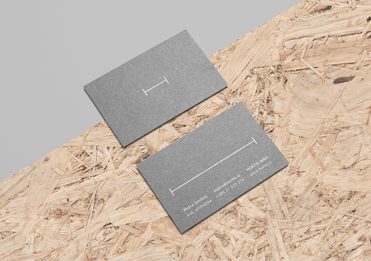
A sign which resembles the symbol of the length marking was formed from the letter H. With this sign, we want to emphasize the precision and, above all, the adaptability to customers’ desires since the logo in such form can be variable or adaptable too. The stretched letter H thus becomes the central recognizable element in all corporate materials.
Due to the creative nature of the company’s activities, we came up with various layouts of the corporate graphic design elements, where we can play with different lengths of the sign.