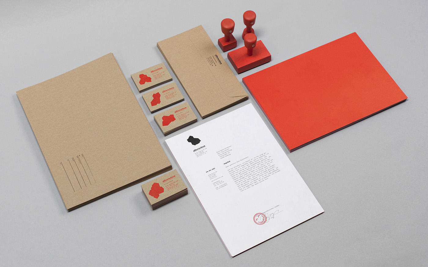
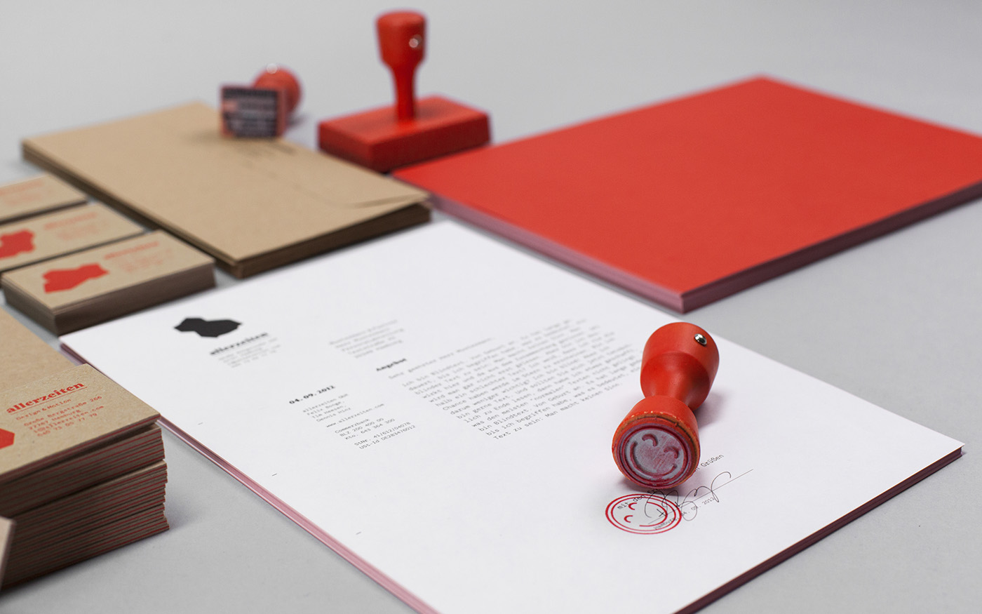
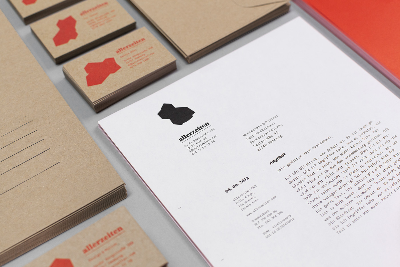
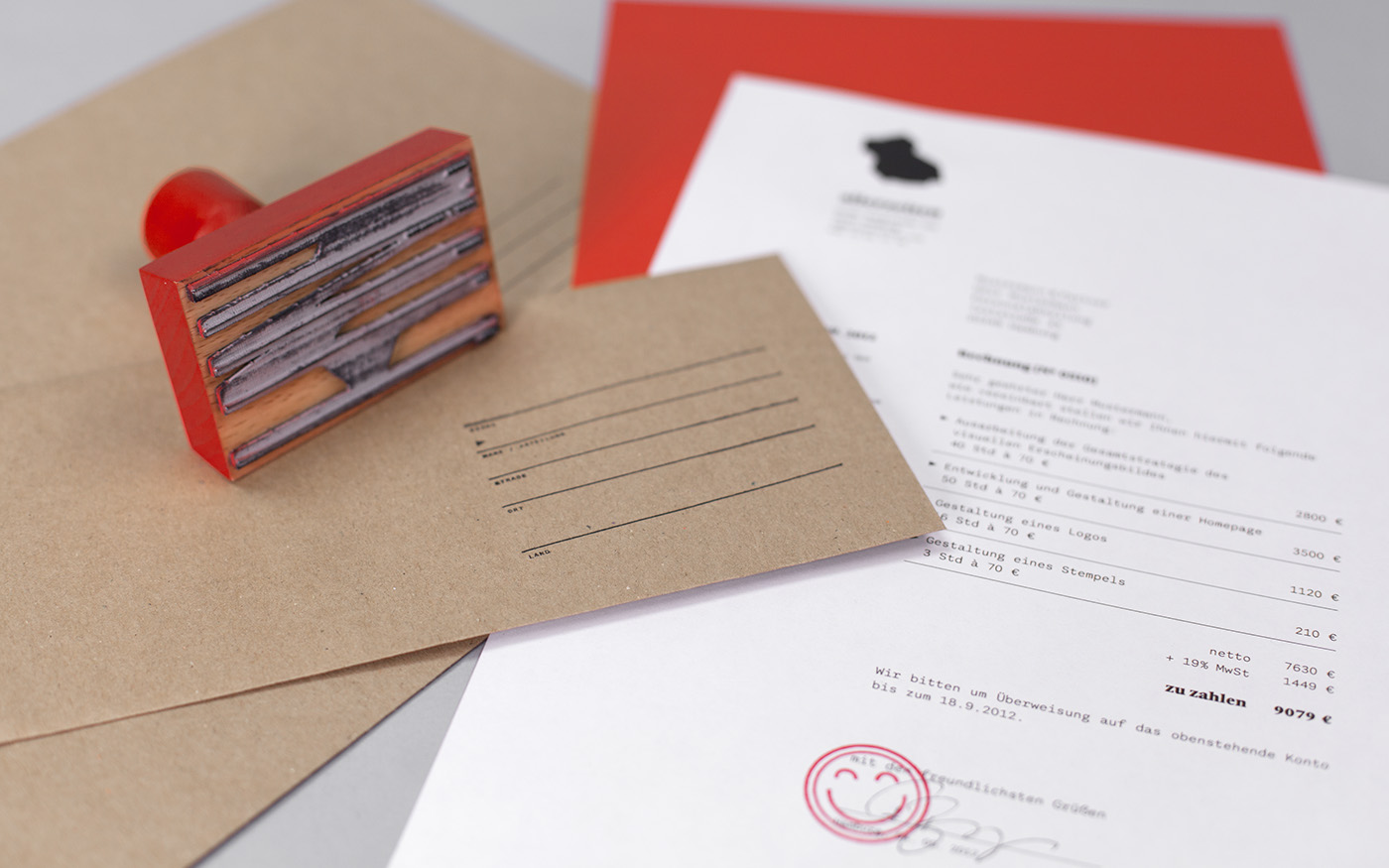
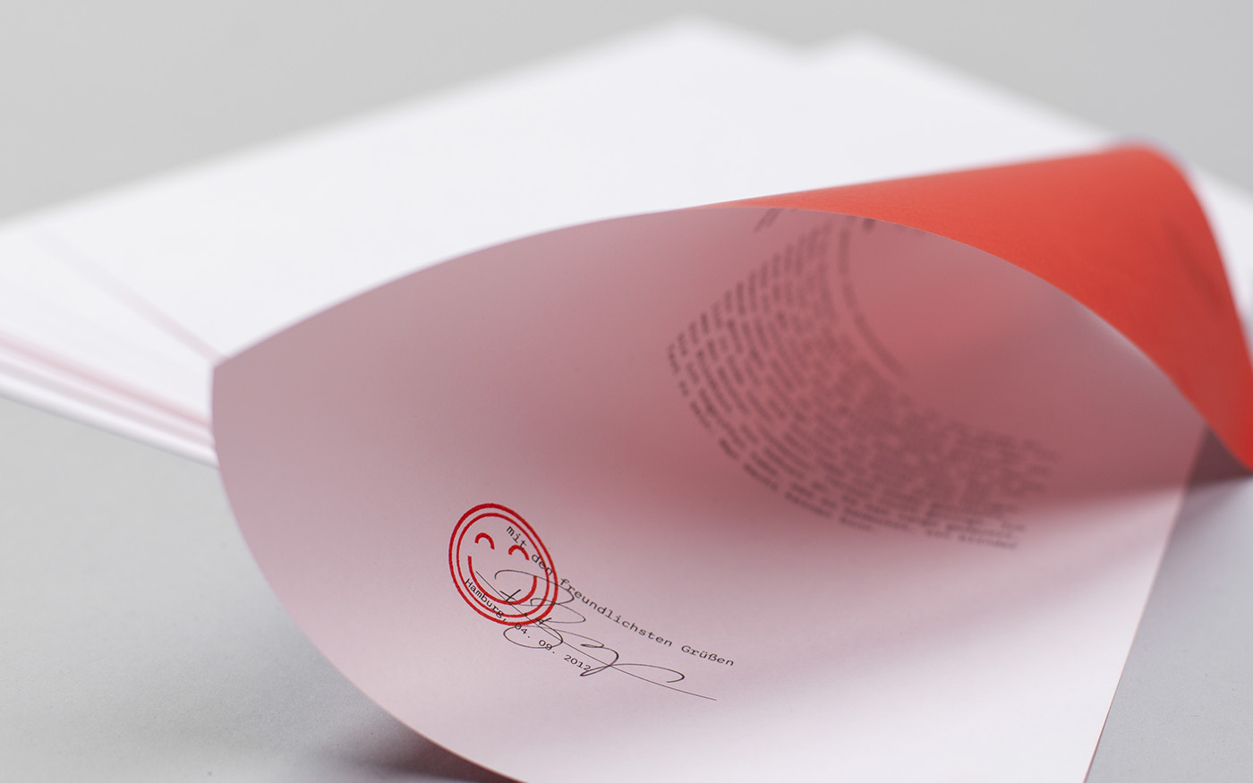
We designed our identity around our home-made typeface and a logo that transforms into a new shape every second unto eternity, containing of three crystalshapes that turn like the hands of a clock and orbit each other like the sun, the moon and the earth. The Logo and the website are programmed in HTML5. Apart from that, stamps and stationery are part of the total package, including hand-printed business cards.