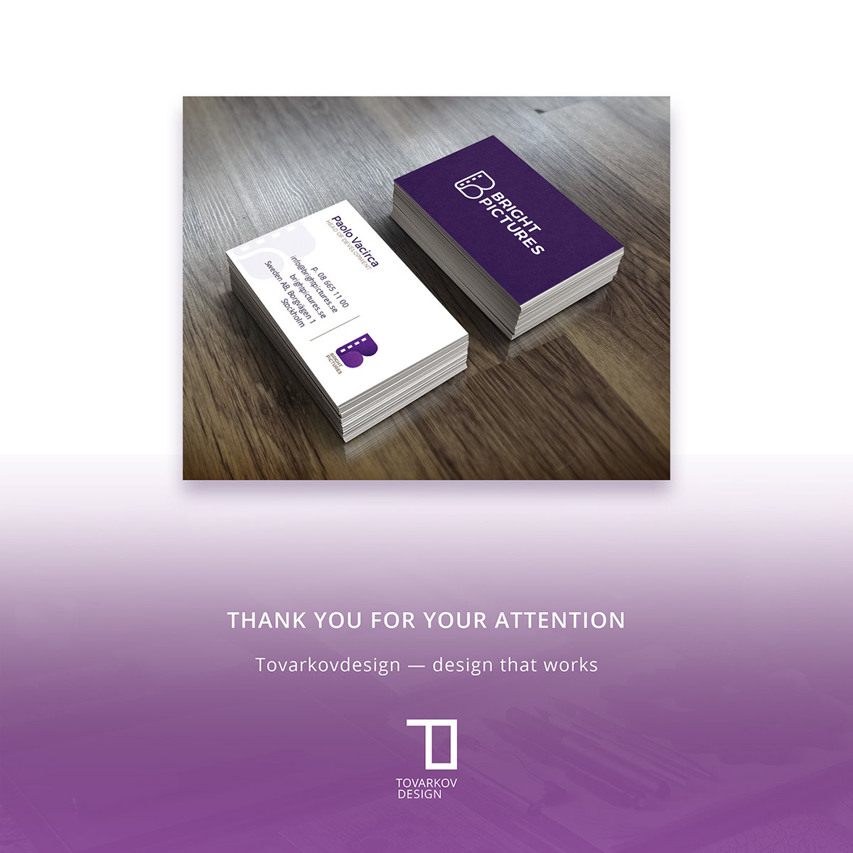
Bright Pictures is a Swedish production company for film and TV. They make series and feature films. Recently I have finished their logo redesign.

As the company is planning to expand into making more film and TV products they feel the old logo design must be updated. They wanted their new logo to feel completely new: “there are no elements from the old logo that we want to keep. ”
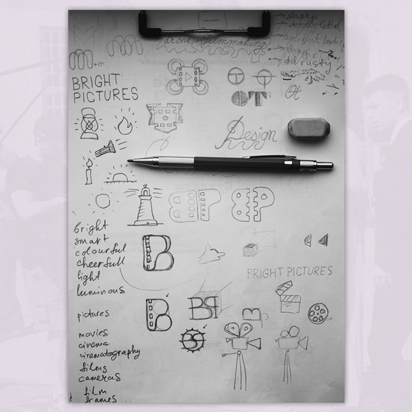
Ideation and sketching phase where I try to jot down any concept possible that might or might not work. This is an exploratory process so I'm trying just to generate as many variants as possible.
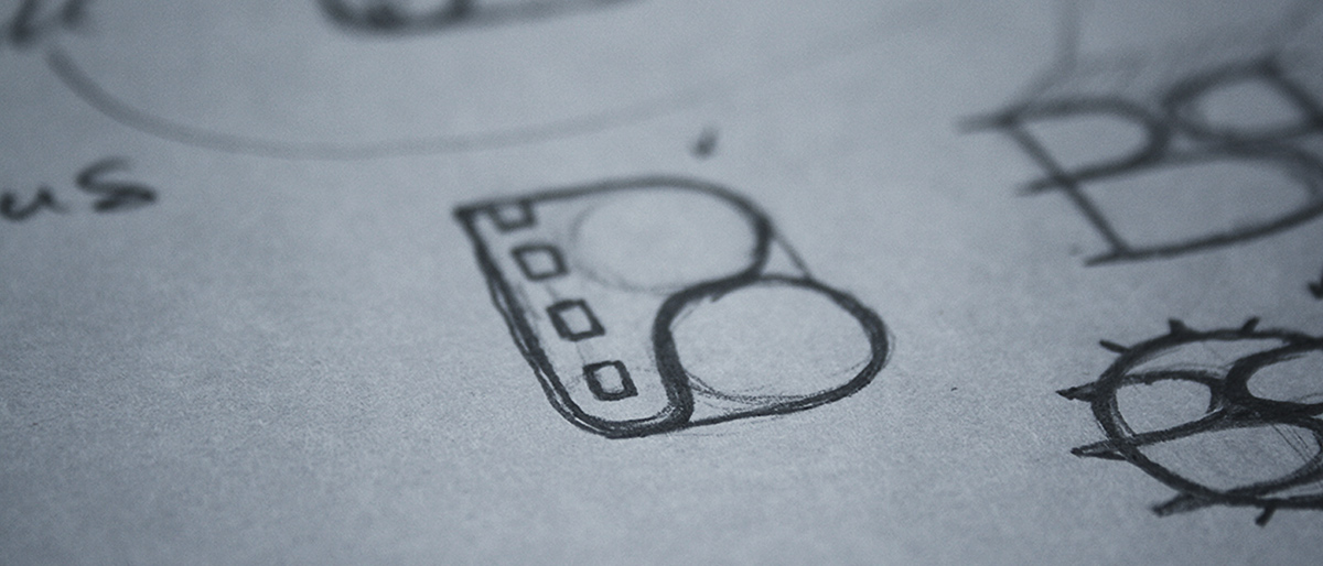
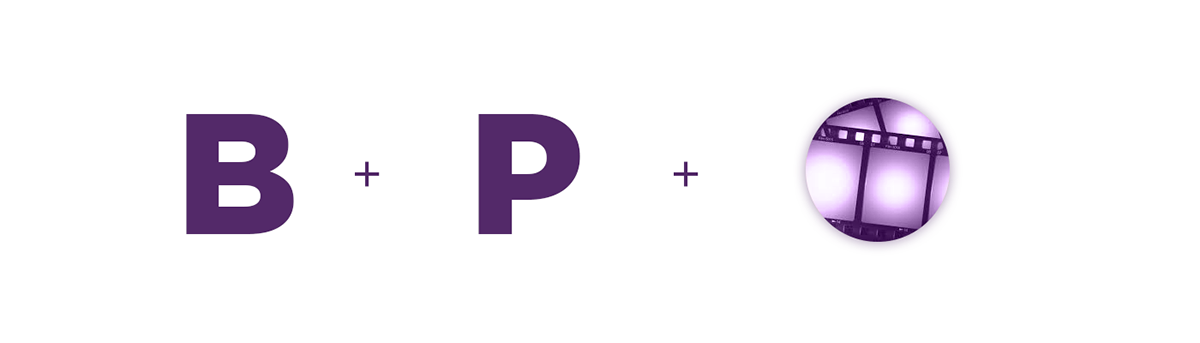
The logo concept represents iconic graphics of perforated film that forms interlocking initial letters B + P which stand for Bright Pictures and refer to a movie industry.
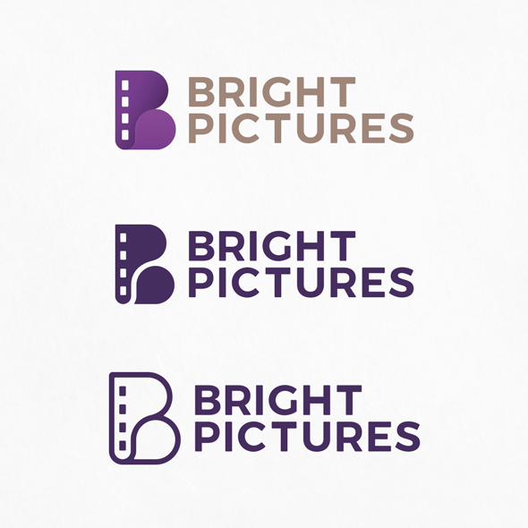
There are 3 variations to be used depending on the media and situation. The primary version will be used on screens and in colour printing, while two other simpler versions can be used when only monochrome printing is available, for hot foiling, blind impressions, and so on. The modular format of the logo allows using the icon on its own without a text. thus it can be used as favicon, app icon, or just icon for whatever purposes.
The violet colour was chosen since it is not used by the company “competitors”, it is fresh, modern, and at the same time professional.

Logo text represents aligned to the grid vertically stacked words “Bright Pictures” all capital letters. Logomark and logo text are aligned to the grid with the width of a letter I as a measurement unit.