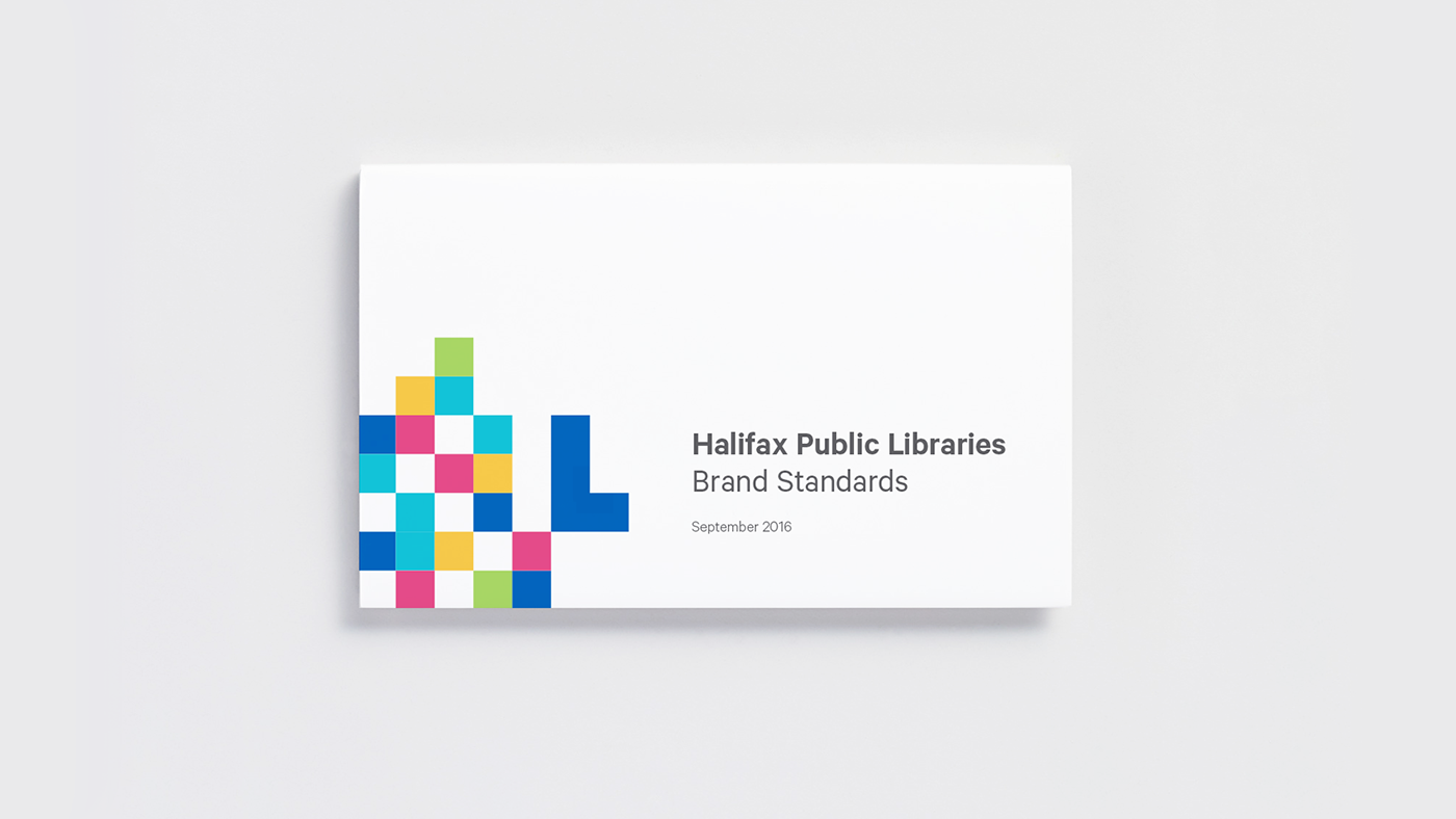
The library, as we know it, is experiencing an evolution. It is no longer a quiet place for study. It's a dynamic space that thrives on progress and is shaped by its community.
Symbolism
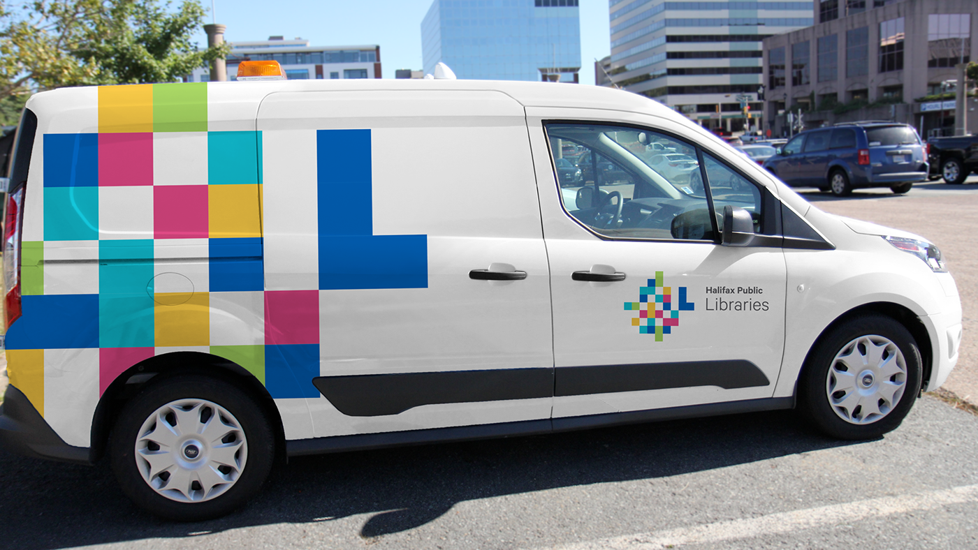
The logo combines fourteen monolithic els, representing each of the branches, woven together as a family. The el stands upward and forward as a beacon of the Library, held up and supported by its community.
The logo combines fourteen monolithic els, representing each of the branches, woven together as a family. The el stands upward and forward as a beacon of the Library, held up and supported by its community.
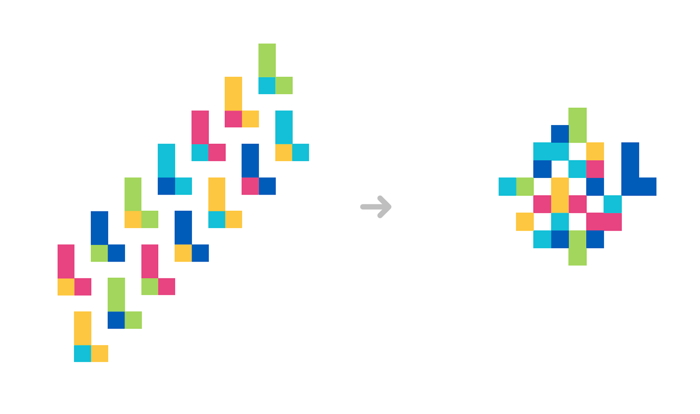


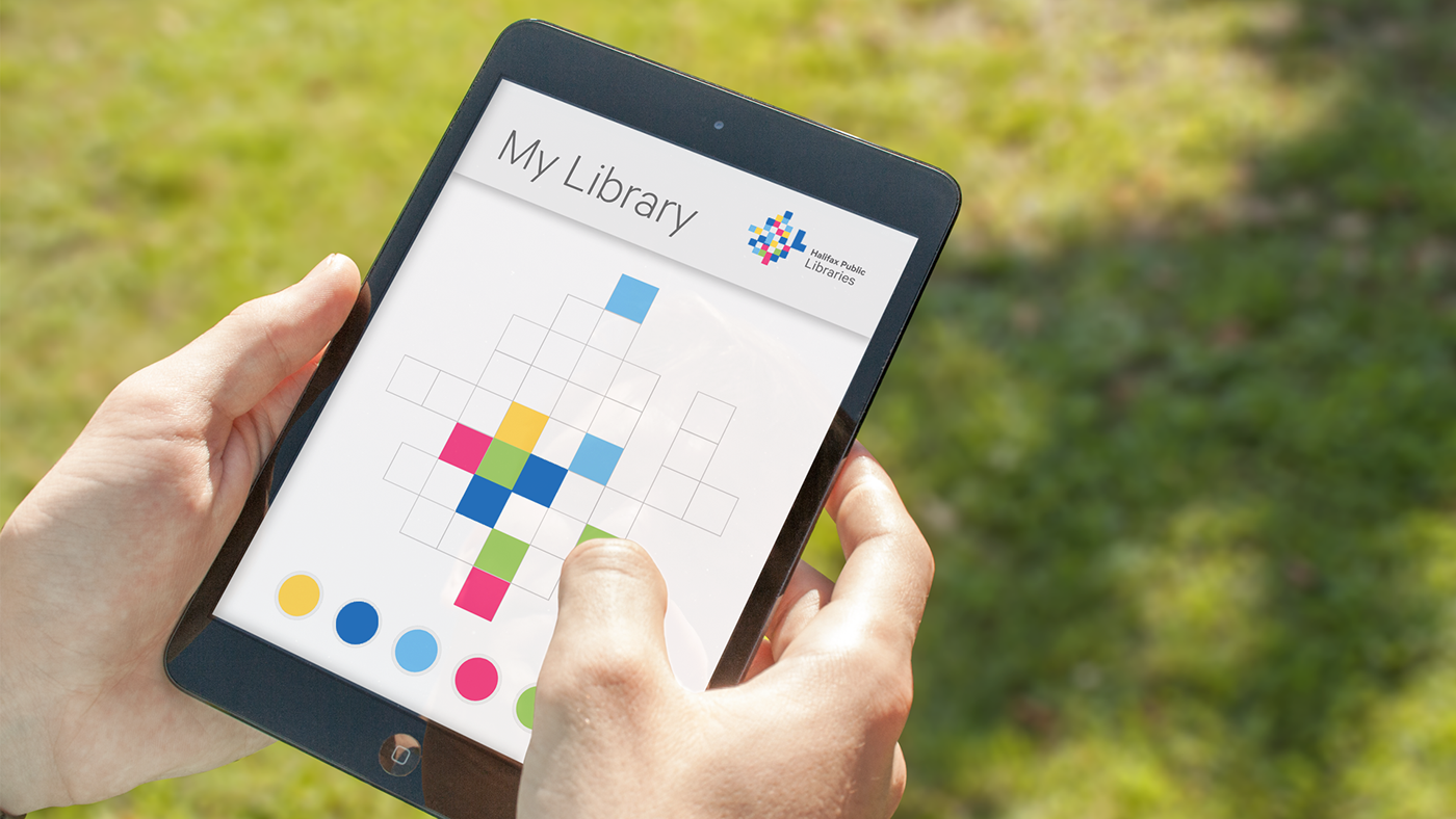
Like an octopus, the logo adapts to its surroundings becoming as quiet or as vivid as needed, infinitely adaptable in colour and in form.


Paper & Pixels
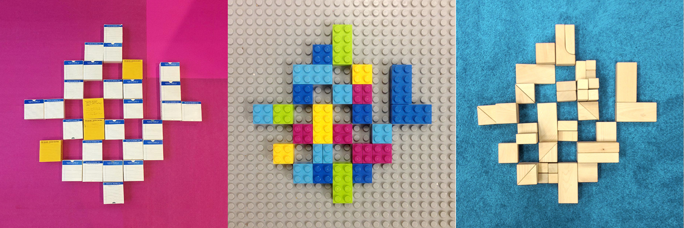
The concept embraces tradition and technology; handcrafted and digital, past and future woven together – the experience of reading a book versus surfing the web.
The concept embraces tradition and technology; handcrafted and digital, past and future woven together – the experience of reading a book versus surfing the web.


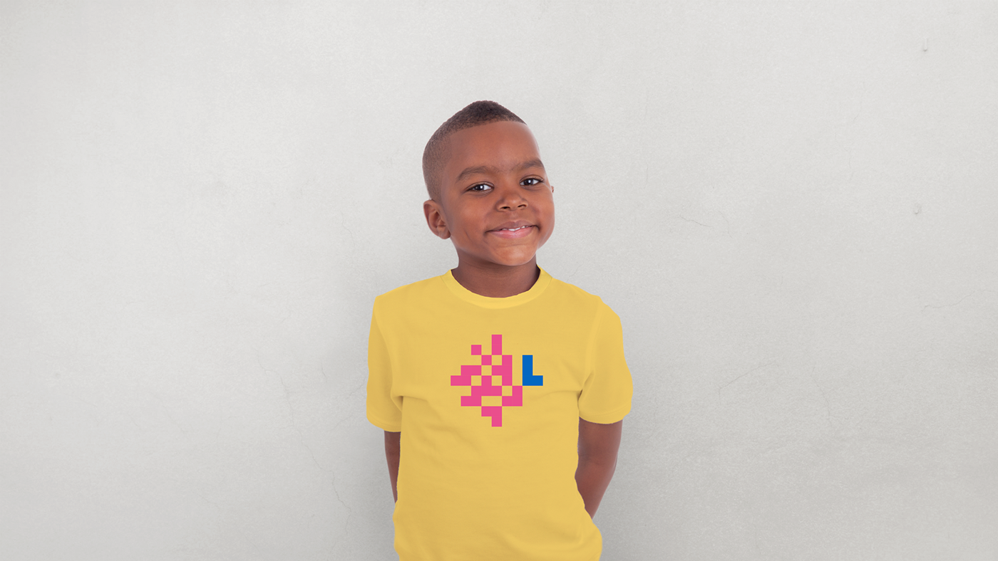
By reflecting the needs of a diverse community, the new identity shows there really is a space for everyone at Halifax Public Libraries.

Social Media responses after public launch
Video Credits
Creative Direction: Breakhouse
Video Production: Accomplice Content Supply Co.
Original Music: Village Sound
Voice: Erin Costelo
Photos (in order of appearance):
El Jones, Municipal Poet Laureate, 2013-2015
Reverend Dr. Rhonda Britton, Cornwallis Street Baptist Church
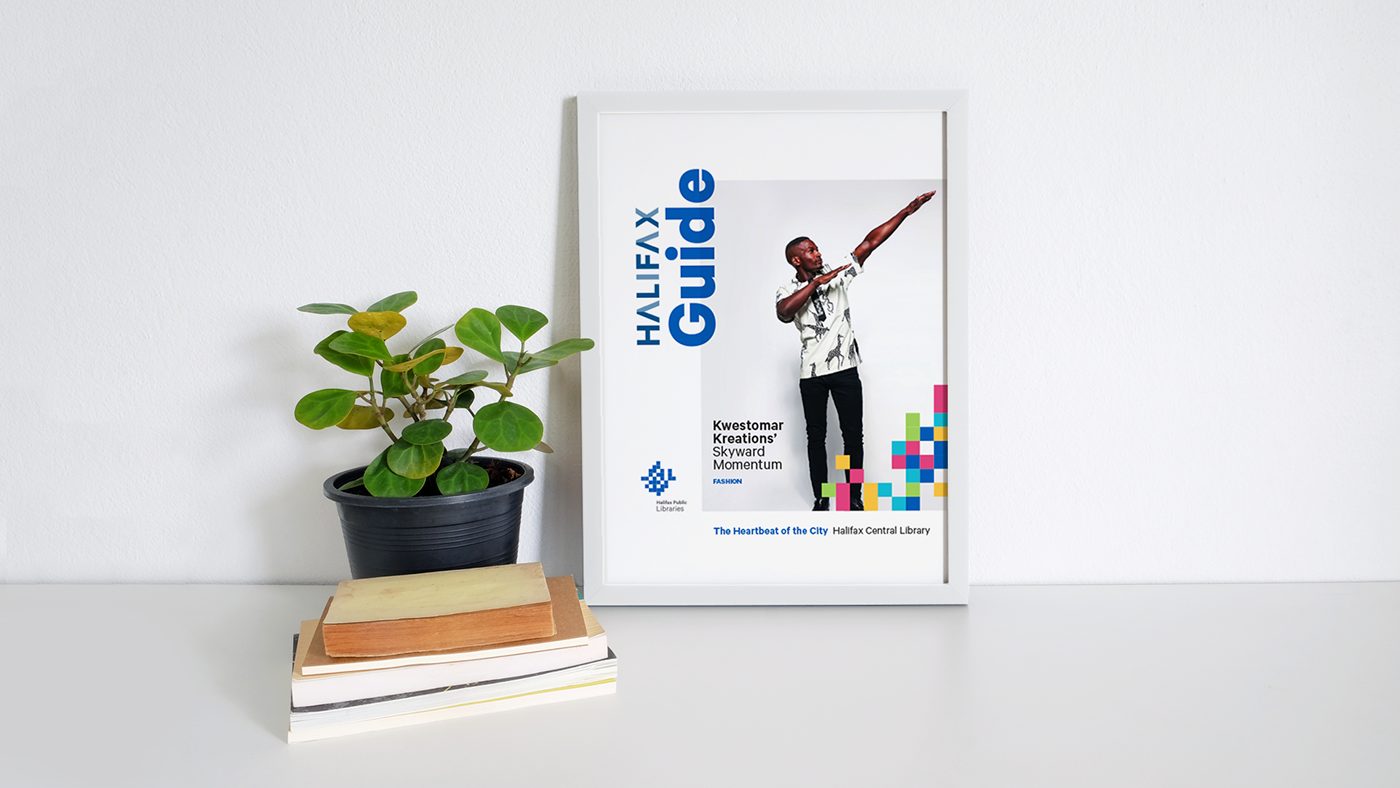
Kwestomar Kreations (Model: Carl Mopoho, Design: Esi Adokowa Aidoo, Clothing: Adzedu of Shapes,
Photography: Click Productions)
Wanda Robson, sister of Viola Desmond
Communications Nova Scotia
El Jones, Municipal Poet Laureate, 2013-2015
Reverend Dr. Rhonda Britton, Cornwallis Street Baptist Church
Kwestomar Kreations (Model: Carl Mopoho, Design: Esi Adokowa Aidoo, Clothing: Adzedu of Shapes,
Photography: Click Productions)
Wanda Robson, sister of Viola Desmond
Communications Nova Scotia
Coming Soon:
Halifax Central Library Signage
Halifax Central Library Signage
Applied Arts Award (2017)
Logo & Brand Identity Design
Logo & Brand Identity Design