


Soyon Branding.
The challenge
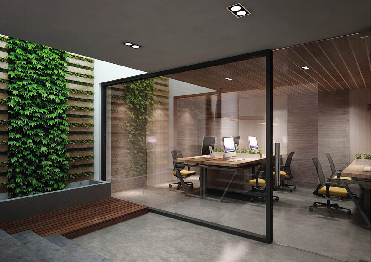
Initially, Soyon was a separate design execution entity of an Australian marketing strategy consulting firm, Helvalis. After its spin-off from Helvalis, Soyon expanded its services to become an independently owned property branding agency, and shortly after opened its first overseas office in Ho Chi Minh City. This service and geographic expansion required a new visual identity that current and new team members, suppliers, new and existing clients could identify.
The new visual identity had to be appealing to the Asian as well as the Australian markets. It had to be light and soft like the pronunciation of its name; it had to be noticeable and proud when standing on its own, yet humble enough to ensure it didn’t overpower clients’ identities and designs when standing side by side.
The insight
The company’s name, Soyon, was originally derived from the Korean name So-Yeong, meaning rising sun. Its initial wordmark logo was designed based on a customised Adobe Garamond font.
The solution
Paying homage to the new location in Vietnam, I took inspiration from the energetic, curious, and uniquely Vietnamese sight of school children walking to school – the white Ao Dai uniforms gracefully floating in the air, with the sunlight of the rising sun dappling around the silhouettes. The logo mark is a stylised representation of the letter S, the flowing Ao Dai and the rising sun. The font retained its serifs and y axis width, yet its shape was stylised to improve the optical balance and to emphasize the contrast of the stem and spire vs the shoulder and descender. The serifs were adjusted to create a sense of lightness, much like the Ao Dai waving in the air.


Designer: Hoà Lương + Animation: Ngọc Phạm


