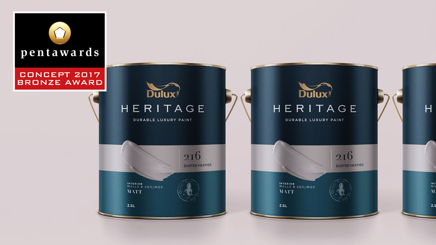
Heritage, Revived.
CONCEPT: DULUX Heritage Packaging Design (personal work)
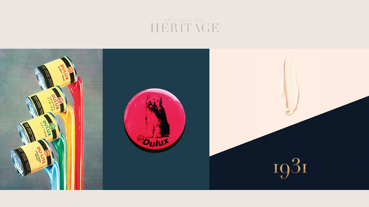
Curated by in-house colourists, DULUX Heritage is a range of 112 classic shades available in 7 different finishes. DULUX Hertiage is marketed in the range of DULUX Trade: the professional range of paint trusted by tradesmen for its high-end quality and ease of application, and is recognized by its silver packaging design (to convey expertise).
However, times have changed and interior decoration and painting is no longer the sole domain of tradesmen and professionals. With this market insight, I created a packaging concept that appeals to consumers searching for high-end quality paint in beautiful classic shades (rather than purely functional aspects).
True to the meaning of the word “heritage”, this design borrows from the brand’s visual equity, and pays homage to the original 1930’s pack design by updating the 2 bands running across the can. Antique Gold and Prussian Blue combine to create a timeless and luxurious look, and become the complimentary backdrop to enhance the paint colour ‘swatch’ and the ‘finish-type’ identification colour. Crucially, Prussian Blue is also a direct equity link to the blue of the DULUX Master Brand.
There are 7 types of finish. Each finish type is an individually colour-coded band (around the can) for easier consumer navigation through the range.
When combined with the Brand Colour, and the paint swatch on the packaging, it creates an elegant and playful combitation of colours.
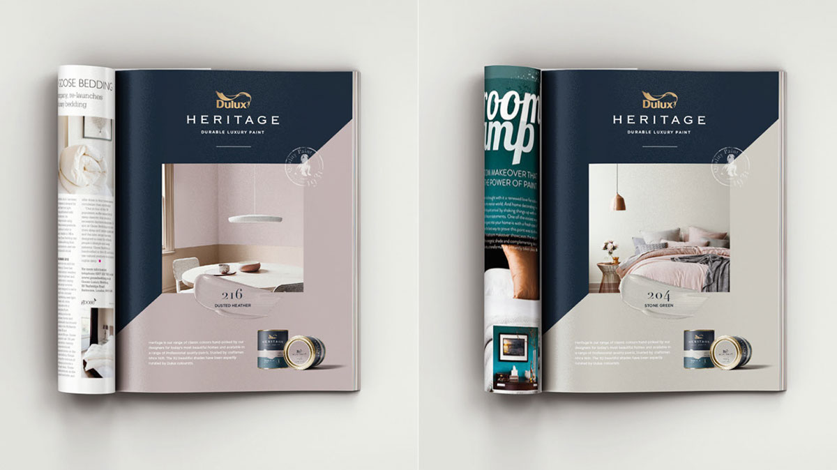
Merging the playful spontaneity of the brands “Let’s colour” ethos, and its classic beauty of its Heritage range, the traditional colour swatch (to indicate the colour of the paint) is re-imagined as a boldly confident and spontaneously playful lick of paint. This lick of paint echoes and reinforces the DULUX brand tagline: “Let’s Colour”. The DULUX Dog icon is designed into a ‘quality–seal’ to enhance credibility to the range, and elevates this timeless icon.


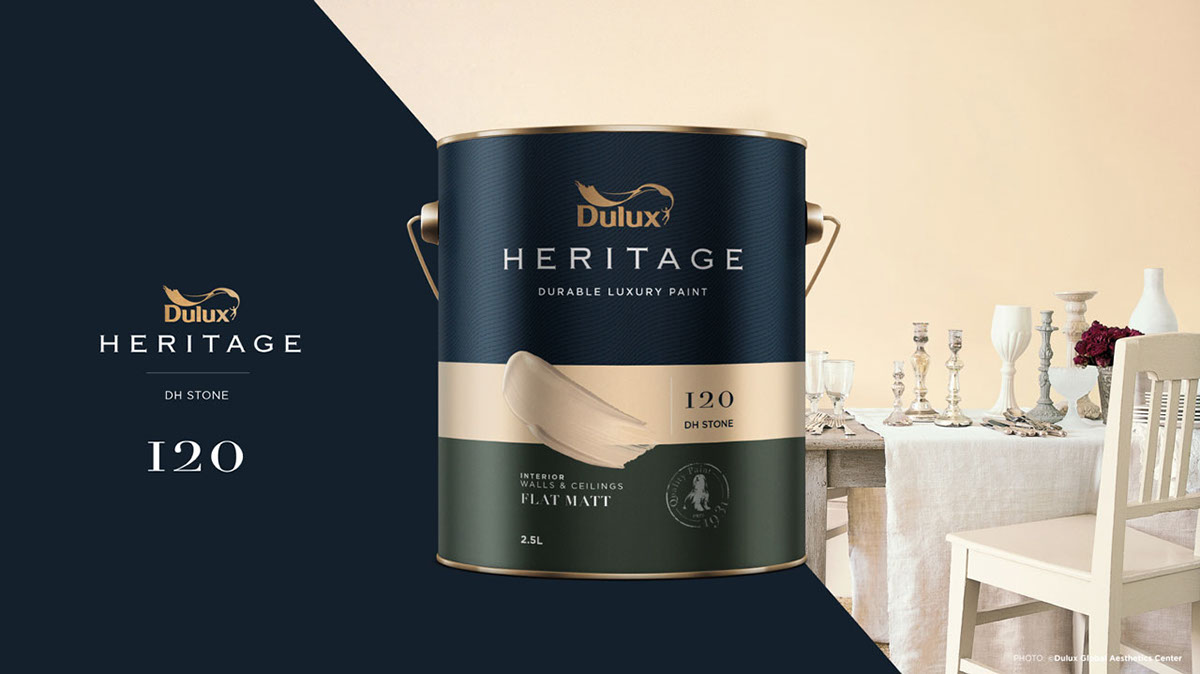
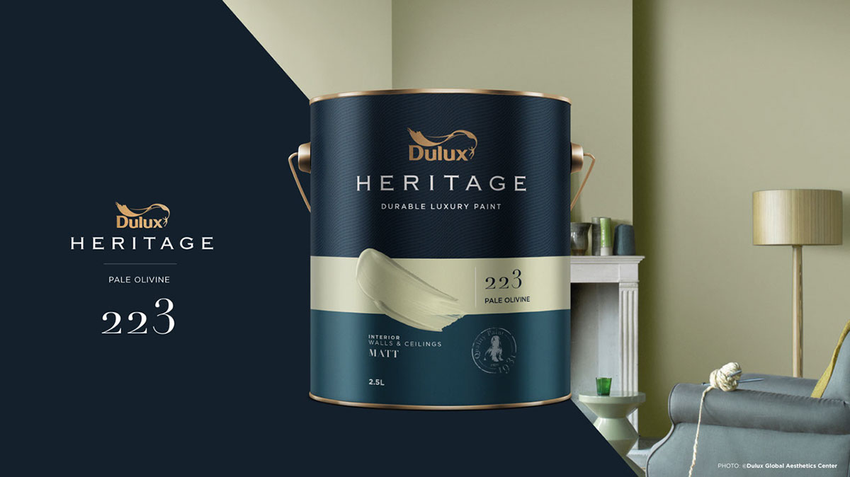


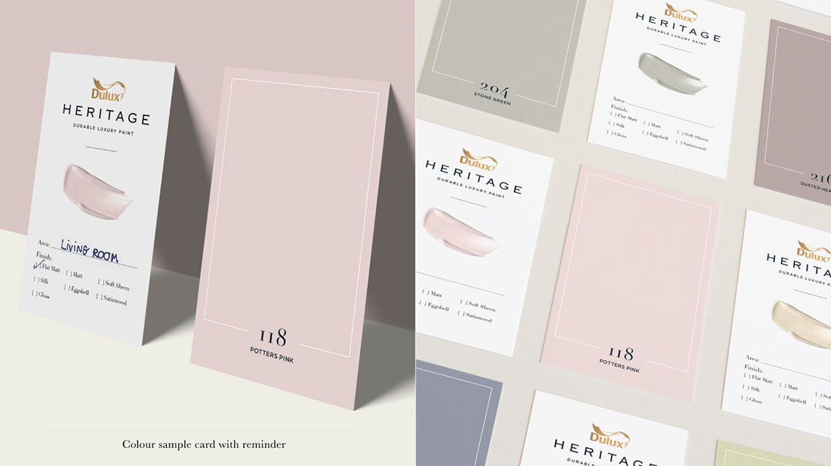
The diagonal spilt line in the key-visual and print communications helps soften the serious look and feel, and makes the brand become more contemporary. An elegant update of the ‘colour sample card’ (usually scribbled on a piece of paper) serves as a reminder of the colour consumers have purchased should they need to buy the same colour again.
NOTE: This is a self-initiated packaging design concept inspired by DULUX Heritage products. DULUX trademark and the dog icon, including product details, colour swatches and interior images are the property of ©DULUX. This project is a pro-active personal design practice and for non-commercial proposes only.
For actual product information, please visit www.duluxtradepaintexpert.co.uk.

