Googa is the name of a new Slovenian swing brand, that is characterized by quality wood and handcrafted products. A key unique and recognizable details are colorful ropes and an anti-slip flooring with a wooden pattern engraving.
Inspired by playfulness, natural materials, modernity, and cleanness, we wanted to communicate happiness and joy present when swinging. It doesn’t matter if a child or an adult nurturing their inner child is swinging.
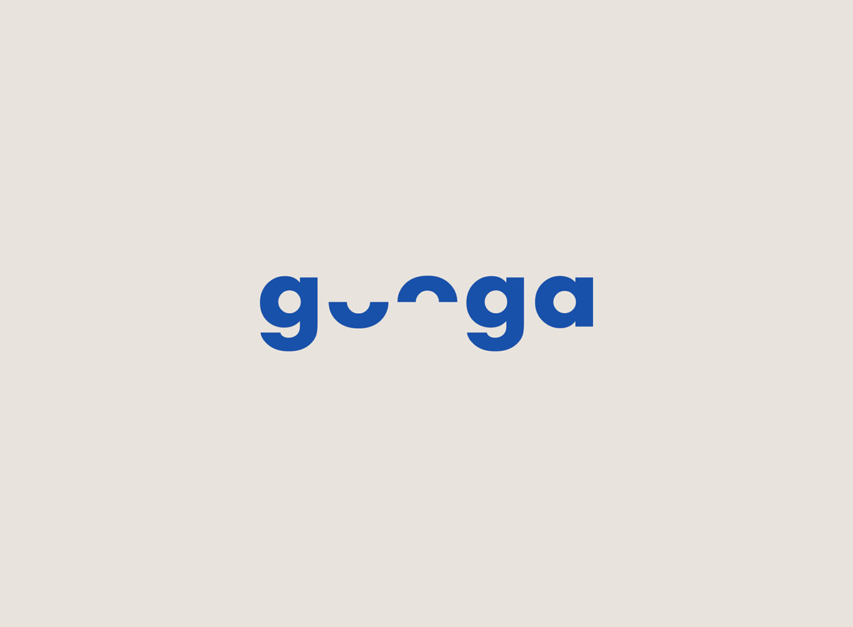
Googa’s logo is a typographic solution utilizing the symmetry created by the repetition of the letter “O”. By cutting that letter in half, we got a U-shaped curve mimicking the path of a swing. In addition, this new letter shape also showcases the method of rope waving of a particular swing model. Breaking the symmetry of the letters rid us of the similarity to google’s lettering, but at the same time, created a playful yet still serious logo that also addresses older customers.
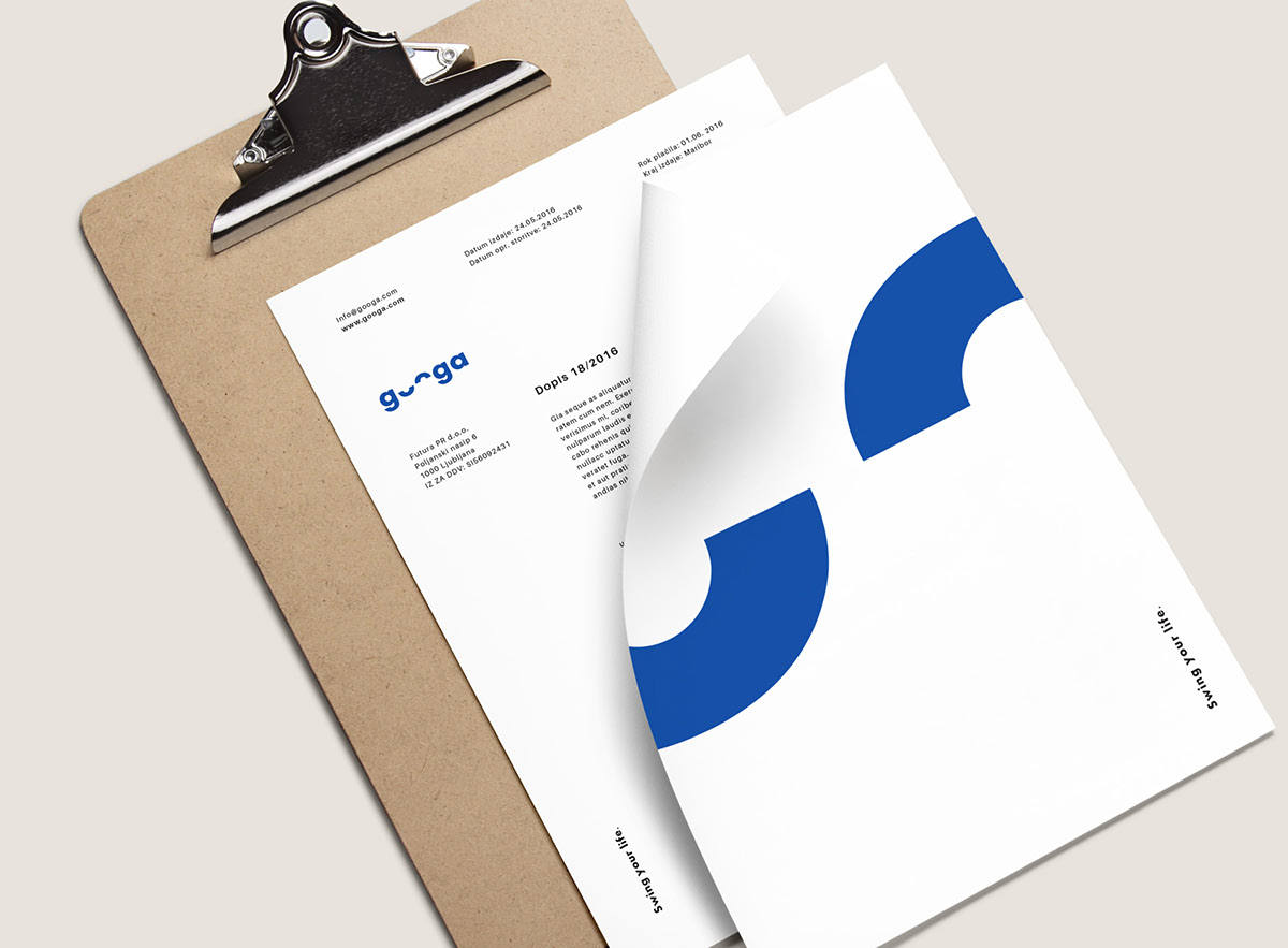
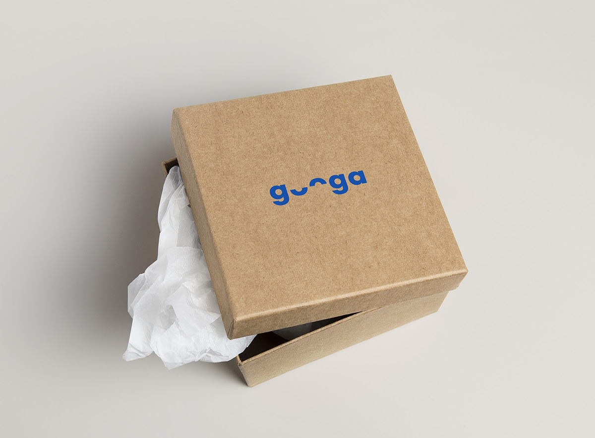
Since swings are handcrafted, products personalized and crafted in smaller series, we decided to communicate this by choosing a natural craft paper. Then we added a white color giving the brand a fresh feel and a playful emphasis through the use of neon colors. These neon colors imitate colorful ropes, a strong and recognizable element of the brand.


Credits:
Client: Duma portali d.o.o.
Graphic Design: Wedesignstuff
Photo: Sami Rahim
Client: Duma portali d.o.o.
Graphic Design: Wedesignstuff
Photo: Sami Rahim
