Rebranding Jelly Joy, giving it a fresher, joyous and modern look throughout its branding and deliverables.

Logo Design
"Fun till the last slurp!"
As it keeps you craving for more whenever you're done, the tagline implies that the fun never ends since you can never get enough of it. In the following deliverables, the 'fun'

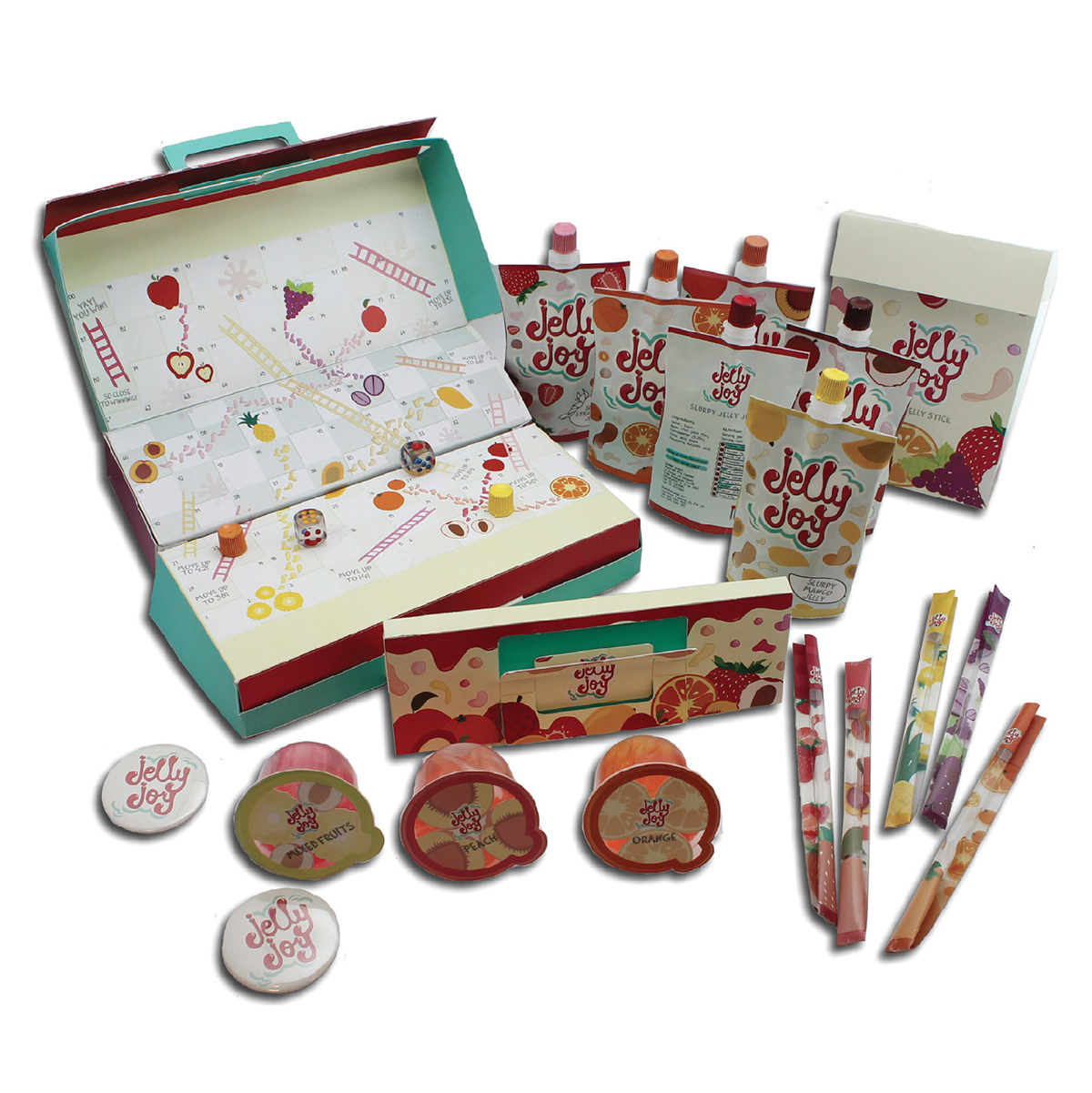
What's some fun without having some interactive element? In the packaging designs, specific parts of it are kept transparent so that the kids will be able to see the amount of product left as they are consuming it.
The main product, the Jelly Joy pouch, is usually sold individually or in a box of 10. The box is designed such that it works harder, and doubles up as a board game with the pouch caps as game pieces.

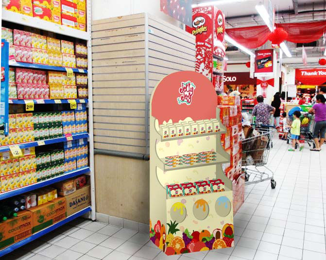
Mainly found in supermarkets, a point of sale station is designed to capture kids' attention. They will be able to choose a specific flavour to buy, or for a surprise element, they could stick their hands into one of the 3 holes and pick a random flavour to consume.

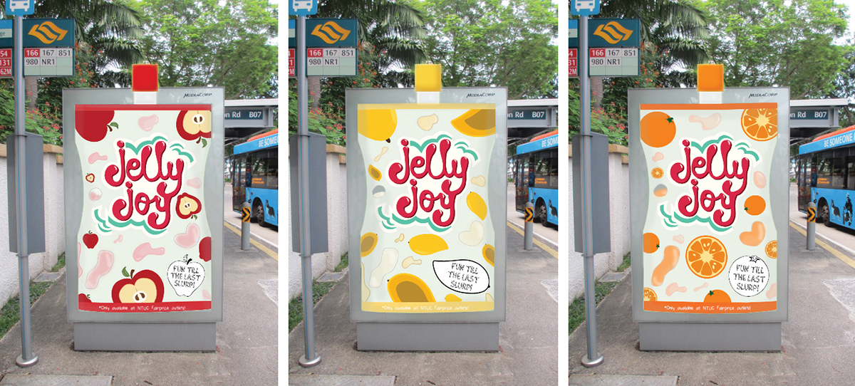
Interactive bus stop ads can be found especially in neighbourhood areas, where animated liquid is used to mimic the jelly in the jelly pouch.


