Gojo Coffee
Logo, Business Card, and Menu Design
Logo, Business Card, and Menu Design
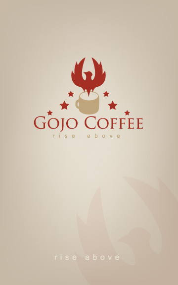
First I had to come up with a Logo for the company. I decided to avoid the cliche of using brown. Instead Gold and Red were used to emphasize quality, integrity, and passion. The bird is a Phoenix, becoming a symbol for resurrection. They rise from their ashes much like we do when we re "awaken" from our nightly slumber with a nice warm cup of coffee.
Next came the Business Card. I opted for a two sided design with plenty of white space to let the content breathe. I went for a little bit of a Mocha color for the background to go with the concept of a coffee shop, but keep it from being a boring and weighty brown.
Finally I attacked the Menu. Using the same color scheme from the Business Card allowed for a strong unity.

Logo

Business Card, Front

Business Card, Back

Menu, Front

Menu, Back


