
S P L I T S P A C E
explained
___
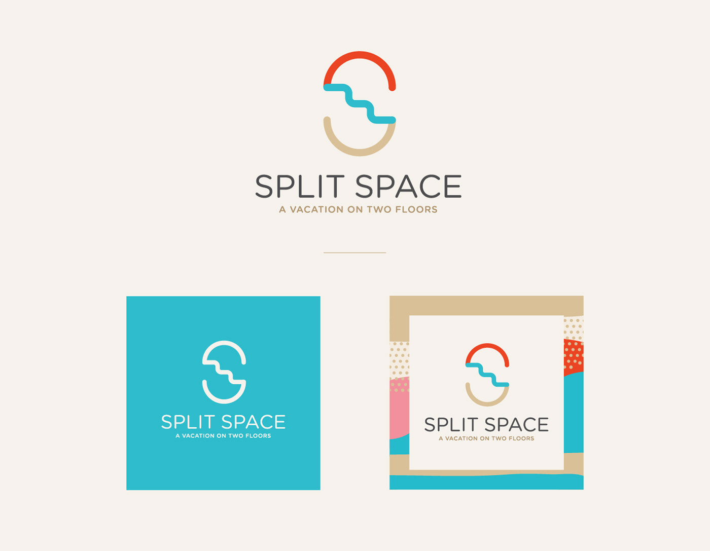
Split Space is a cute little apartment smack in the middle of the Old Town of Split.
Although quite small, the apartment came into existence by merging two floors and is,
in a way, split in two parts. Hence the name.
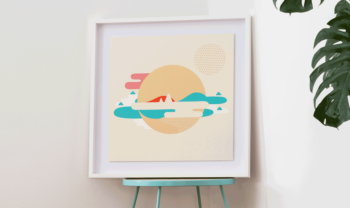
The goal was to portray the setting – the climate, the landscape and the Mediterranean
backdrop, as well as the main characteristics of the apartment.
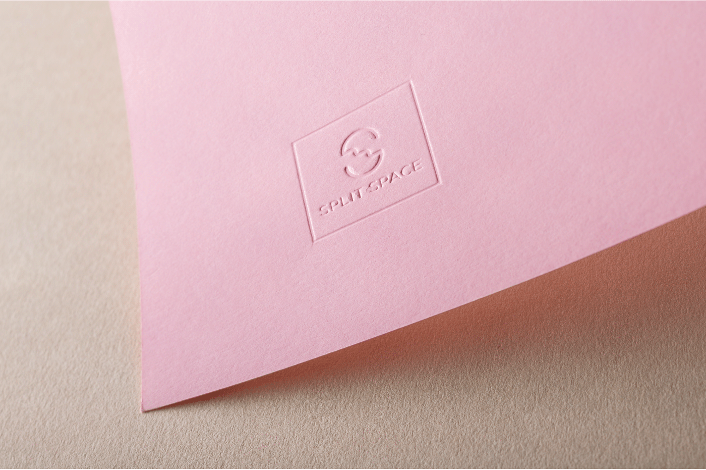
That’s why the logo incorporates not only the contour of the apartment – a space split in
two parts - it also gives homage to the Mediterranean scenery by incorporating the sun,
the sea and the coast.
____

____
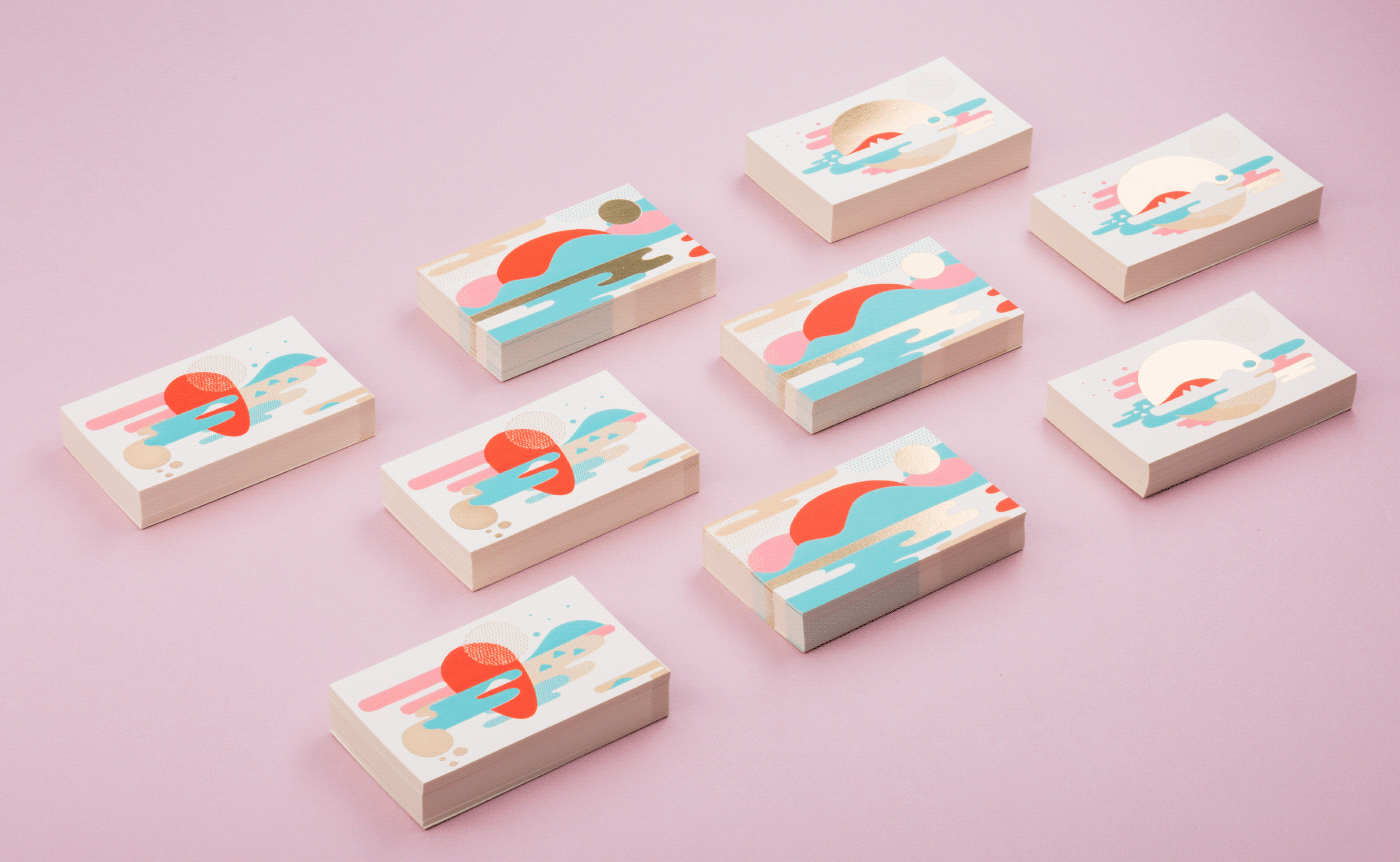
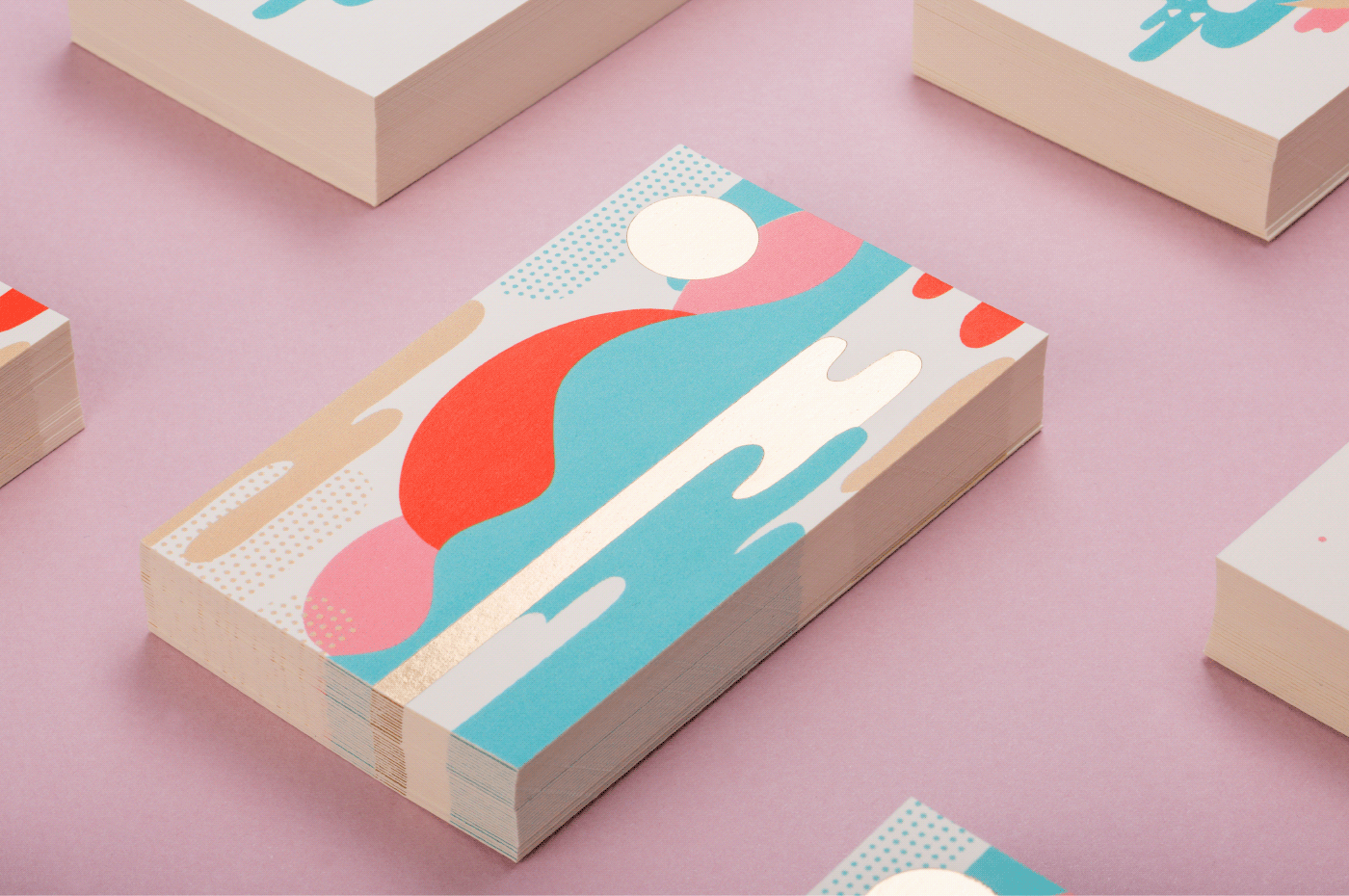
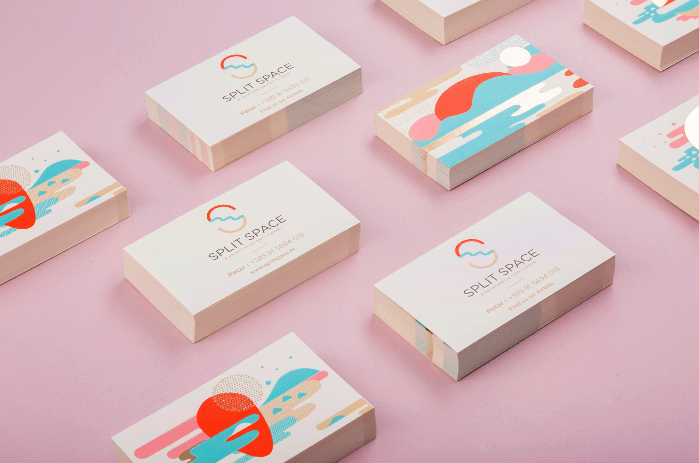
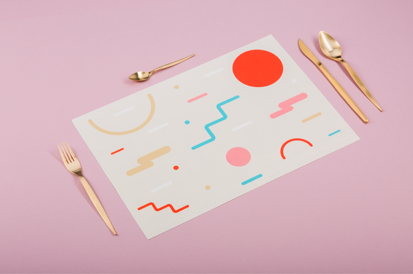
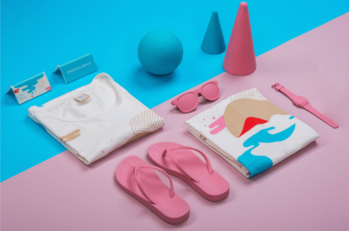
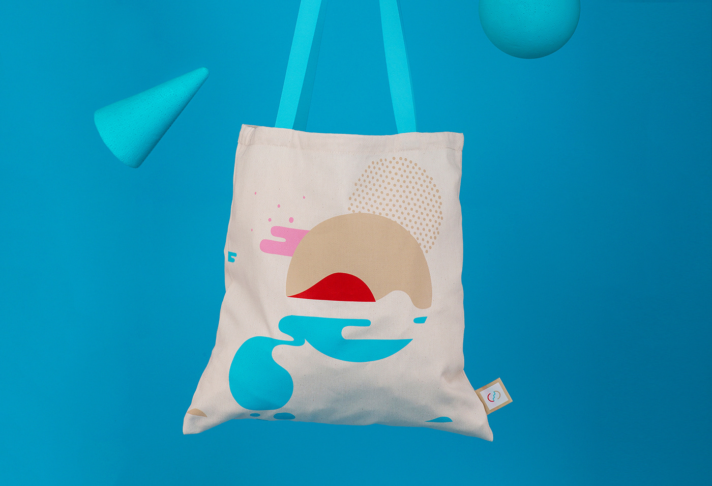
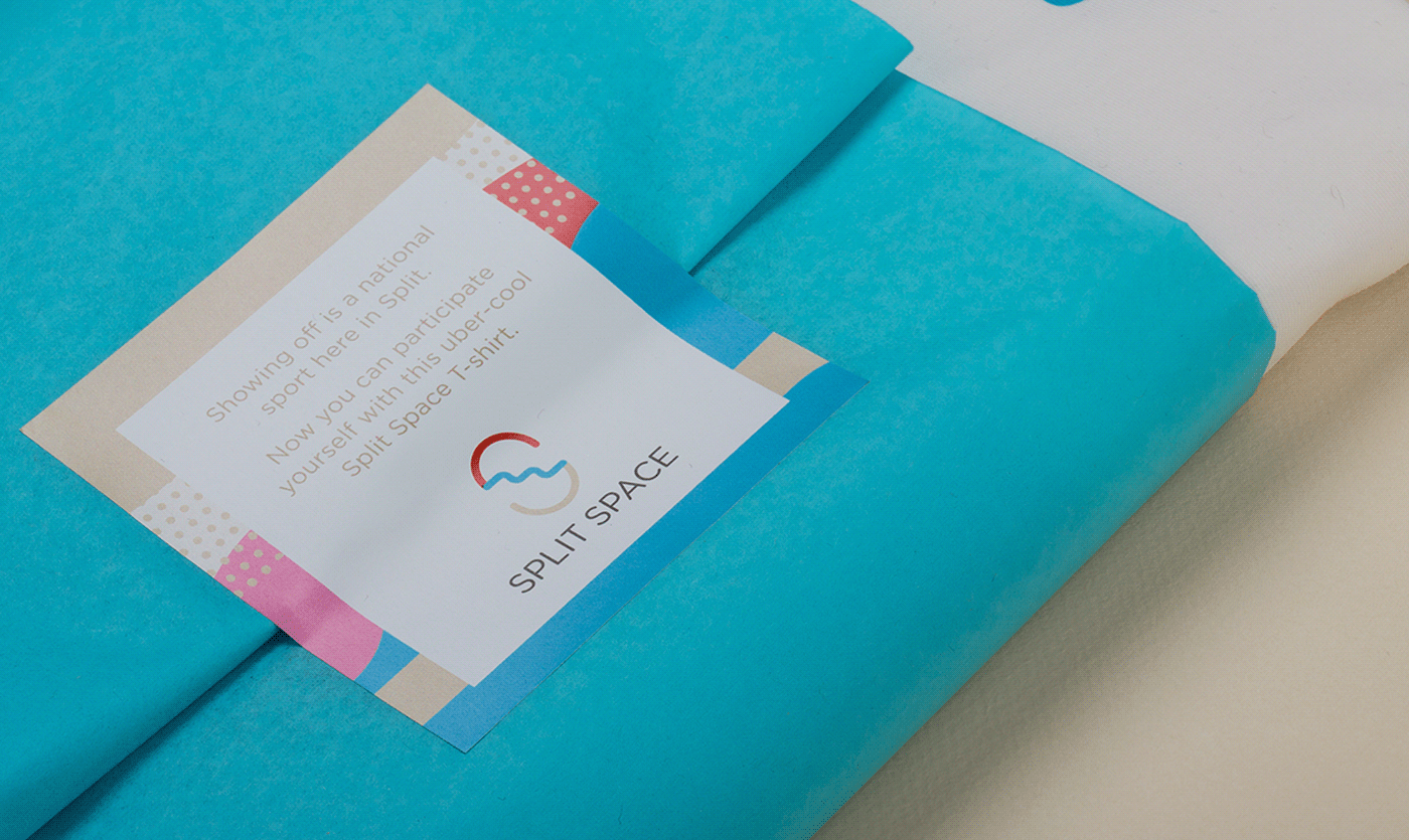
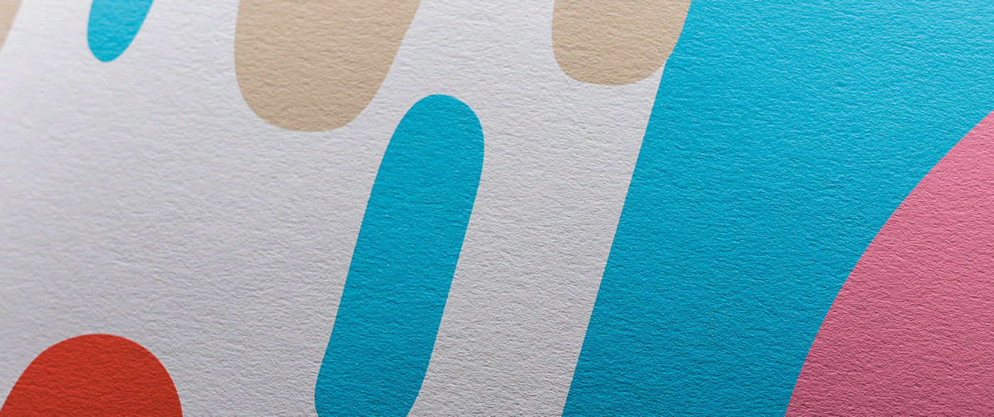
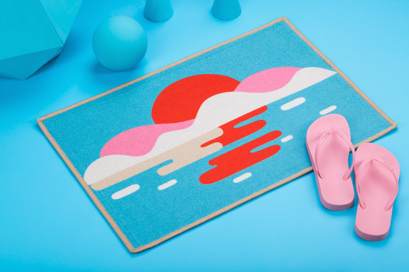
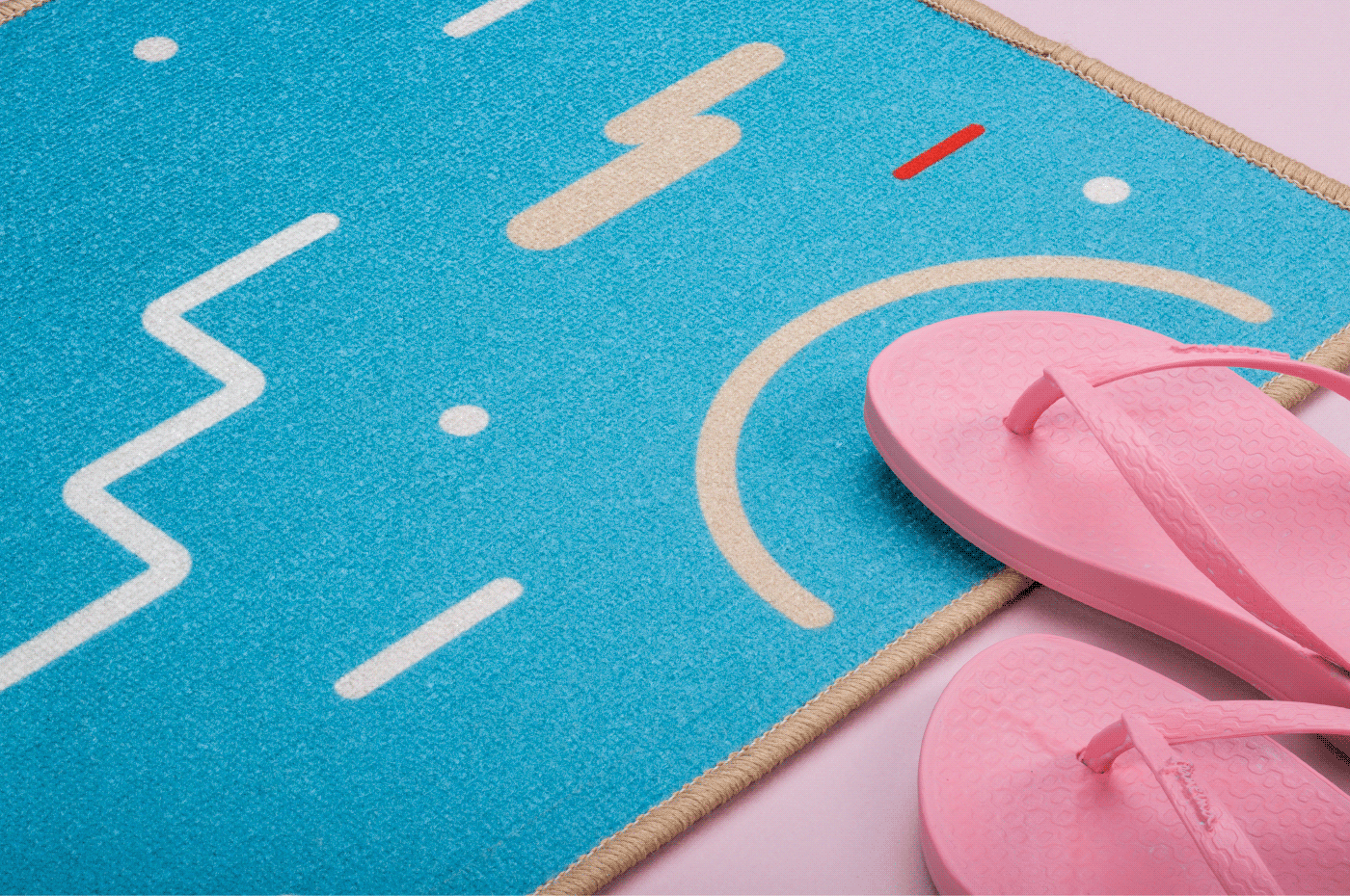
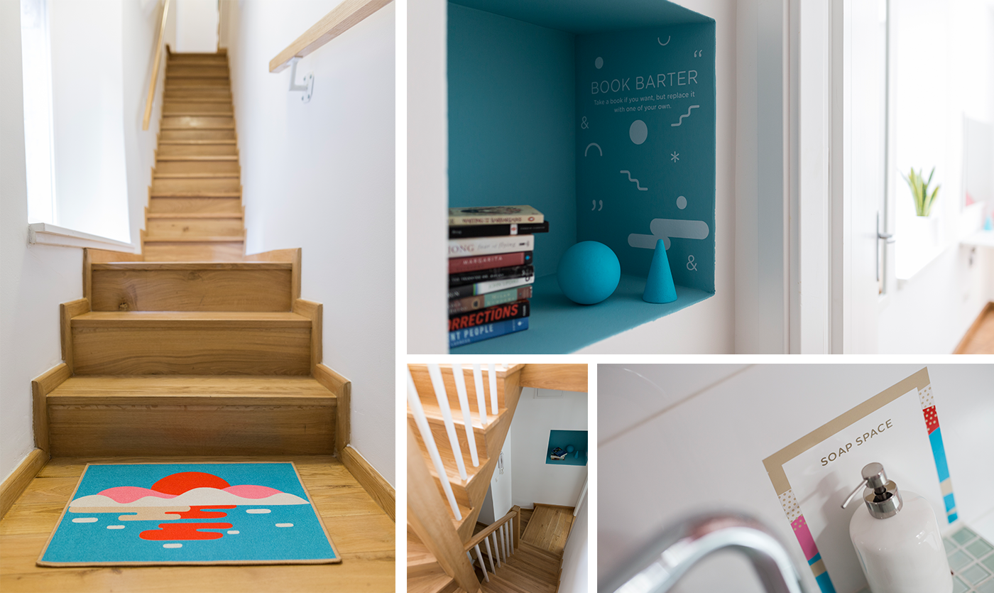
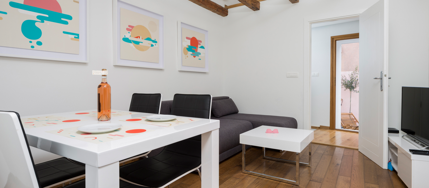
The visual identity made its way onto the materials created for guests and spread
throughout the space of the apartment to form a subtle branding experience.
____
----- Plate paper coaster -----

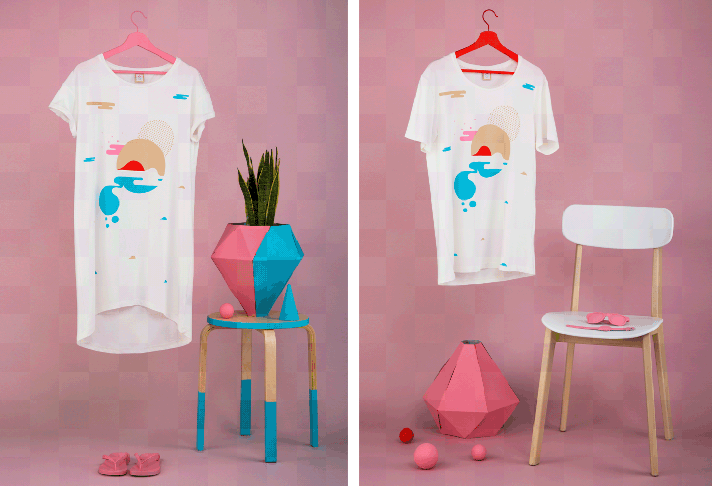
---- Split Space Apparel ----

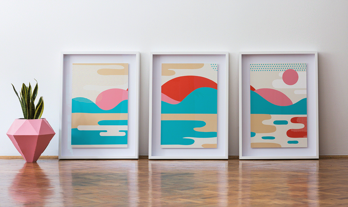
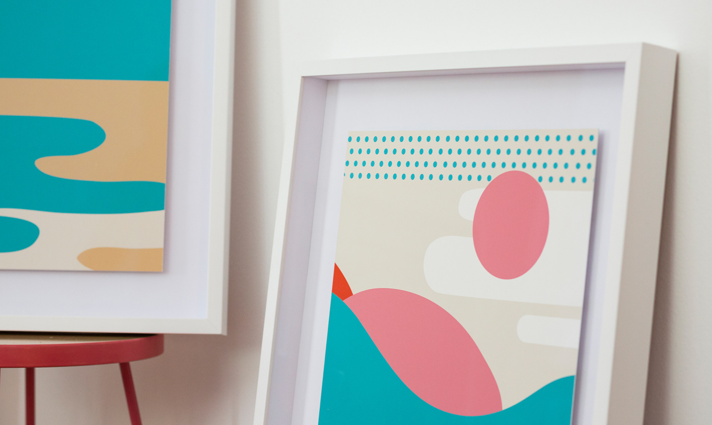
---- Prints ----
---- Welcome carpet mat ----
____
While you’re at it, take a moment and check out
the apartment.
____


Creative directions: Imelda Ramović & Mirel Hadžijusufović
Art direction, Design & Illustrations: Imelda Ramović
Copywriter: Luka Pervan
Project manager: Svjetlana Vukić
Photographer: Domagoj Kunić
_____
Special thanks to: Cerovski, Digital Print, Fini Print, Galerija Mazuth, Roba, Signum Max
Very honorable mention: Žarko Kuvalja - logo animation, Željka Zrnić for Mobiliar side tables,
Señor for letting us shoot at their office.
....

...


