For the broader audiences of Georgia Intellectual Property is mostly perceived as an
alien concept. Even for many successful business CEOs it may still be a piece of
complex bureaucracy, and needless body of law.
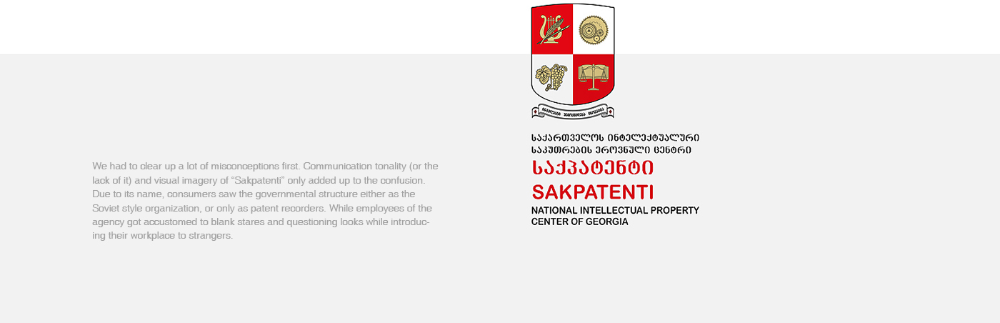
So, when “Sakpatenti” – the main governmental agency determining IP policy
approached us in October 2015, we agreed to kick-start a thorough rebranding process,
refreshing brand architecture to reflect the challenges of digital age - to innovate, and to
simplify.
Concept.
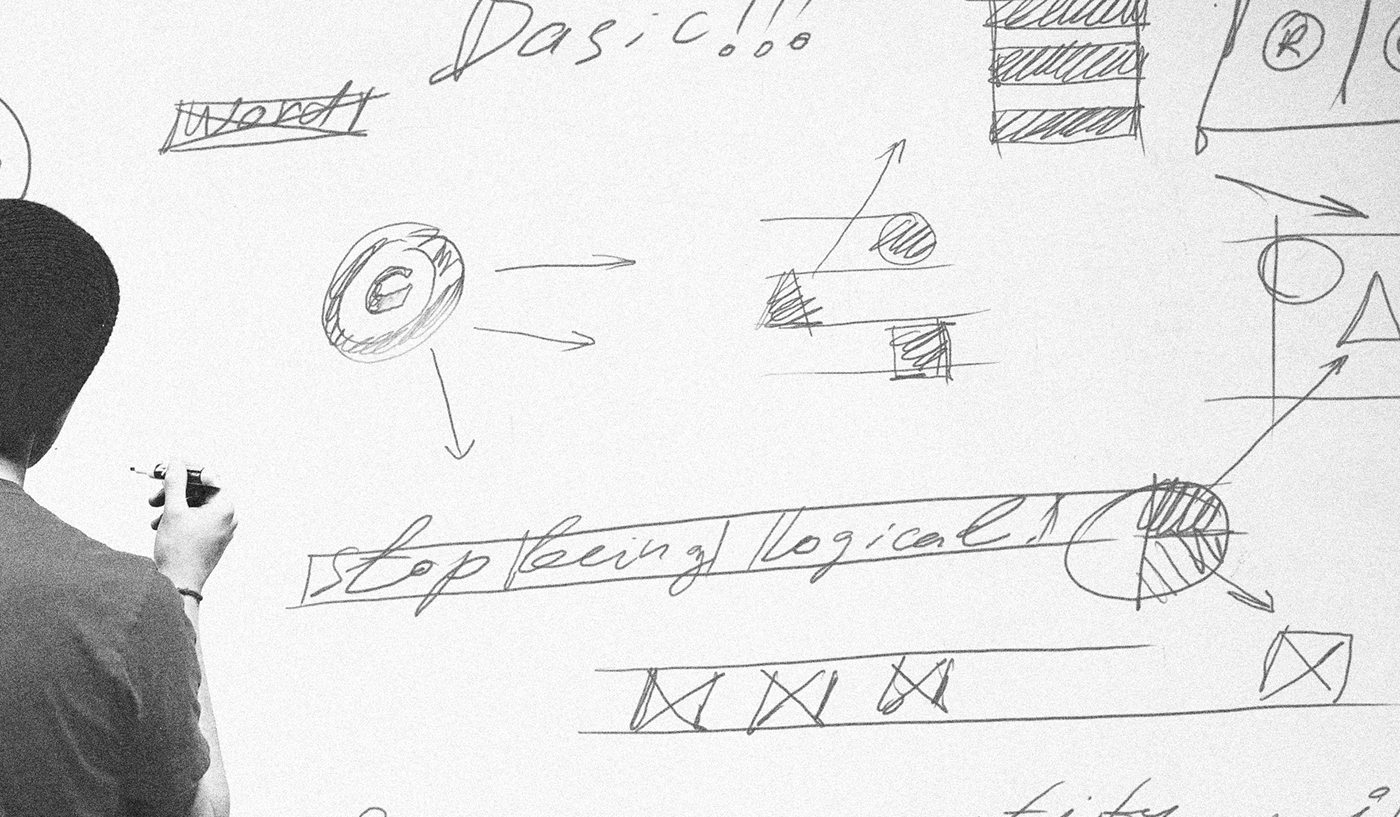
To turn things around, we immersed ourselves into IP field for the next couple of
months.
For starters, we recognized the clear difference between Copyright, Trade Marks, Design, New Breeds and Geographical Indications – very distinct, but equally valuable units run by IP agency along with Patents.
We went on to study the daily working process of the agency in 6 units – analyzing what came in and how it got processed. We saw IP experts working their magic with sketches, formulas, computer codes, blocks of text, musical notes, etc.
And then it all came down to very basic forms and shapes.

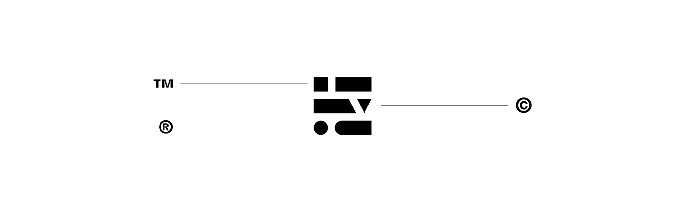
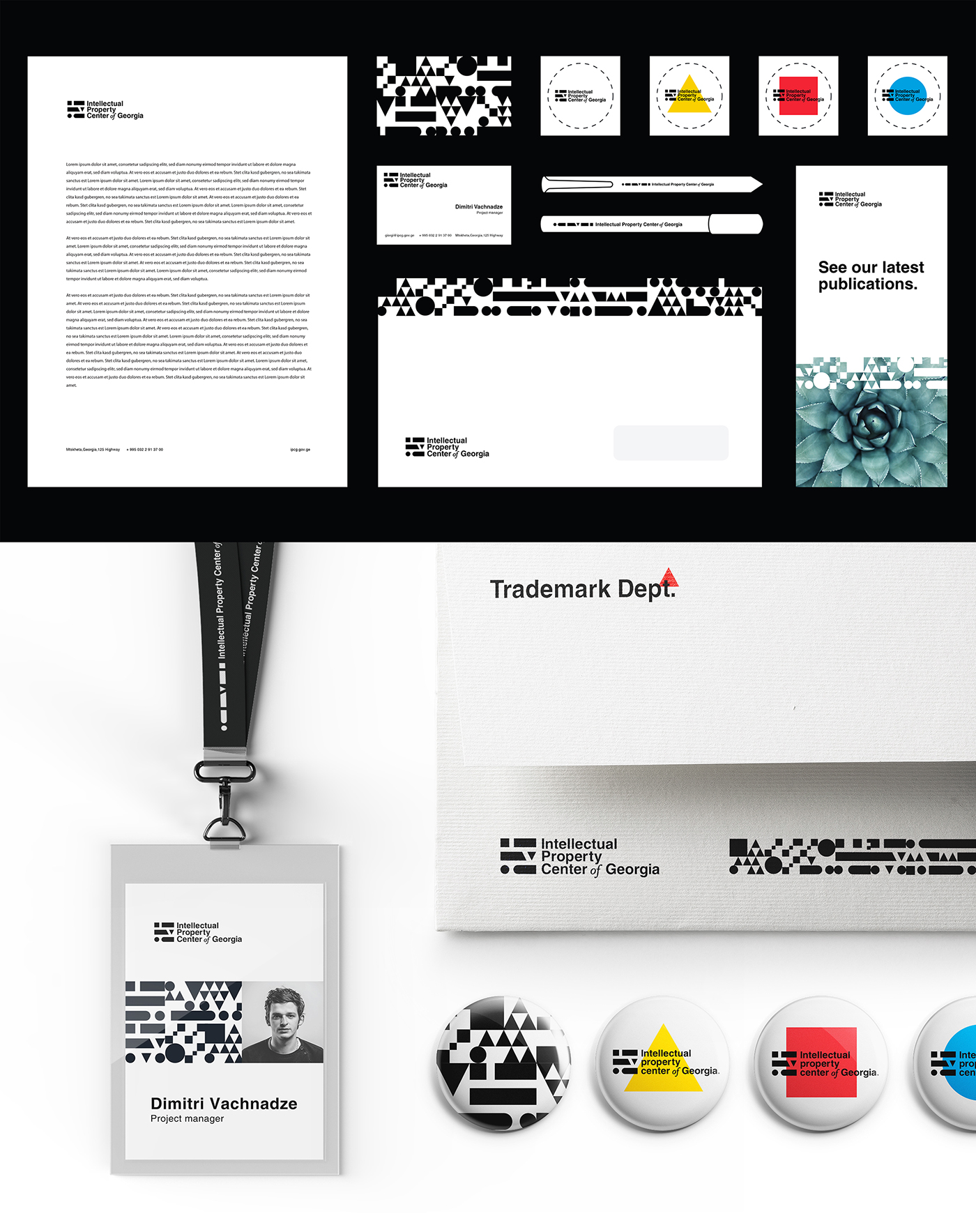
Brand Identity.
The graphic mark is based on the simple forms, which, we believe, shape inspiration.
The symbol becomes the central element of branding – unifying distinct fields of
Intellectual Property.
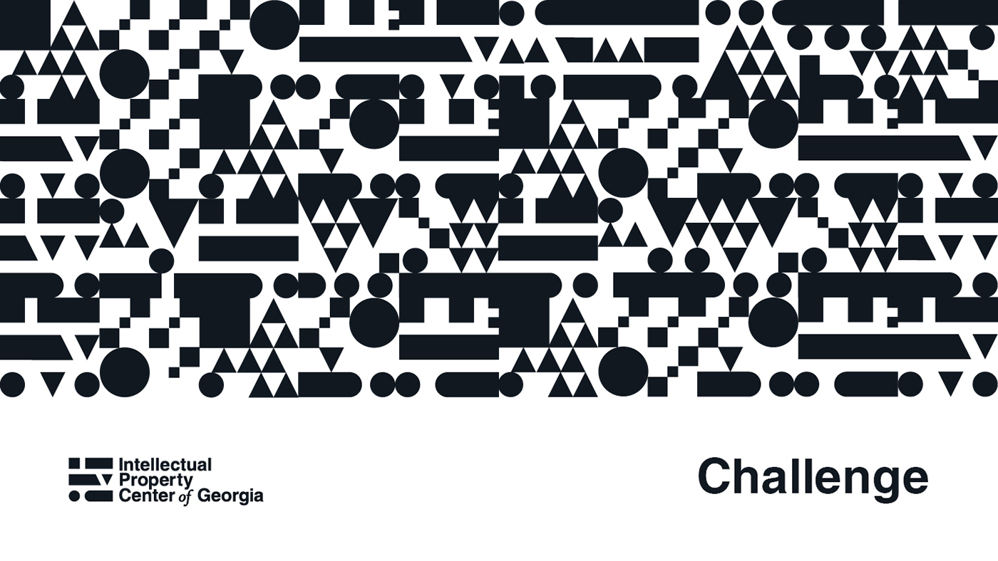
In application, logo extends to colorful patterns – representing 6 different units governed
by IP agency.


Credits.
Agency — Windfor's Communication.
Account Managers — Dimitri Vachnadze, Vaska Chubinidze.
Strategy — Lado Malazonia.
Creative Concept — Zakharia.
Art Direction & Graphic Design — Zakharia & Ruslan Beridze.
www.unsplash.com
Photo Credits — Erol Ahmed, Tim Stief, Vadim Sherbakov, Anthony Delanoix.


