The Challenge
Develop Identity for Russian company AKVION that creates and displays the innovative pharmaceutical products to the market.
Decision
“Akvion” is the only company in Russian pharmaceutical market, that creates and promotes innovative products. That is why we suggested new positioning – Creative Healthcare. Also, we deduced 5 basic brand values: ideas, solutions, dialogue, innovations, assistance.


The main logotype element – the drop – became the base for reflecting this structure, the element, from which all the others were born.

As the new product, that helps people to keep healthy, comes from the idea, the sign of “Akvion” – the drop – keeps its shape and fills itself with new content, new sense. The principle of endless creation of new elements is the distinctive feature of this identity.


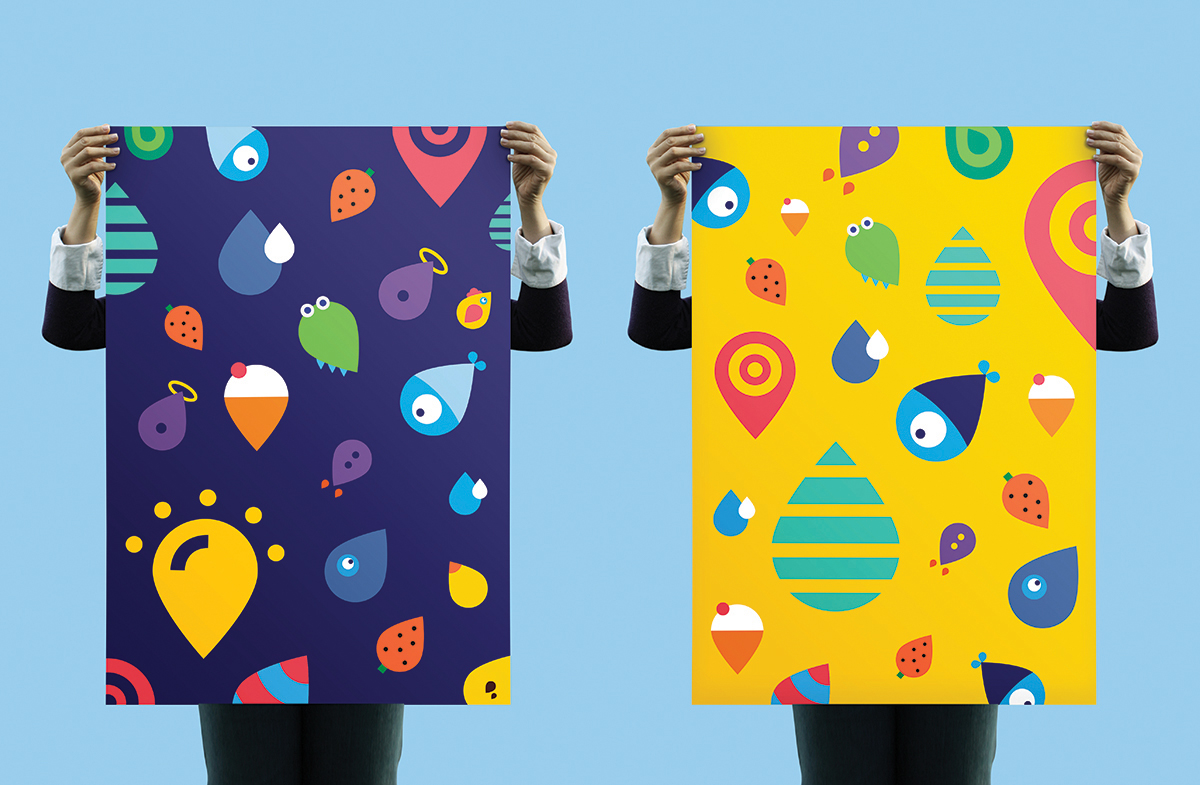


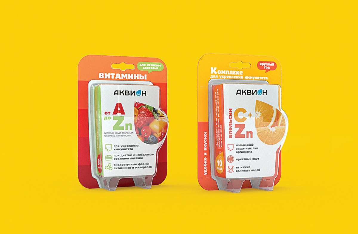


We created dynamic corporate style, demonstrating the company’s wide possibilities and new look at pharmaceutical products consumption, building comfortable language of communication with the consumer.
www.dezzza.ru

