Here is the entire campaign for Deft Adept, the fictional electronic music band created and branded by me for my Music Branding elective at Ringling College. The campaign was done in four parts: The initial identity and logo creation, concert posters, album packaging, merchandise with a new media element. Photographs were edited by me but taken by the great folks at NASA. I would also like to credit my girlfriend Alexandra Garey for taking the photographs of me while holding up the posters.
Identity/Logo/Mark Development

The graphic and typographic logo for Deft Adept. The thought process behind the graphic was the intials D and A abstracted as triangles > and ^. These later morphed into isosceles triangles, with the "A" triangle a reflected cut out from the "D".
The typographic logo is a medium weight Futura kerned back -75 and then worked with to bleed certain strokes into each other. This is the style I apply to all heading titles of their work such as album names. I keep the colors at a 60% K value, unless when working with dark backgrounds, where I use white and glows with a hint of Y or C.
I actually had to think awhile before coming up with this logo. I knewI wanted to do an electronic music band, and the name "Deft Adept" justpopped into my head and I liked it much more than the ones I had beenwriting down forcibly. Unfortunately Deft Adept is a nonsense name thatcould be defined as "skilled at being talented," and does not lenditself to any real descriptive visuals since both words are adjectives.I knew my logo had to be done with the only visual it had, the letters,but it wasn't until the posters that I came up with the formaltypographic formatting.
Event Posters


These posters are what really give off the look and feel of Deft Adept. It was at this stage that I figured out the second logo for the band, the typographic based version. I wanted something retro-spacey; I've always been interested in space, but I think these evolved past retro and into their own niche.
I had been working with radial pulsating marks earlier, to abstract the turning of knobs and dials related to electronic artists, and thats where the green circles came from, but the posters went in their own direction towards this "triangle/circle/square - r/g/b" theme by the end of things. The backgrounds all belong to NASA, I merely edited them. They were all orange clouds at one point.
Initially, all three posters had the type in the exact same place, and sponsored the fictional band's appearance at Musikfest, a festival full of musicians, mostly local, in Bethlehem PA. I chose this location because it is personal to me, and Pennsylvania was my home state. The date "8/9/10" is also personal as it is my birthday; when I turn 21 to be precise. The numbers were also sequential which I found to be interesting as well.
The "Triangle" poster was later changed into a tour date poster at the request of my professor. Keeping with a white color with a glow proved too overpowering on the body text; it emphasized the triangle geometry far less, so I ended up giving it a gradient overlay that reflected the background.
Album Packaging


more to come once I get back to campus/recover my stolen computer, I promise!
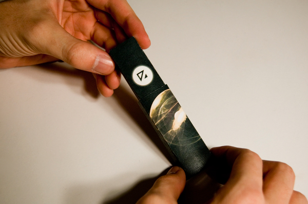
For the packaging I started to experiment a little more. I took a look at the album package and thought "is this going to be the future of music distribution?" "will there still be a tangible package?". Given the futuristic electronic qualities of my band, I decided to try something new. I made the whole album fit on a thumb drive, with a tiny matchbox like case with minimal graphics, with the main appeal being what could be on the inside; digital artwork and screensavers and biographies, etc.
I started working with itunes' new LP system that features digital albums. Unfortunately, my computer is m.i.a. and possibly stolen from the train ride up to my home for the winter holiday, and so I can't access my campus network from the PC I am using now, and so I for now, cannot show more of the LP album I was working on for itunes, but I will update this once I return after break.
Additionally, I wanted to expand upon the geometric forms I had developed for Deft Adept for the posters. I thought the logical expansion would be Fractals, and so I started researching programs on how to make them. It was amazing to find an entirely different world out there of artists, who create and develop fractals. These were featured among others on the thumb drive packaging, and were created using a tool called "Apophysis."
Merchandise/New Media


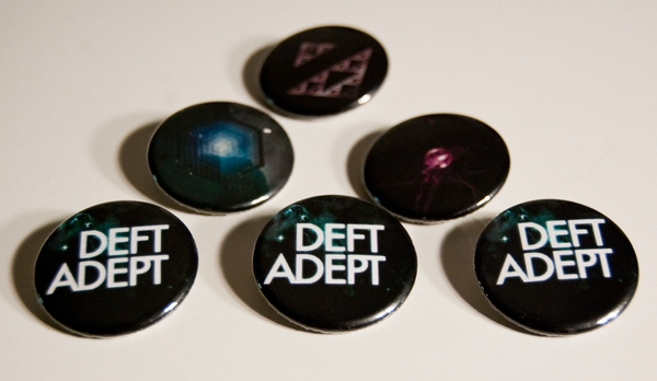
The merchandise involved simply using the content created to make things that sell. I rather like how the fractals worked on the t-shirts. For the new media portion I created a mock website for Deft Adept, that had clear functionality and clean expression.
Note to everyone: Don't wait to take pictures of buttons AFTER your Music Branding show where you give them all away! In reality, the photo lab got locked down after some idiot stole an expensive camera. Bad timing.
Note to everyone: Don't wait to take pictures of buttons AFTER your Music Branding show where you give them all away! In reality, the photo lab got locked down after some idiot stole an expensive camera. Bad timing.

