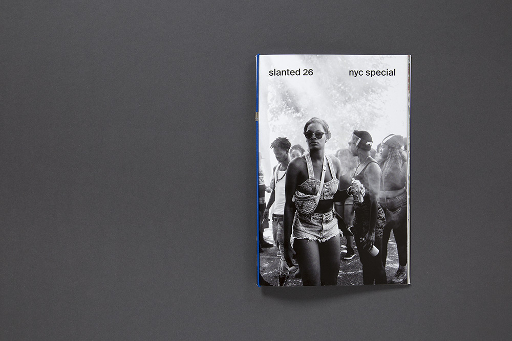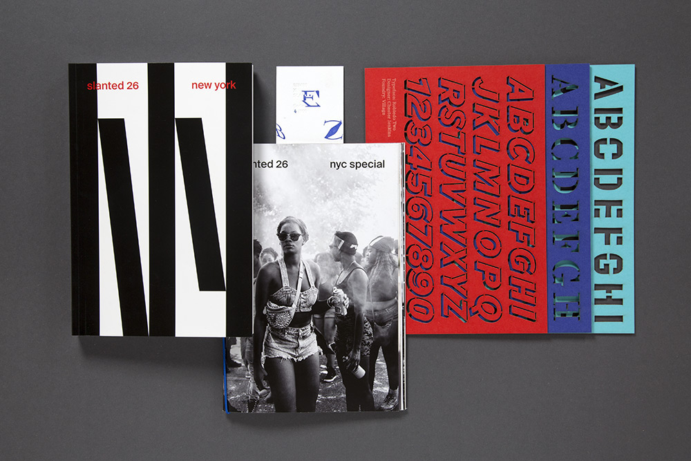
On occasion of the release of Slanted Magazine #26 – New York, the Special Edition NYC has been published, which is exclusively available in the Slanted Shop. The edition contains a Photo Essay by Jochen Sand, and a limited type-stencil-set by Commercial Type, Village and XYZ Type.
Special Edition + Slanted Magazine #26: slanted.de/shop/slanted-26-nyc-special-magazin-photo-essay-type-stencils-bookmark
Special Edition only: slanted.de/shop/slanted-26-nyc-special-photo-essay-type-stencils-bookmark
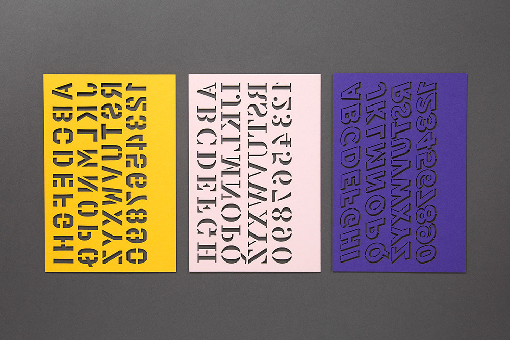
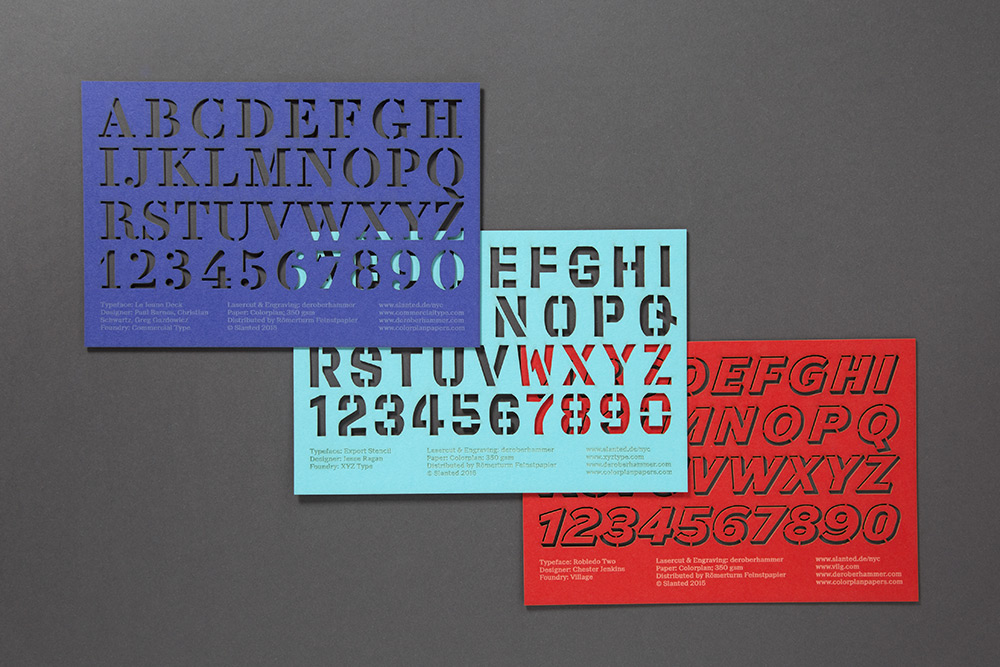
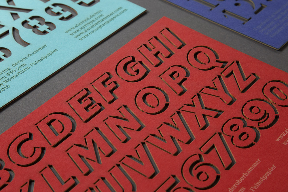
NYC Type Stencils
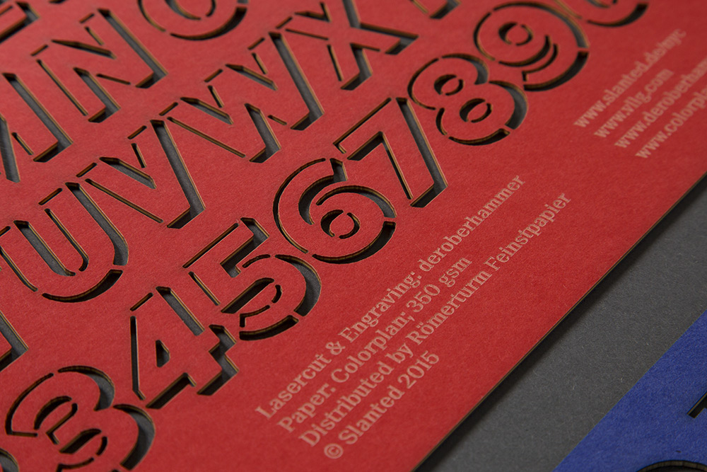
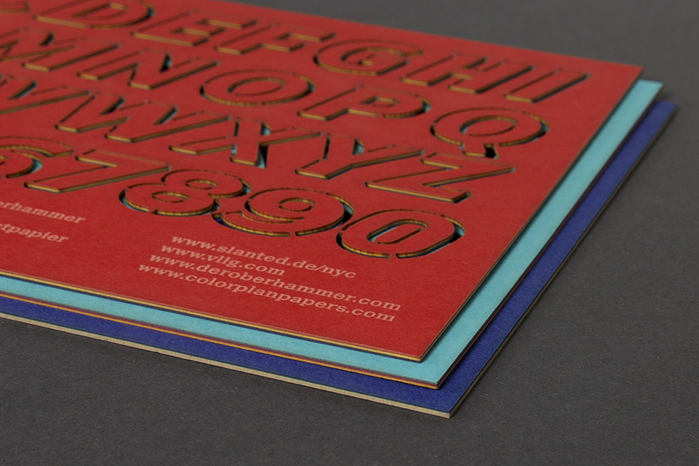
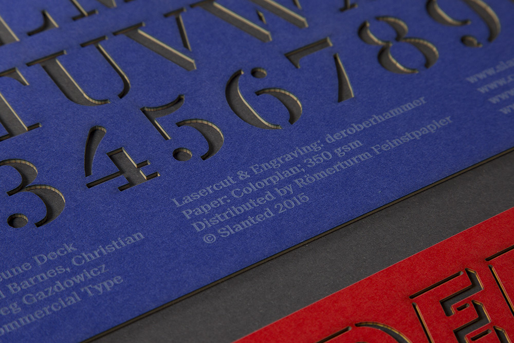
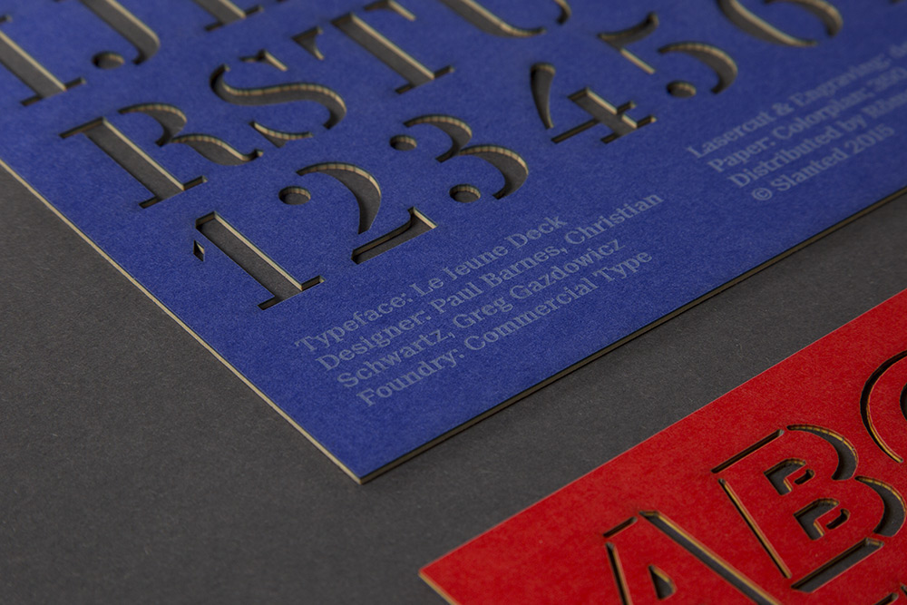
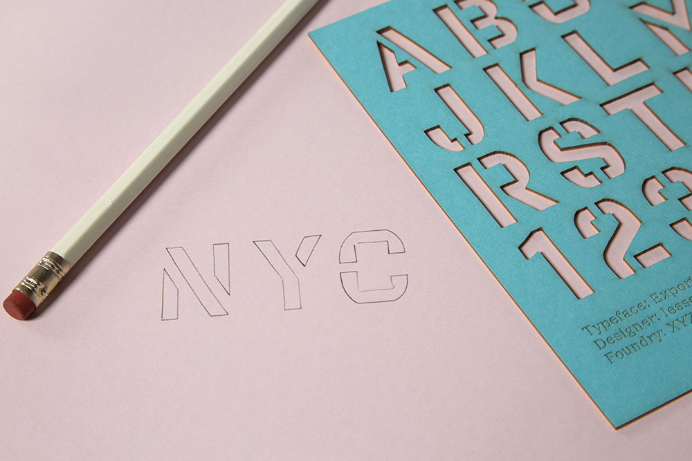
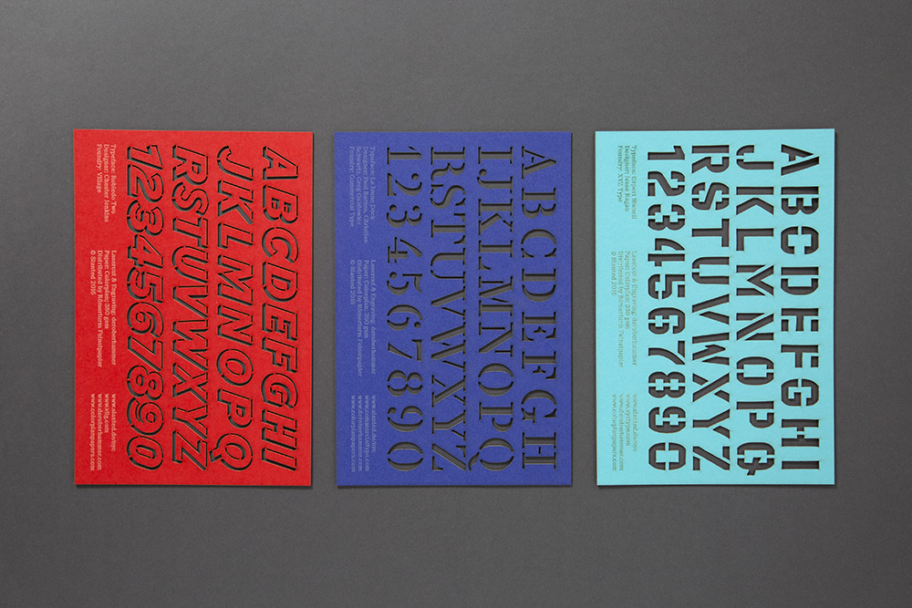
We love Type! Commercial Type, XYZ Type and Village – three type publishers from New York – created a font exclusively for the Slanted NYC Special which is now waiting for use as a set of three colored type-stencils. Lasercut and engraved by deroberhammer on colored Colorplan paper by Römerturm.
Publisher & design: Slanted Publishers Size: 16 x 24 cm
Bundle with 3 stencils
Paper: Colorplan (Römerturm Feinstpapier)
Lasercut & engraving: deroberhammer
Stencil 1 – Le Jeune Deck
Designer: Paul Barnes, Christian Schwartz, Greg Gazdowicz
Foundry: Commercial Type
Stencil 2 – Export Stencil
Typeface: Export Stencil
Designer: Jesse Ragan
Foundry: XYZ Type
Stencil 3 – Robledo Two
Designer: Chester Jenkins
Foundry: Village
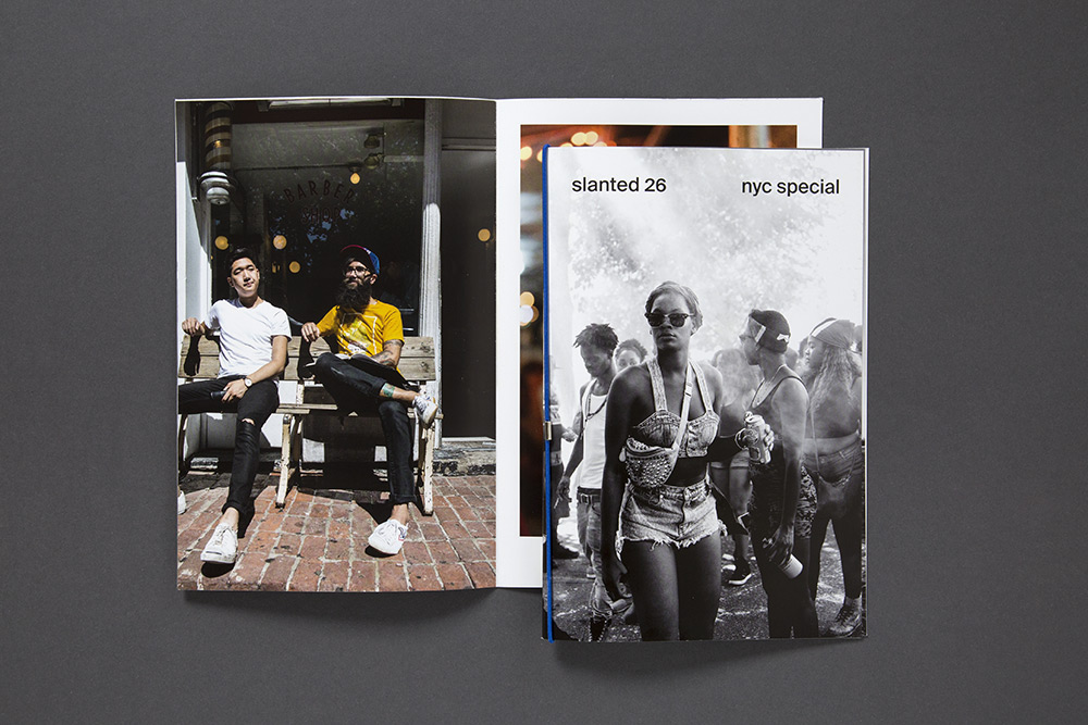
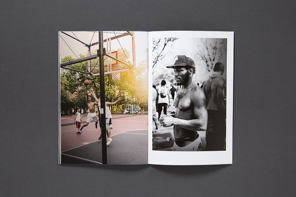
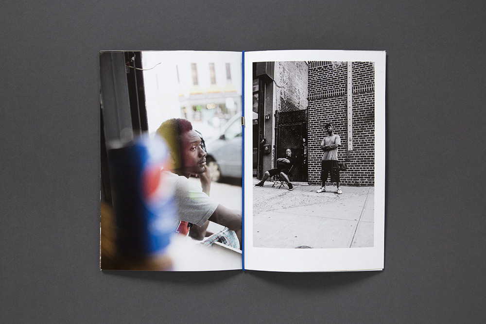
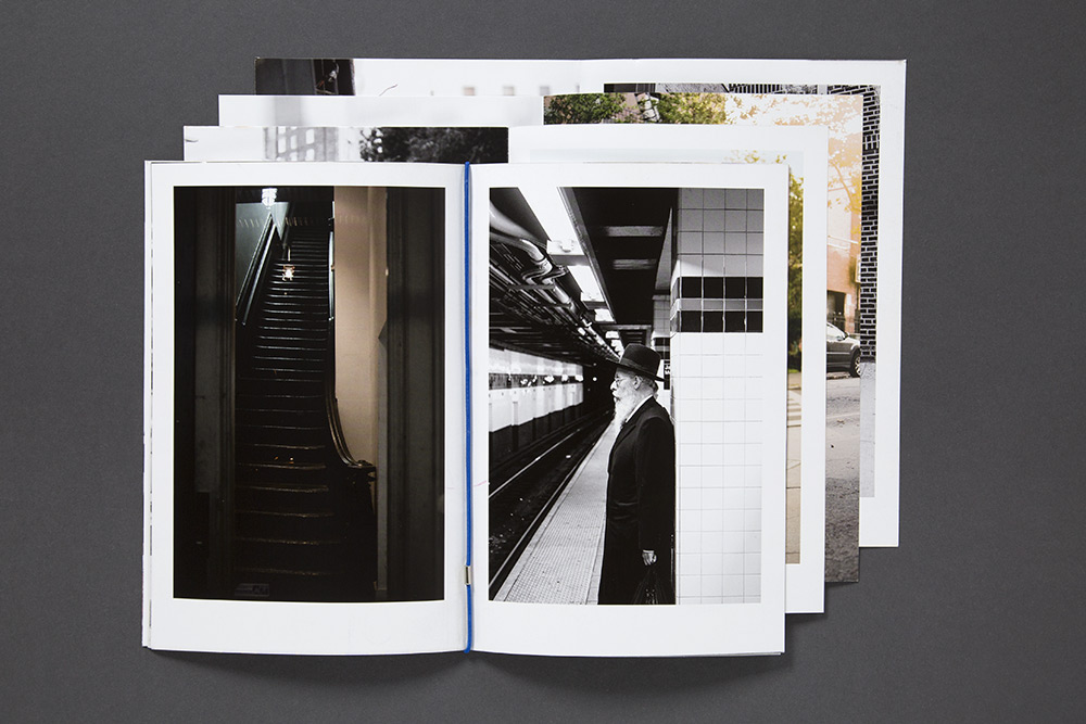
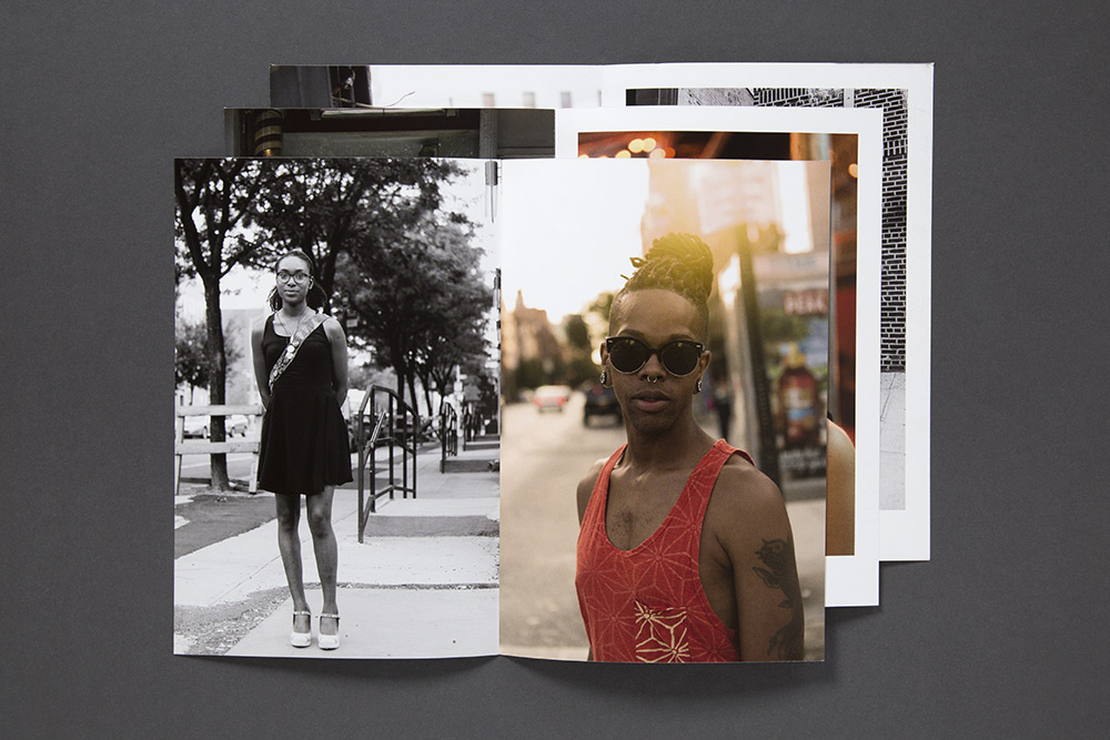
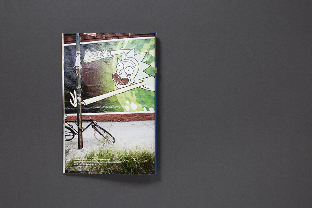
Photo Essay – NYC Special
Jochen Sand is a German photographer who works for international clients since 1995. In September 2015, he accompanied the Slanted team on their way to New York to meet the young generation of designers, typographers and artists which witness and create the change of a megacity.
Many years ago Jochen Sand came to New York City as a young photographer already. Over there he discovered that hanging out on the roofs of Hell’s Kitchen shooting fashion or ending up celebrating Mickey Rourke’s birthday, was much more glamorous than giving a sexy light to doorhandles and kitchen cupboards.
New York is the city of superlatives – this inspiration and the collected experiences are very important to Jochen Sand’s work. For Slanted, he caught the pulse of the city, the breath of the streets, and the life of those who live and survive in NYC.
Publisher & design: Slanted Publishers
Photography: Jochen Sand
Release: November 2015
Numbers of pages: 32 pages
Size: 16 x 24 cm
Language: English
Version: Loose print sheets with elastic band
Print: diedruckerei.de / Onlineprinters
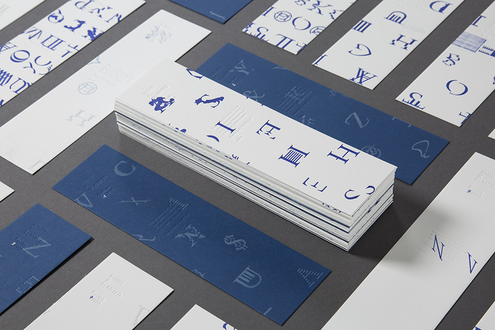
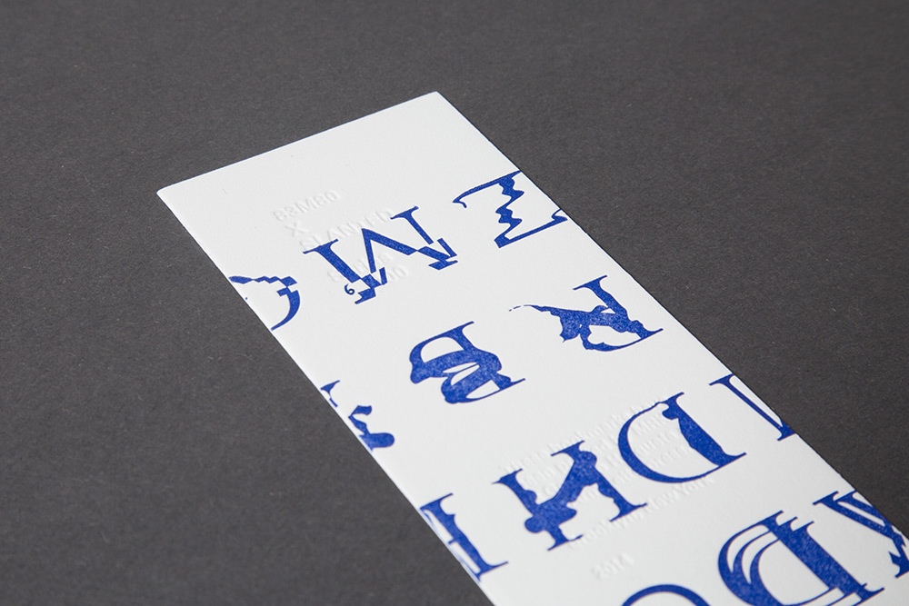
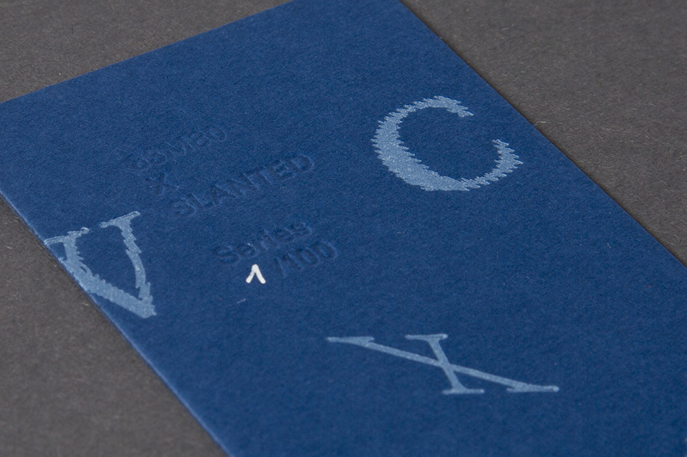
83M80 original letterpress bookmark
83M80 is an exploration of the influence of technology on visual communication, from the days of the letterpress to the Internet era. Focusing on errors and misconceptions, 83M80 preserves these aesthetic cues by representing them in a movable typeface. These typefaces were casted as a letterpress alphabet with which posters have been designed and printed. 100 limited and signed bookmarks are part of the Special Edition NYC now.
You can learn more about the story of the project in the Slanted Magazine #26 – New York on page 208–215.